
5 Material Challenges You Can Finally Measure Accurately with the CiF3200 For years, color teams across industries have faced the same frustrating truth: many modern materials are simply too small, too decorated, too textured, or too complex for traditional spectrophotometers to measure reliably. When your components don’t fully cover the aperture, or include multiple colors, intricate patterns, or uneven surfaces, your options shrink quickly. Many organizations fall back on visual assess...
Posted 16 March 2026 by X-Rite Color

Hitting offset lithographic color targets isn’t always fast or easy. The manual process of measuring color bars and making ink key adjustments takes time and opens the door to operator error. Meanwhile, the press is running (and wasting) paper and ink. To achieve accurate and repeatable color, printers need to convert their printing operation to an efficient manufacturing process and drive efficiencies in all phases of their operation. For many, a closed-loop automated solution is the...
Posted 12 March 2026 by Ray Cheydleur

The Challenge of Printing Whites The PANTONE Color of the Year 2026, Cloud Dancer, is more than just a trend, it’s a technical challenge for packaging converters. While white may seem simple, its appearance is impacted by substrate color, ink formulation, and the presence of optical brightening agents (OBAs). For converters, the goal is to deliver consistent, accurate whites across every run, between every plant, and throughout every region. Why Whites Are Complex in Packaging Whites are ...
Posted 22 January 2026 by X-Rite Color

5 Steps to Digitize Your Press Room and Defend Your Margins Margins in print are under pressure. Rising substrate costs, labor shortages, and energy volatility are squeezing profitability. At the same time, compliance audits—ISO, G7, internal reviews—are becoming more frequent and more demanding. Digitizing your press room isn’t just about passing audits. It’s about building a lean, smart operation that protects your bottom line. Here are five steps to get there: Step 1...
Posted 05 September 2025 by X-Rite Color

Sustainability in Manufacturing Is No Longer Optional From brand mandates to government regulations, sustainability is now a core requirement in print and packaging. But for many print teams, the path to greener operations feels like a trade-off: reduce waste or maintain quality—not both. The good news? You don’t have to choose. The Hidden Waste in Traditional Workflows Manual color control and fragmented workflows create more waste than you think: Reprints due to color mi...
Posted 05 September 2025 by X-Rite Color

For print and packaging, color accuracy isn’t optional—it’s essential. Yet many teams still rely on manual color control methods that introduce variability, slow down production, and quietly erode margins. If your workflow feels more reactive than repeatable, it may be time to modernize. Here are the 10 signs to watch for: Your color targets live in email threads Operators waste time searching or guessing—costing setup time and risking errors. Operators rely...
Posted 05 September 2025 by X-Rite Color

The Hidden Cost of Color Inconsistency on Packaging Color inconsistency in print and packaging isn’t just a visual issue—it’s a margin killer. Decentralized workflows, manual setups, and tribal knowledge create inefficiencies that quietly erode profitability. From wasted substrate to delayed approvals, the hidden costs add up fast. The Operational Fallout of Color Inconsistency Longer setup times as teams hunt for historical data Inconsistent output across p...
Posted 04 September 2025 by X-Rite Color

White ink is one of the most expensive and widely used inks in packaging production—but it’s often under-optimized. In this blog, we’ll explore how MeasureColor enables printers to maximize white ink opacity, reduce waste, and boost overall print performance. Why White Ink Matters White ink acts as the foundation layer when printing on transparent, metallic, or colored substrates. It ensures brand colors are vibrant and consistent. But due to its high-volume use and cost...
Posted 20 August 2025 by X-Rite Color

This is the third blog in our MeasureColor in Action blog series, which introduces key features to help you achieve smarter, more efficient print production. MeasureColor: Optimize Dot Gain for Better Print Quality Achieving consistent print quality hinges on your ability to control dot gain—a critical but often overlooked variable. Dot gain plays a major role in color accuracy, image sharpness, and overall visual impact, especially in packaging and extended gamut workflows. With MeasureC...
Posted 11 August 2025 by X-Rite Color

This is the second blog in our MeasureColor in Action blog series, which introduces key features to help you achieve smarter, more efficient print production. MeasureColor: Manage Digital Color Targets with Confidence In today’s complex and fast-moving print environments, managing digital color targets and ICC profiles efficiently is essential for delivering consistent, high-quality results. Without a structured system, it's easy to lose control over your color libraries—leading to ...
Posted 08 August 2025 by X-Rite Color

This is the first blog in our MeasureColor in Action blog series, which introduces key features to help you achieve smarter, more efficient print production. MeasureColor: A User-Friendly Interface for Faster Print Decisions In today’s print industry, finding skilled press operators is more challenging than ever. At the same time, production environments are becoming increasingly complex—often combining multiple printing techniques and a wide range of press makes and models. That&rs...
Posted 07 August 2025 by X-Rite Color
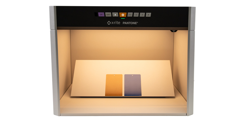
What’s the Difference Between a Light Booth and a Lighting Box? When it comes to achieving consistent lighting for color evaluation, photography, or product display, two tools often come up: light booths and lighting boxes. While they may sound similar, they serve different purposes and are designed for distinct use cases. In this post, we’ll break down the key differences between the two and help you decide which one is right for your needs. What Is a Light Booth? A light booth&mdas...
Posted 31 July 2025 by X-Rite Color

Color Matching Machines for Retail Paint Solutions In the world of retail paint, precision in color matching is crucial. Having the right tools to ensure accurate color matching can make all the difference. Enter the color matching machine—a revolutionary tool that ensures your paint colors are consistent, vibrant, and true to your customer's vision. What is a Color Matching Machine? A color matching machine is a device designed to measure and match colors with high precision. These mach...
Posted 11 July 2025 by X-Rite Color

Five Important Components of a Quality Control Program Step 1: Quantify Color with a Spectrophotometer Human vision is subjective—terms like “a bit brighter” or “slightly darker” are open to interpretation. That’s why spectrophotometers are essential. These instruments measure color by analyzing how light transfers through or reflects off a surface, producing a spectral reflectance curve—essentially a color’s unique fingerprint. This data-driven ...
Posted 10 July 2025 by Tim Mouw

When your reputation relies on your print quality, accurate, repeatable color control isn’t optional— it’s a necessity. The combination of the eXact 2 Portable Spectrophotometer and MeasureColor Software delivers a robust, integrated solution that empowers print and packaging professionals to achieve precise, repeatable color across jobs, substrates, and devices. eXact 2: Precision Hardware for Next-Level Color Control The eXact 2 is X-Rite’s latest handhe...
Posted 08 July 2025 by X-Rite Color

X-Rite Video Gallery- Your Ultimate Resource for Color Education Welcome to the X-Rite Video Gallery Whether you're a novice or an experienced professional, the X-Rite Video Gallery offers in-depth color education and practical training to enhance your color management skills. Our carefully curated collection of videos provides valuable insights and expert tips designed to help you master color accuracy and optimize your workflow. In this blog, we'll highlight five must-watch videos that sho...
Posted 08 July 2025 by X-Rite Color

Ensuring color consistency is not just a matter of aesthetics; it's a critical component of brand identity and consumer trust. Imagine a world where Coca-Cola's iconic red varies from can-to-can, or where the blue labels of Alcon eye drops don’t match on the shelf. Such inconsistencies can confuse customers and dilute brand recognition. For big brands, maintaining brand color consistency across all platforms and materials is paramount. This guide will introduce the essential s...
Posted 08 July 2025 by X-Rite Color

Ensuring color consistency in commercial printing and packaging is critical for maintaining brand integrity and meeting customer expectations. One of the most effective ways to achieve this is by leveraging quality control software that utilizes precise color tolerancing methods. In this blog, we will explore different tolerancing techniques and how QC software enhances accuracy in color control. The Challenge of Visual Color Assessment Many assume that visual inspection alone is sufficient for...
Posted 03 April 2025 by X-Rite Color

In the fast-paced world of print and packaging, achieving precise color accuracy is a critical challenge. Whether you're matching brand colors, controlling ink density, or ensuring quality consistency, selecting the right color measurement instrument can make all the difference. Understanding Color Measurement Instruments Selecting the right instrument for your print operation depends on factors such as production environment, measurement requirements, and industry standards. There are several ...
Posted 11 March 2025 by X-Rite Color

When it comes to achieving precise and consistent color measurement, investing in a high-quality spectrophotometer is essential. Spectrophotometers are critical to color quality because they provide repeatable and reliable data that ensure products meet strict color standards. Whether you're in the business of manufacturing durable goods, apparel, cosmetics, or building materials, the right spectrophotometer can make all the difference by detecting even the slightest variations in color. These ...
Posted 11 March 2025 by X-Rite Color

The Future of Sustainable Color Evaluation: Embracing LED Lighting Technology In today's rapidly evolving world, sustainability in manufacturing has become more than just a buzzword; it's a necessity. As industries strive to reduce their environmental footprint, the importance of sustainable practices in manufacturing cannot be overstated. This shift towards sustainability not only benefits the planet but also enhances business operations, leading to long-term success and resilience. The ...
Posted 25 February 2025 by X-Rite Color

When it comes to printing, color accuracy is critical. However, achieving color consistency can be a challenge, leading to color rejections in printing. Here are seven common pressroom issues that lead to color rejections and ways to avoid them. Color Perception Varies Among Individuals. Did you know that color perception can vary significantly from person to person? This variability can lead to disagreements about whether a color is accurate, resulting in color rejections in ...
Posted 24 February 2025 by X-Rite Color

Color is a powerful tool in print and packaging, influencing consumer decisions and defining brand identity. Whether you’re designing luxury goods or everyday products, accurate color ensures your materials stand out while maintaining brand consistency. However, achieving accurate color can be challenging, especially for those who rely solely on visual evaluation. Let’s explore how controlled lighting improves color perception and why it’s essential for effective visual color ...
Posted 24 February 2025 by X-Rite Color

In the world of consumer packaged goods (CPG), color plays a crucial role in attracting customers and conveying brand identity. Whether it's the vibrant red of a soda can or the calming blue of a skincare product, color consistency is key to maintaining brand recognition and trust. In this blog, we'll explore the significance of color in packaging design and how X-Rite Pantone can help brands achieve excellent color consistency in packaging design and execution. Why Color Consiste...
Posted 15 January 2025 by X-Rite Color

Brands may not have a line item in their budget for color, but it can impact the bottom line in different ways. Understanding the true cost of color can help accelerate go-to-market, reduce waste, and save thousands. Color plays a big role in purchase decisions when you consider it only takes shoppers 2 to 7 seconds to select an item from the shelf. To stand out, brands must introduce interesting designs to launch new varieties and seasonal specials, while considering the impact new packaging wi...
Posted 12 November 2024 by Cindy Cooperman

Originally published May 3, 2024 from https://canmaker.com/light-touch/ Industry stakeholders came together to explore ink and proofing standards for two-piece beverage cans. Nisa Ali reports from Manchester Leading companies across canmaking industry supply chains are considering general guidance for PantoneLIVE colours in the production of two-piece beverage cans. Following a series of seminars discussing the role of PantoneLIVE colour libraries in the design, proofing and printing process ...
Posted 29 October 2024 by X-Rite Color

Autura Ink: The Future of Cloud-Native Ink Formulation and Quality Control X-Rite’s latest innovation, Autura Ink, a cloud-native ink formulation and quality control solution, recently won the prestigious PRINTING United Alliance Pinnacle Award in the color management and quality control category. This award recognizes innovative new products that significantly enhance the printing industry through exceptional quality, capability, and productivity. We sat down with Ming-Pong Liu, Software...
Posted 17 September 2024 by X-Rite Color
.jpg?h=350&iar=0&w=700&hash=CD4D45962C5CDB5CD0CC2B06E45102DC)
Brands invest a great deal of time and resources when selecting a new color to represent their products. If the color doesn't match expectations after printing, runs are wasted, and everyone is left wondering where the color went wrong. Here's a typical scenario. A brand selects a season color for product packaging and communicates that color to the designer. The designer integrates the color into the design and hands it off to the premedia team to convert it into print-ready files. The files a...
Posted 13 September 2024 by X-Rite Color

Originally published May 3, 2024 from https://canmaker.com/light-touch/ Industry stakeholders came together to explore ink and proofing standards for two-piece beverage cans. Nisa Ali reports from Manchester Leading companies across canmaking industry supply chains are considering general guidance for PantoneLIVE colours in the production of two-piece beverage cans. Following a series of seminars discussing the role of PantoneLIVE colour libraries in the design, proofing and printing process ...
Posted 26 August 2024 by X-Rite Color

Looking for a centralized location to manage your X-Rite products and services? Check out My X-Rite. Whether you need product information or support, service details, or access to learning resources, our free online portal is just a few clicks away. 24/7 Access: Easily access your personal dashboard from your computer or mobile device around the clock. Personalized Dashboard: See what matters most to you in one convenient location. Effortless Service & Support: Submit and track...
Posted 25 April 2024 by X-Rite Color

In the sign and display graphics business, as in many other segments of the printing industry, shorter runs and reduced cycle times can stress even the most efficient wide format printing operations. By implementing a color-managed RIP-to-roll (or RIP-to-rigid media) workflow, these operations can ensure that color is right the first time and every time to help speed work through the shop and meet color expectations. Photo by Peter Saunders Today we are share tips from our Color Experts that c...
Posted 23 April 2024 by X-Rite Color

When it comes to color accuracy in the world of print and packaging, having the right tools at your disposal is crucial. We understand how overwhelming it can be to choose from a plethora of options. Fear not, for we’ve simplified your decision-making process. Here’s our list of top color match devices, each catering to different needs: eXact™ 2 Handheld Spectrophotometer for Paper, Corrugated & Carton Boards Ideal for professionals working with paper, corr...
Posted 08 December 2023 by X-Rite Color

Starbucks has once again kicked off the holiday season with four new festive cup designs. This year they surprised us with a magenta accent, which “lifts the traditional holiday colors and makes the red even look brighter,” said Kristy Cameron, Starbucks’ creative director. In the frenzy of holiday shopping, packaging plays a crucial role in catching the eye of potential buyers. However, staying ahead of the game and adapting packaging designs to align with ever-changing con...
Posted 01 November 2023 by Cindy Cooperman

Working in prepress holds a unique challenge. Even if your color workflow is tight, everything can fall apart if the customer’s file isn’t color managed. We’ve all seen it. You receive a file that the customer claims is ready to print, yet when you open it on your computer, the colors don’t look right at all. You can’t send it to print without knowing for sure, because you’re the one who will take the hit for wasted time and materials if it’s wrong....
Posted 23 August 2023 by Mark Gundlach

If ensuring color consistency is part of your job description, you’ll want to learn more about PantoneLIVE. Our customers report that it helps them get products to market an average of four times faster! PantoneLIVE is an end-to-end, digital color communication ecosystem that helps everyone involved in a packaging workflow visualize and communicate color. It shows which colors are achievable, and which are not, across everything from flexible packaging to corrugated board. And, since the digital...
Posted 15 March 2023 by X-Rite Color
.jpeg?h=285&iar=0&w=400&hash=ED79D79C85FF8AADE075D87575893B3C)
When all of final production packaging comes together on the store shelf, it’s a brand’s moment of truth. Do the stand-up pouches, overwraps, and corrugated POP displays match? How close is the color to its standard? We know you spend so much time and money designing, proofing, sampling, printing, and shipping… so where does the color go wrong? Is it an issue with accuracy, consistency, or both? Package designs come together on the shelf. Here you see pouches, labels, cartons, and corrugated wit...
Posted 15 March 2023 by Cindy Cooperman

What happens when you have more than 2,000 brand colors to manage across a complex global packaging supply chain? Things get complicated! Although it may seem easier to create a new color than to dig through databases or binders of color drawdowns to find the closest match, the problem comes later when you’re faced with a huge, unmanageable library. One of our clients, a well-known fast-moving consumer packaged goods (FMCG) company, understands how easily things can get out of control. Th...
Posted 15 March 2023 by Cindy Cooperman

All it takes is 2 to 7 seconds. That's right, a tiny snapshot in time is what a consumer invests in making many purchase decisions about a product. This is the much talked about and researched “First Moment of Truth”. X-Rite color management solutions for print and packaging deliver excellence in quality control, formulation and automation. Color is a significant factor in First Moment of Truth, when you considered the reach it has to engage us and communi...
Posted 15 March 2023 by Cindy Cooperman

When someone says “apple,” do you think red, green, or yellow? What do you do if a customer asks you to produce a color using descriptions that are not specific enough? Check out how something as seemingly simple as color communication can determine whether your color program succeeds or fails. A picture may paint a thousand words, but words alone do not paint a thousand colors. Circular conversations about color happen everyday. They generally start with someone asking for a sligh...
Posted 15 March 2023 by Cindy Cooperman

Does your quality control program include visual evaluation? If not, it should. Using the SpectraLight QC as part of a color evaluation workflow. No matter your industry, judging color is more than just measuring samples with a color measurement device. Just because a spectrophotometer says your color is within tolerance, doesn’t necessarily mean it will look right to the human eye. To minimize customer rejects, your color control process needs to include visual evaluation in a light boo...
Posted 15 March 2023 by X-Rite Color
