Sharing a strong passion for how color can transform a face, mood or even an attitude, Pantone® has once again partnered with Sephora, the leading beauty specialty retailer, to create another extraordinary PANTONE Color of the Year cosmetic collection.
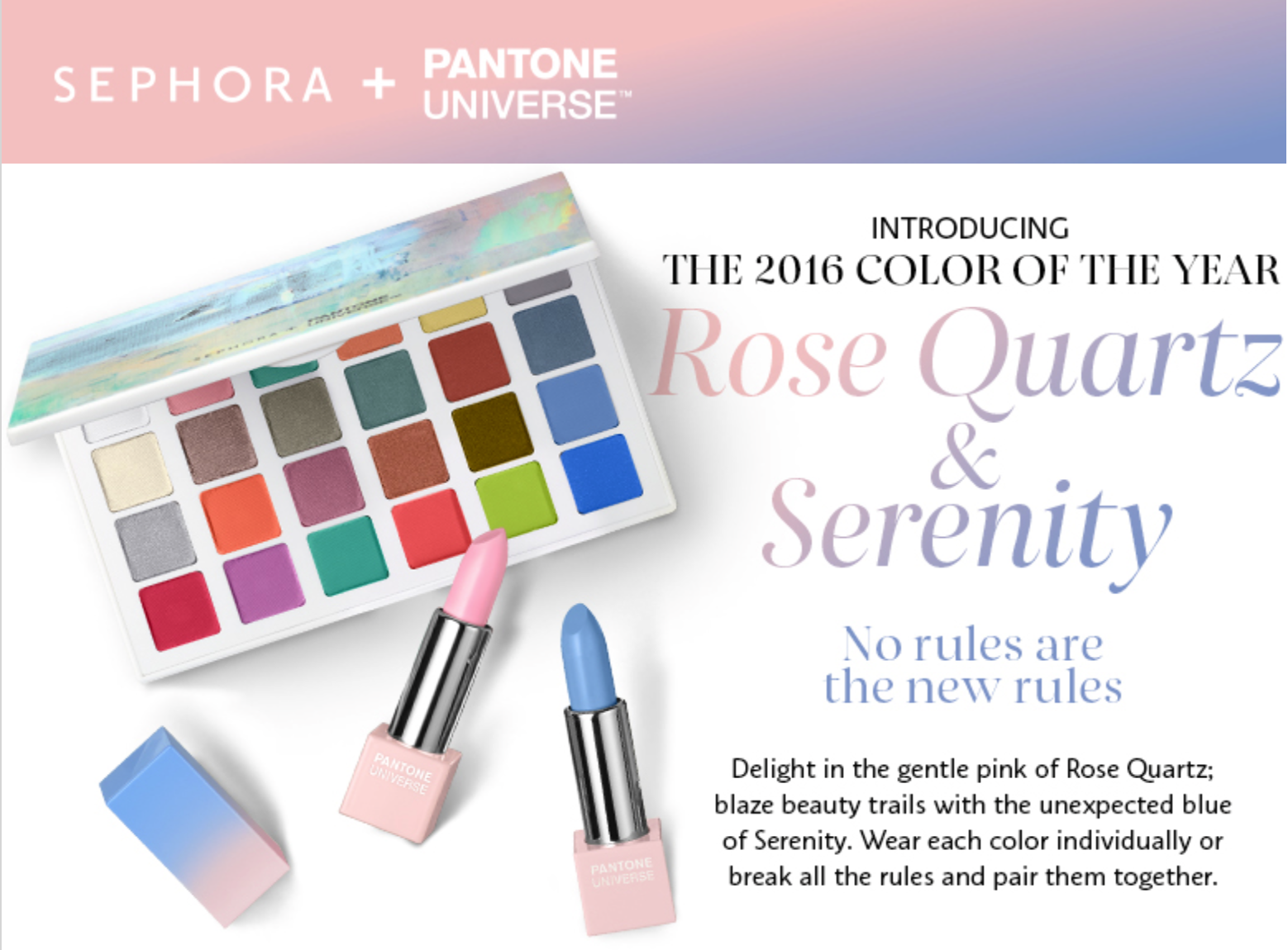
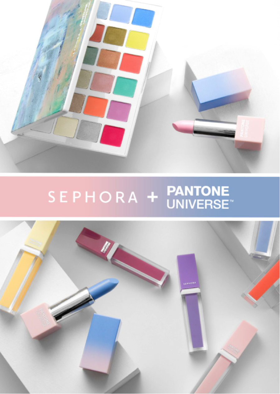
Launched on December 26th, the SEPHORA + PANTONE UNIVERSE collection includes a 24-color eyes palette, a matte lipstick in each color, and a 5-piece lip gloss set.
The first SEPHORA + PANTONE UNIVERSE collection was released in 2011 with Tangerine Tango. It was a huge hit, and paved the path for many successful collections.

SEPHORA + PANTONE UNIVERSE collection was released in 2011 with Tangerine Tango
This year was a little different because it includes two shades: Serenity (PANTONE 15-3919) and Rose Quartz (PANTONE 13-1520).
We recently sat down with Elizabeth Hayes, Vice President of Sephora Collection, to learn more about what went on behind the scenes to bring these two shades to market.
What was the inspiration behind this year’s SEPHORA + PANTONE UNIVERSE collection?
After much brainstorming over the colors selected for Color of the Year, we decided to create a watercolor pastel story to fully express the range within a cosmetics collection. We worked with Pantone to broaden the palette with other complimenting colors, but kept Serenity and Rose Quartz as the heroes. The result is a set of 24 matte and shimmer shades, from pastels to brights, that includes everything you need to create an impactful look.
How did you decide which cosmetics to include in this collection?
We always start by looking back at our past successes. Historically, the Color of the Year lipstick has been iconic, bold and wearable. We also know that transformative options in the eyeshadow palettes are always big sellers, too.
Then we evaluate whether the colors will work, and how many places on the face they can be worn. For example, Serenity as a light blue lipstick took some thought. We decided to go with it because it was on trend – less traditional – and we’re glad we did. It’s getting a great response from our clients.
Once we had an idea of how the collection should look, we worked with Pantone to ensure our colors matched the Color of the Year.
How does Pantone’s color expertise fit into the Color of the Year collection?
When you’re dealing with a translucent surface such as skin, which varies greatly in color from one person to the next, plus the variability you see in cosmetics, from shimmer to metallic to lacquer, it becomes a tricky process. We did a lot of visual evaluation using color standards and a SpectraLight light booth.
A color standard is a physical reference that we place next to each cosmetic to evaluate how closely it matches the color we are trying to achieve – in this case, Serenity and Rose Quartz. We do this comparison inside a light booth, which allows us to make sure the color still looks good under a variety of lighting conditions. Think about all of the places the cosmetics will be worn. The collection’s shades must continue to blend well under noon daylight, indoor lamps, and even fluorescent store lighting.

PANTONE color standards are used by many industries to communicate and evaluate color.
We’re also very concerned with the overall appearance of the makeup once it’s applied. For example, when dealing with opalescence, you may see three or four colors depending on your angle of vision, but the PANTONE Color of the Year is in there somewhere.
For the 2016 SEPHORA + PANTONE UNIVERSE, it was important to keep focus on the overall collection as it related to the PANTONE Color of the Year 2016. If you focus only on one product, say lipstick or eyeshadow, it’s easy to lose sight of how everything looks together. If the colors don’t look good as a collection, we haven’t done our job right. At the end of the day, it’s up to the customer. You can tell them the color data is technically accurate, but if it doesn’t look right they won’t buy it.
How else does Sephora use color matching technology?
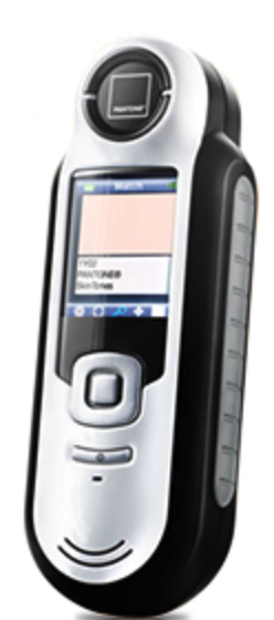 At Sephora stores we also use Pantone’s color matching technology to help our clients choose the best products for their skin type. Color IQ is a customized and complimentary beauty service from Sephora that uses a color measurement device, called the X-Rite CAPSURE™, to measure the color of your skin. We can then match your skin tone to a database of colors and provide recommendations for lip, foundation, and concealer that will look best with your complexion.
Our beauty consultants love it because they know they are helping their clients make the best choices, and our clients love it because they know they’re walking out of the store with products that will look great when they get home. Color IQ has been a key differentiator for us with our customers.
Why do you think the Pantone and Sephora partnership is so successful?
We each have our separate brand recognition, and when you put it together it creates a really nice dynamic. The combination of a color authority and one of the most sought after cosmetic lines – it’s a win-win situation.
Partnering with Pantone gives us color leadership and an exclusive concept that that no one else can speak to. Sephora is looking for point of difference to better service our clients beauty needs, and Pantone helps us give them something no other beauty retailer can provide.
