
5 Material Challenges You Can Finally Measure Accurately with the CiF3200 For years, color teams across industries have faced the same frustrating truth: many modern materials are simply too small, too decorated, too textured, or too complex for traditional spectrophotometers to measure reliably. When your components don’t fully cover the aperture, or include multiple colors, intricate patterns, or uneven surfaces, your options shrink quickly. Many organizations fall back on visual assess...
Posted 16 March 2026 by X-Rite Color

Hitting offset lithographic color targets isn’t always fast or easy. The manual process of measuring color bars and making ink key adjustments takes time and opens the door to operator error. Meanwhile, the press is running (and wasting) paper and ink. To achieve accurate and repeatable color, printers need to convert their printing operation to an efficient manufacturing process and drive efficiencies in all phases of their operation. For many, a closed-loop automated solution is the...
Posted 12 March 2026 by Ray Cheydleur

The Challenge of Printing Whites The PANTONE Color of the Year 2026, Cloud Dancer, is more than just a trend, it’s a technical challenge for packaging converters. While white may seem simple, its appearance is impacted by substrate color, ink formulation, and the presence of optical brightening agents (OBAs). For converters, the goal is to deliver consistent, accurate whites across every run, between every plant, and throughout every region. Why Whites Are Complex in Packaging Whites are ...
Posted 22 January 2026 by X-Rite Color

5 Steps to Digitize Your Press Room and Defend Your Margins Margins in print are under pressure. Rising substrate costs, labor shortages, and energy volatility are squeezing profitability. At the same time, compliance audits—ISO, G7, internal reviews—are becoming more frequent and more demanding. Digitizing your press room isn’t just about passing audits. It’s about building a lean, smart operation that protects your bottom line. Here are five steps to get there: Step 1...
Posted 05 September 2025 by X-Rite Color

Sustainability in Manufacturing Is No Longer Optional From brand mandates to government regulations, sustainability is now a core requirement in print and packaging. But for many print teams, the path to greener operations feels like a trade-off: reduce waste or maintain quality—not both. The good news? You don’t have to choose. The Hidden Waste in Traditional Workflows Manual color control and fragmented workflows create more waste than you think: Reprints due to color mi...
Posted 05 September 2025 by X-Rite Color

For print and packaging, color accuracy isn’t optional—it’s essential. Yet many teams still rely on manual color control methods that introduce variability, slow down production, and quietly erode margins. If your workflow feels more reactive than repeatable, it may be time to modernize. Here are the 10 signs to watch for: Your color targets live in email threads Operators waste time searching or guessing—costing setup time and risking errors. Operators rely...
Posted 05 September 2025 by X-Rite Color

The Hidden Cost of Color Inconsistency on Packaging Color inconsistency in print and packaging isn’t just a visual issue—it’s a margin killer. Decentralized workflows, manual setups, and tribal knowledge create inefficiencies that quietly erode profitability. From wasted substrate to delayed approvals, the hidden costs add up fast. The Operational Fallout of Color Inconsistency Longer setup times as teams hunt for historical data Inconsistent output across p...
Posted 04 September 2025 by X-Rite Color

はじめに 色温度(いろおんど)は、光の色合いを表す物理的な指標であり、私たちの生活や産業活動に深く関わっています。印刷、テキスタイル、塗料、自動車、プラスチック、食品パッケージなど、色が重要な意味を持つ分野では、色温度の理解が欠かせません。 特に、色を正確に評価・管理する業務に携わる方にとって、色温度は品質やブランドイメージの維持に直結する要素です。本記事では、初心者の方にも分かりやすく、色温度の基本概念から産業における活用事例、測定方法、よくある誤解までを解説します。 1. 色温度とは何か 色温度は、黒体放射(こくたいほうしゃ)の概念に基づく指標です。黒体とは、すべての波長の光を完全に吸収し、かつ温度に応じて光を放射する理想的な物体のことです。加熱したときの色を、xy色度図上にプロットすると、下図のようになり、黒体の軌跡と呼びます。温度によって光の色が変化します。 例えば、約1,000Kでは暗い...
Posted 04 September 2025 by X-Rite Color

1. 表色系とは? 表色系(ひょうしょくけい)とは、色を数値的に表現する方法や基準のことです。私たちは普段、色を「赤」「青」「緑」と言葉で認識しますが、機械やコンピューターは色を数値で扱います。そこで、どのように数値化するかを決めたのが 表色系 です。 具体的には、色を表すために「明るさ(輝度や反射率)」や「色味(色相、彩度)」などを数値化し、色を座標上にマッピングします。 これにより、異なる機器や環境間でも「同じ色」を再現・比較しやすくなります。 2. 表色系と色空間とは? 初心者にとって「表色系」と「色空間」は似たように聞こえますが、実は意味が少し異なります。両者の違いと関係を理解することで、色管理の基礎知識がより明確になります。 表色系(Color System)とは? 表色系は、色を数値で表現するための方法や原理のことを指します。つまり、色をどのよ...
Posted 04 September 2025 by X-Rite Color

はじめに 私たちが日常生活で「色」として認識しているものは、実は光の波長によるものです。その中でも、人間の目が感知できる範囲の光を可視光スペクトル(かしこうスペクトル)と呼びます。 この概念は印刷、デザイン、自動車塗装、産業用塗料など、幅広い分野で色を正しく扱うための基礎知識となります。この記事では、初めて可視光スペクトルを学ぶ方でも理解しやすいように、仕組みから応用まで解説します。 1. 可視光スペクトルの基本 光とは何か? 光は電磁波の一種で、波長(はちょう)によって性質が異なります。電磁波には、ガンマ線、X線、紫外線、可視光線、赤外線、マイクロ波、電波などがあります。その中で、**380〜780ナノメートル(nm)**の波長を持つ電磁波が人間の目で見える光、つまり可視光線です。 可視光とは何か 可視光(かしこう)とは、人間の目で知覚できる電磁波の一種で、波長...
Posted 04 September 2025 by X-Rite Color

White ink is one of the most expensive and widely used inks in packaging production—but it’s often under-optimized. In this blog, we’ll explore how MeasureColor enables printers to maximize white ink opacity, reduce waste, and boost overall print performance. Why White Ink Matters White ink acts as the foundation layer when printing on transparent, metallic, or colored substrates. It ensures brand colors are vibrant and consistent. But due to its high-volume use and cost...
Posted 20 August 2025 by X-Rite Color

This is the third blog in our MeasureColor in Action blog series, which introduces key features to help you achieve smarter, more efficient print production. MeasureColor: Optimize Dot Gain for Better Print Quality Achieving consistent print quality hinges on your ability to control dot gain—a critical but often overlooked variable. Dot gain plays a major role in color accuracy, image sharpness, and overall visual impact, especially in packaging and extended gamut workflows. With MeasureC...
Posted 11 August 2025 by X-Rite Color

This is the second blog in our MeasureColor in Action blog series, which introduces key features to help you achieve smarter, more efficient print production. MeasureColor: Manage Digital Color Targets with Confidence In today’s complex and fast-moving print environments, managing digital color targets and ICC profiles efficiently is essential for delivering consistent, high-quality results. Without a structured system, it's easy to lose control over your color libraries—leading to ...
Posted 08 August 2025 by X-Rite Color

This is the first blog in our MeasureColor in Action blog series, which introduces key features to help you achieve smarter, more efficient print production. MeasureColor: A User-Friendly Interface for Faster Print Decisions In today’s print industry, finding skilled press operators is more challenging than ever. At the same time, production environments are becoming increasingly complex—often combining multiple printing techniques and a wide range of press makes and models. That&rs...
Posted 07 August 2025 by X-Rite Color
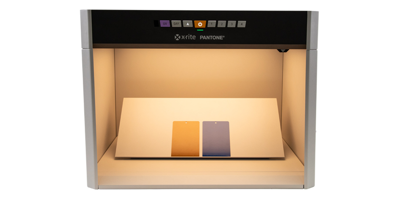
What’s the Difference Between a Light Booth and a Lighting Box? When it comes to achieving consistent lighting for color evaluation, photography, or product display, two tools often come up: light booths and lighting boxes. While they may sound similar, they serve different purposes and are designed for distinct use cases. In this post, we’ll break down the key differences between the two and help you decide which one is right for your needs. What Is a Light Booth? A light booth&mdas...
Posted 31 July 2025 by X-Rite Color

Color Matching Machines for Retail Paint Solutions In the world of retail paint, precision in color matching is crucial. Having the right tools to ensure accurate color matching can make all the difference. Enter the color matching machine—a revolutionary tool that ensures your paint colors are consistent, vibrant, and true to your customer's vision. What is a Color Matching Machine? A color matching machine is a device designed to measure and match colors with high precision. These mach...
Posted 11 July 2025 by X-Rite Color

Five Important Components of a Quality Control Program Step 1: Quantify Color with a Spectrophotometer Human vision is subjective—terms like “a bit brighter” or “slightly darker” are open to interpretation. That’s why spectrophotometers are essential. These instruments measure color by analyzing how light transfers through or reflects off a surface, producing a spectral reflectance curve—essentially a color’s unique fingerprint. This data-driven ...
Posted 10 July 2025 by Tim Mouw

When your reputation relies on your print quality, accurate, repeatable color control isn’t optional— it’s a necessity. The combination of the eXact 2 Portable Spectrophotometer and MeasureColor Software delivers a robust, integrated solution that empowers print and packaging professionals to achieve precise, repeatable color across jobs, substrates, and devices. eXact 2: Precision Hardware for Next-Level Color Control The eXact 2 is X-Rite’s latest handhe...
Posted 08 July 2025 by X-Rite Color

X-Rite Video Gallery- Your Ultimate Resource for Color Education Welcome to the X-Rite Video Gallery Whether you're a novice or an experienced professional, the X-Rite Video Gallery offers in-depth color education and practical training to enhance your color management skills. Our carefully curated collection of videos provides valuable insights and expert tips designed to help you master color accuracy and optimize your workflow. In this blog, we'll highlight five must-watch videos that sho...
Posted 08 July 2025 by X-Rite Color

Ensuring color consistency is not just a matter of aesthetics; it's a critical component of brand identity and consumer trust. Imagine a world where Coca-Cola's iconic red varies from can-to-can, or where the blue labels of Alcon eye drops don’t match on the shelf. Such inconsistencies can confuse customers and dilute brand recognition. For big brands, maintaining brand color consistency across all platforms and materials is paramount. This guide will introduce the essential s...
Posted 08 July 2025 by X-Rite Color
