競争の激しい市場において、ブランド企業とパッケージデザイナーは、店頭に並んだ自社製品を差別化する方法を模索しています。その対策は、色だけでなく、箔、特殊ワニス、ソフトタッチの仕上げなどの装飾オプションまで広がっています。また、デザイナーは従来の印刷だけでなく、より強いソリッドカラーや蛍光色、虹色なども使用するようになっています。デジタル ソリューションにより、パッケージのバリエーションを増やせ、稼働時間の短縮やサイクル タイムの短縮に対応できるようになります。

鮮やかな色や仕上げは、パッケージを店頭で目立たせますが、この傾向はパッケージ印刷のコンバーターに多くの課題をもたらします。消費者に鮮やかな色や仕上げを与える光の物理学的性質が、測定上の課題にもなっています。見る人に輝きを与えるよう、光が反射したり屈折したりすると、分光測色計で捉えるのが難しい鏡面成分も生じます。
ここでは、パッケージ印刷業者とコンバーターがデザイン意図に沿って、強いソリッドカラーと特殊な仕上げを施したパッケージを製造するための5つのヒントをご紹介します。成功している企業には、大きなビジネス成長のチャンスがあります。
強いソリッドカラーと装飾を施したパッケージ制作のヒント
1 - 工程管理が鍵である
製造工程の管理は、どのパッケージ作業においても重要ですが、特殊の色や仕上げを扱う場合は、なおさらです。工程管理ソフトウェアを導入する作業は、ジョブのセットアップを迅速化し、色評価をほぼリアルタイムで実施でき、さらに問題対処のためのレポートも出力できる、非常に重要なステップです。レポートを作成することで、ブランド企業は期待に応えられているという確信を得ることができます。多くの場合、これにより、現場での印刷機チェックの必要性が最小限に抑えられ、色評価の待ち時間を減らせます。
2 - 測定しないものは管理できない
経営の専門家であるピーター・ドラッカー氏によるこの言葉は、どのようなパッケージ作業にも確実に当てはまります。パッケージ業界では、生産プロセスのさまざまな段階で色を測定するために 45:0 の分光測色計を使用してきました。しかし、特殊な仕上げや装飾によって、異なる測定技術が必要になります。特に、反射特性、鏡面、メタリック、真珠光沢、テクスチャーなど、近年、パッケージ業界で人気を集める表面について当てはまります。
光沢のある表面を測定する場合、45:0の測定器では反射光の一部を見逃す可能性があり、その結果、光沢のある表面は、マット仕上げの同じ色のサンプルよりも暗く、彩度が高く表示されます。一方、積分球分光測色計は、基材に関連する表面効果の有無にかかわらず色の測定を可能にするため、より汎用性があります。特殊効果仕上げが一般的な自動車業界で普及している多角度分光測色計は、見る角度によって色が変化する仕上げのパッケージを正確に測定するために必要です。このようなタイプのパッケージ仕上げが近いうちに一般的になるとは予想していませんが、時間の経過とともに、高級品やハイエンド製品に使用されるかもしれません。
適切に分光測色計を選択することは、パッケージ作業における色管理ワークフローの重要な要素です。
詳細はこちらの記事よりご覧ください。

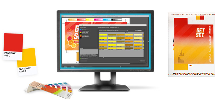
3 - 現物色見本とデジタル色見本を活用する
現物色見本は、長年にわたり、色管理のワークフローに重要な要素となっています。デザイナーは、実際に触って感じることができる現物色見本を使用することを好み、インスピレーションを得るためにも、現物色見本を使用することがよくあります。印刷やパッケージにおいて、現物色見本はデザイナー、ブランドオーナー、印刷会社の間に、期待結果を伝えるツールとなり、最終製品の品質を管理するのに役に立ちます。しかし、経年劣化や色あせ、不適切なお手入れによって、現物色見本は時間とともに変化し、色が曖昧になったり、不正確な色になったりする可能性があります。
現物色見本は色管理のワークフローにおいて、重要な要素ですが、デジタルの色見本はより洗練されたレベルの接続性を提供します。デジタルの色見本は追跡可能で、正確かつ再現性があります。さらに、現物色見本と異なり、時間とともに変化することがありません。管理されるデジタルワークフローのさらなる利点は、必要に応じて色を常に検証・更新できることです。
デジタルの色見本を導入することで、異なる基材やインク、そして印刷技術でも、一貫した色を実現できます。複数の印刷機能を調整することや、大きなプロジェクトのコンポーネントを結合することも、現物色見本からの作業より、はるかに効果的です。さらに、デジタルの色見本は、スペクトル値、または色のDNAとして表現される場合、色の期待値に関して全員が同じ認識を持つ事が出来ます。経験豊富なコンバーターは、現物とデジタルの色見本を両方使っています。このアプローチはより普及してくると予想されます。
4 - 色の意図を色の実現可能性に変換する
奇妙に聞こえるかもしませんが、スペクトル値で色を指定することと、実際にその値を達成することは全く別の話しです。 それは、印刷技術、インキシステム、基材がすべて、最終製品の色に影響を与えるからです。先に述べた高度な仕上げ技術も同様です。店舗ディスプレイが複数のコンポーネント (段ボールディスプレイ、オフセット印刷や大判印刷の印刷看板、製品、パッケージなど) で構成されている場合、すべてのコンポーネントを一致させる必要があります。
デザイナーはマスター色と依存色、つまりデザイン中に画面に表示される色と基材や印刷工程を考慮した色、両方を指定できるようになり、より熟練すると予想されます。Adobe プラグインである PantoneLIVE Design など、最も一般的な印刷物や包装材に適用したときに Pantone カラーがどのように変化するかを表示するクラウドベースのツールが利用可能です。
5 - 規格
標準化団体は、より良いコミュニケーションを実現しようとしています。エックスライトによって開発されたCxFは、色と他のデータを伝えるためのツールとして、現在では標準化団体に完全に受け入れられています。 ISO 17972 CxF/X シリーズにその使用に関連する4つの標準があります。他の規格も同様にコミュニケーションに注力しています。特にブランドから印刷業者、印刷業者からブランド、効果的な双方向コミュニケーションのためのPrint Requirements Exchange(PRX)とPrint Quality Exchange(PQX)など、規格プロセスの実現を向けています。エックスライトは、世界最大のブランド企業によって使用している方法を活用したい企業様向けに、ブランドパッケージング品質管理とサプライチェーン管理のためのオープンエコシステムを立ち上げました。これらの傾向を注意深く監視し、パッケージ化ワークフローに適切に採用する必要があります。
さらに知りたい方へ
印刷とパッケージにおける標準の最新情報について こちらのブログをご覧ください。
印刷やパッケージのワークフローで活用できるよう、グラフィックアートの標準や技術仕様の世界で最新トレンドを提供します。大胆で鮮やかな色を実現する方法について こちらのブログをご覧ください。
スポット印刷、プロセス印刷、そして急速に成長している拡張色域 (ECG) 印刷を説明します。 特定の印刷およびパッケージングニーズについて、無料相談を受けたい方は弊社までお問い合わせください。
