Many companies spend a lot of time and money on color measurement instruments and software but forget about the importance of lighting when approving products for shipment.
When used properly, spectrophotometers and color management software can tell you if your colors are within tolerance, and they can also manage gloss and metamerism (see explanation of metamerism below). However, you could still be sending out unsatisfactory parts if they don’t look right after they’re assembled, once they hit the store shelves, or after they arrive in the consumer’s home or office. At some point in the supply chain, someone must visually evaluate these parts – next to each other and under different light sources – to make sure they are ready to ship.
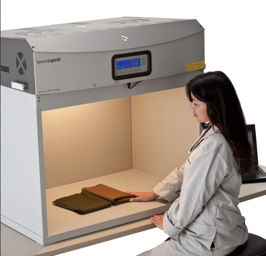
Proper evaluation considers how the product will look, when assembled, in each possible location. A light booth can simulate colors pre-purchase under store lighting, as well as under lighting that might represent their final environment. For instance, carpet manufacturers need to know how their products will look in the showroom as well as under incandescent tungsten, warm-white fluorescent, and the LED bulbs increasingly found in homes.
When a finished good is comprised of several materials, a light booth can ensure that the harmony among components remains constant under all lighting conditions. A light booth should be used to verify color acceptability, and more importantly, to ensure that the item does not exhibit physical defects.
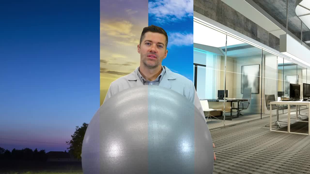
Today we’ll look at the color science behind why a light booth is a necessary part of every color evaluation workflow.
All shades of whites are not the same.
Since we can’t see all of the colors that go into white, we tend to assume that white light is just white light. Not true.
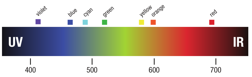
White light is actually comprised of all the colors in the visible spectrum… red, orange, yellow, green, blue, indigo and violet. Different light sources contain varying amounts of these colors, which in turn impacts how we perceive the color of objects they’re illuminating. For example, if you’re evaluating blue parts under a tungsten filament in an incandescent bulb, you won’t be able to see small color shifts because that type of bulb doesn’t generate as much light energy in the blue range of the spectrum.
Solution: Evaluate your colors under each potential light source to make sure they are visually acceptable.
Watch out for distractions.
Our eyes have adapted to “see” color as we think it should look. Think of an apple. No matter where you see it, it’s red. But it will appear much more vibrant outside at 3:00 in the afternoon on a sunny day than it will in the kitchen at dusk. To our eyes, this is of no consequence. We continue to see the apple as red. Surrounding colors can also distract our eyes. If you look at that red apple on a yellow counter, it will look more orange than if you look at it against gray.
Solution: Viewing booths are painted Munsell gray (N7 or N8 depending on your industry) because that allows you to isolate the item you are viewing from other distractions so your eye can focus on the task at hand without distraction.
Daylight isn’t constant.
Our eyes have adapted to viewing color under light from the sun. Daylight renders a great variety of colors, making it easy to distinguish between subtle shades, and has the right proportions of wavelengths for natural appearance.
The downside is that sunlight isn’t always available, and its color proportions are constantly changing. Noon daylight is different in the summer than in the winter, on a cloudy day versus a sunny one, and even between geographic locations. The light from a morning sunrise on clear day is weighted with yellow and red wavelengths, but the curve shifts more strongly to the blue side of the spectrum by noon. Daylight in Paris is markedly different than it is in New York at the same day and time, even if the weather conditions are identical.
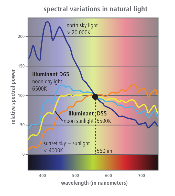
Spectral variations in natural light.
Solution: Rely on standardized daylight from a light booth, not your office window.
Optical brighteners are actually invisible.
Many product contain optical brightening agents to make them look brighter. OBAs are dyes that absorb light in the ultraviolet and violet region of the electromagnetic spectrum and re-emit that light in the blue region. It’s an amazing trick, and our eyes are none the wiser. Many products, from fabrics to laundry soap to papers, contain OBAs.
Standard illuminants remove the guesswork.
To remove the subjectivity from visual evaluation, the international organization Commission Internationale de l’Eclariage (CIE) created systematic definitions of white light. Known as spectral power distribution (SPD) curves, these standards define the wavelengths of many different light sources.
There are a number of daylight illuminants based on measurement of the sun’s SPD when it reaches certain positions in the sky. For example, the graphic arts industry usually uses the D50 illuminant that describes noon sky daylight. Textiles and other industries often use D65. The “horizon” (HOR) illuminant simulates early morning sunrise or late afternoon sunset. The CIE also created standard illuminants for tungsten, halogen, and multiple fluorescent light sources. For instance, illuminant F2 is the mathematical representation of lighting from cool white fluorescent bulbs.
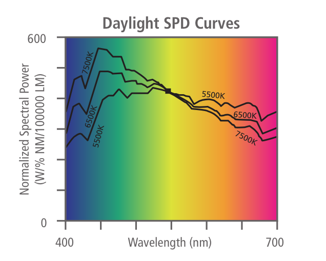
SPD curves for daylight.
Solution: Use the SPD settings on your light booth to simulate all potential light sources for your product.
Metamerism is tricky.
Metamerism is an optical phenomenon in which a pair of samples appears to matches under one light source, but not under another. A great example is your clothing… you leave the dimly lit house in what you think are two matching blue socks, but once you get into the sunlight you realize one is actually black.
Solution: Again, check your products (and maybe even your socks!) under a variety of light sources to ensure they still match.
Correlated color temperature gives limited guidance.
If you ask your customers to specify the illumination source for color evaluation, they may give you the correlated color temperature of the light source instead. Light sources with low color temperatures generally have a higher proportion of red and yellow wavelengths, while light sources with higher color temperatures generally have higher proportions of blue light. But the color of an object illuminated by noon daylight measured at 5000K still may appear quite differently when it is illuminated by an artificial light source rated at 5000K.
Taken by itself, the color temperature can be deceptive when it comes to color perception because it is only a partial description of the lamp. Spectral distribution curves provide a much more complete description of a light source. Two lamps with the same color temperature may have very different SPDs, and therefore may result in very different visual experiences for the same object. The color temperature listing gives only a very rough estimate of the proportions of visible colors that are contained in the white light — certainly not anywhere near the precision required to predict how colors will be perceived.
Solution: When possible, ask for SPD curves, but at least make sure you and your customer are speaking the same language.
Color Rendering Index only predicts color perception.
Color Rendering Index is a quantitative measurement of the ability of a light source to faithfully reproduce the color of an object in comparison with a standard source. CRI is expressed as a value of zero to 100, where zero is no color rendering and 100 is perfect color rendering. The problem is that the light source isn’t specified. Knowing that a lamp has a CRI of 90 only tells us that the lamp renders colors 90% as well as a standard source, but does not tell us whether the standard source is incandescent or daylight.
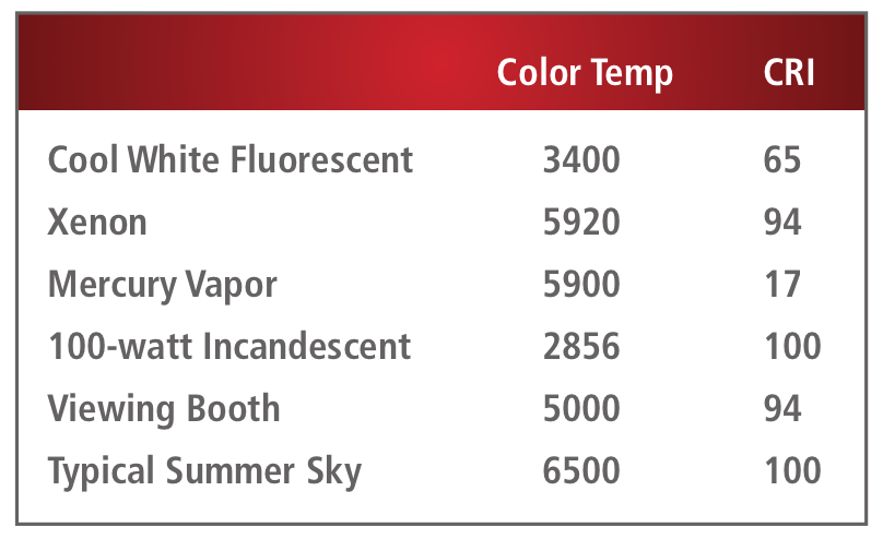
Solution: Like color temperature, CRI is an incomplete description of a light source, but customers may use it… so be aware.
Watch the lux.
Both lux and foot-candle are measurements of the intensity of light on a defined area. One lux is defined as one lumen uniformly distributed over an area of one square meter. A typical office may have illuminations in the 320 to 500 lux range, while direct sunlight on a clear day may be measured at more than 100,000 lux. A foot-candle is defined as one lumen uniformly distributed over an area of one square foot, with one foot-candle equaling the power of approximately 10.8 lux.
Although X-Rite’s SpectraLight QC provides lux settings, most light booths do not. If yours does not, you may need to use a light meter to determine the lux or foot-candles that are falling on a sample and adjust your test lighting accordingly.
Solution: Ask your customers about the quantity of incident light that should be used to illuminate light, medium, and dark colored samples and define best practices that address how to do that.
Know the standards for your industry.
In addition to providing standard viewing conditions, the ISO has also developed standards to guide sample illumination for visual evaluation. ISO 3664 was developed to assist the photographic and graphics industries, and ISO 23603 was developed largely for manufacturers.
Solution: Use ISO standards as a solid starting point for your visual evaluation program.
Let the experts help.
Visual evaluation is one of those things that seems simple on the surface, but in reality is quite scientific and complicated. If you want to produce and ship products that will please your customers, you need to have a solid visual evaluation process in place, and it must involve a light booth.
To learn more about how to use your light booth, check out our 10 tips for visually evaluating color.
Learn more about Lighting and Visual Evaluation