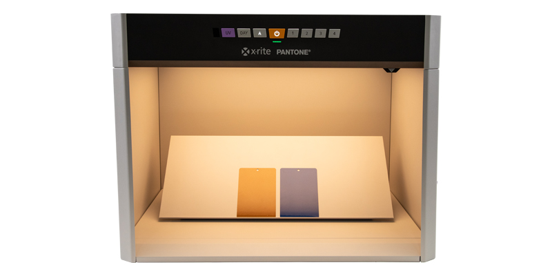
What’s the Difference Between a Light Booth and a Lighting Box? When it comes to achieving consistent lighting for color evaluation, photography, or product display, two tools often come up: light booths and lighting boxes. While they may sound similar, they serve different purposes and are designed for distinct use cases. In this post, we’ll break down the key differences between the two and help you decide which one is right for your needs. What Is a Light Booth? A light booth&mdas...
Posted 31 July 2025 by X-Rite Color

The Competitive Edge in Color and Appearance: Why Global Brands Trust Us In today’s fast-paced, quality-driven industries, precision in color measurement is essential—but it’s only the beginning. True leadership in the color space comes from a commitment to innovation, global service, and a holistic approach that transforms color into a strategic advantage. Decades of Expertise, Proven Results With over 60 years of experience in the color industry, we’ve helped define th...
Posted 29 July 2025 by X-Rite Color

Color Matching Machines for Retail Paint Solutions In the world of retail paint, precision in color matching is crucial. Having the right tools to ensure accurate color matching can make all the difference. Enter the color matching machine—a revolutionary tool that ensures your paint colors are consistent, vibrant, and true to your customer's vision. What is a Color Matching Machine? A color matching machine is a device designed to measure and match colors with high precision. These mach...
Posted 11 July 2025 by X-Rite Color

X-Rite Video Gallery- Your Ultimate Resource for Color Education Welcome to the X-Rite Video Gallery Whether you're a novice or an experienced professional, the X-Rite Video Gallery offers in-depth color education and practical training to enhance your color management skills. Our carefully curated collection of videos provides valuable insights and expert tips designed to help you master color accuracy and optimize your workflow. In this blog, we'll highlight five must-watch videos that sho...
Posted 08 July 2025 by X-Rite Color

리테일 LED 조명의 시각적 색 평가를 위한 산업 표준의 필요성 소매업계에서 조명은 고객의 제품 인식에 영향을 미치는 중요한 요소입니다. 그러나 표준화된 LED 조명이 부족하면 소매업체와 소비자 모두에게 영향을 미칠 수 있는 상당한 어려움이 발생합니다. 일관성 없는 색상 재현 표준화된 LED 조명이 없을 때 주요 문제 중 하나는 색상 재현에 일관성이 없다는 것입니다. 각각의 LED 조명마다 다양한 색온도와 스펙트럼 분포가 나타날 수 있으며, 따라서 조명 조건이 다를 경우 제품의 보이는 모습에 차이가 생깁니다. 이러한 불일치로 인해 매장에서 보이는 제품과 집에서 보이는 제품이 달라 보여 고객 불만이 발생하고 반품 가능성으로 이어질 수 있습니다. 브랜드 평판에 영향 일관성 없는 조명은 고객 만족도에 영향을 미칠 뿐만 아니라 브랜드 평판에 폭넓은 영향을 미칩니다. 조명의 편차로 인해 제품 모습이 예상대로 나타나지 않으면 브랜드에 대한 신뢰가 떨어질 수 있습니다. 고객은 제품의 품질과 ...
Posted 11 February 2025 by X-Rite Color

분광측색계의 이전 버전과의 호환성이 일관된 색상 유지의 핵심인 이유 이 상황에 있다면 색상 품질을 적절한 수준으로 유지하기 위해 벤치톱 분광측색계에 의지하고 있을 가능성이 큽니다. 섬유와 플라스틱에서 페인트, 코팅 등에 이르기까지 이러한 고정밀 장비는 프로세스의 일관성 유지를 위해 매우 중요합니다. X-Rite에서는 매우 까다로운 환경에서도 수년간 안정적으로 작동하도록 분광측색계를 설계합니다. 그러나 어떤 기기도 영원히 지속되지 않으며 결국 최고의 성능을 유지하려면 업그레이드가 필요하게 됩니다. 업그레이드가 중요한 결정이라는 점을 알고 있기 때문에 자세한 보상 판매 가이드를 만들어 도움을 드립니다. 당사의 최우선 과제는 고객이 새로운 장비로 전환할 때 최대한 원활하게 진행하도록 하는 것입니다. 이를 달성하는 주요 방법 중 하나는 벤치톱 분광측색계 후향 호환성을 통해 이루어지며, 이번 블로그에서 그 내용을 중점적으로 다룹니다. 후향 호환성이란 무엇인가? 벤치톱 분광측색계의 후향 호...
Posted 28 October 2024 by Tim Mouw

When it comes to color accuracy in the world of print and packaging, having the right tools at your disposal is crucial. We understand how overwhelming it can be to choose from a plethora of options. Fear not, for we’ve simplified your decision-making process. Here’s our list of top color match devices, each catering to different needs: eXact™ 2 Handheld Spectrophotometer for Paper, Corrugated & Carton Boards Ideal for professionals working with paper, corr...
Posted 08 December 2023 by X-Rite Color

Are you feeling overwhelmed by the colorful world of spectrophotometers? Don't worry, we've got your back! We've put together a quick list of the unique features of four of our color match devices to help you find your perfect match. Let's dive right in! Ci7860: The Precision Prodigy The Ci7800 is your go-to if you're all about precision. With its cutting-edge technology, this benchtop spectrophotometer guarantees spot-on color matches. If you're into perfection, this one's for you....
Posted 20 November 2023 by X-Rite Color

Working in prepress holds a unique challenge. Even if your color workflow is tight, everything can fall apart if the customer’s file isn’t color managed. We’ve all seen it. You receive a file that the customer claims is ready to print, yet when you open it on your computer, the colors don’t look right at all. You can’t send it to print without knowing for sure, because you’re the one who will take the hit for wasted time and materials if it’s wrong....
Posted 23 August 2023 by Mark Gundlach
.jpeg?h=285&iar=0&w=400&hash=ED79D79C85FF8AADE075D87575893B3C)
When all of final production packaging comes together on the store shelf, it’s a brand’s moment of truth. Do the stand-up pouches, overwraps, and corrugated POP displays match? How close is the color to its standard? We know you spend so much time and money designing, proofing, sampling, printing, and shipping… so where does the color go wrong? Is it an issue with accuracy, consistency, or both? Package designs come together on the shelf. Here you see pouches, labels, cartons, and corrugated wit...
Posted 15 March 2023 by Cindy Cooperman

What happens when you have more than 2,000 brand colors to manage across a complex global packaging supply chain? Things get complicated! Although it may seem easier to create a new color than to dig through databases or binders of color drawdowns to find the closest match, the problem comes later when you’re faced with a huge, unmanageable library. One of our clients, a well-known fast-moving consumer packaged goods (FMCG) company, understands how easily things can get out of control. Th...
Posted 15 March 2023 by Cindy Cooperman

When someone says “apple,” do you think red, green, or yellow? What do you do if a customer asks you to produce a color using descriptions that are not specific enough? Check out how something as seemingly simple as color communication can determine whether your color program succeeds or fails. A picture may paint a thousand words, but words alone do not paint a thousand colors. Circular conversations about color happen everyday. They generally start with someone asking for a sligh...
Posted 15 March 2023 by Cindy Cooperman

제품 또는 포장 인쇄를 담당하는 사람이라면 누구나 오렌지와 같은 일부 색상은 CMY 잉크만을 사용하여 재현하기가 너무 어렵다는 것을 알고 있습니다. 네 번째 색상인 검은색(K는 키 컬러(Key color)를 의미)은 종종 감산 색상 인쇄 응용 프로그램에 추가됩니다. C+M+Y는 실제로 C, M, Y의 잉크 불순물로 인해 탁한 갈색을 만들기 때문에, 검은색 잉크를 별도로 첨가하면 CMY만으로는 달성할 수 없는 깊은 색과 톤이 생성되고, 게다가 그림자에 밀도가 더해집니다. 이러한 4색 인쇄를 CMYK라고 합니다. 이번 포스팅에서는 프린터가 CMY의 영역을 확장하여 잉크를 절약할 수 있는 다른 방법에 대해 알아보겠습니다. 인쇄기에 Gray component replacement (GCR) (GCR)와 스팟 컬러를 사용하면 더 선명하고 생생한 색상을 만들 수 있습니다. GCR & UCR 1980년대에 GCR (Gray Component Replacement)라고 ...
Posted 10 February 2023 by Scott Harig

This time of year, the internet is full of Top 10 Countdowns. It’s a tradition we’ve embraced since 1940 when the Billboard published its first chart ranking the top selling recorded songs. Since then, others have jumped on the bandwagon to highlight the most popular trends of the previous year. We’ve been publishing our top-read blogs since 2016, and we’re happy to see some educational topics like color perception, tolerancing, and spectrophotometers continue to r...
Posted 28 December 2022 by X-Rite Color

Companies use optical brightening agents (OBAs), also called Fluorescent Whitening Agents (FWAs), to give their products a brighter, whiter appearance. Although adding OBAs creates a brighter product, the addition of these chemicals fundamentally alters the way the color is seen, which makes it impossible to accurately evaluate color by eye. Materials and fabrics that contain OBAs may appear similar in production under factory lighting, but those same products can look much different under othe...
Posted 23 November 2022 by X-Rite Color

컬러는 식품 선택 시에 중요한 역할을 합니다. 스위스 치즈, 딸기, 브로콜리, 으깬 감자와 같이 다수의 음식들은 항상 똑같아 보입니다. 우리는 처음에 입에 넣을 때 기대하는 것도 알고 있습니다. 하지만 으깬 감자가 녹색이라면 어떨까요? 맛이 다를까요? 시도해 보시겠습니까? 식품 산업에서 색상 분석이 중요한 이유 우리가 음식을 인식하고 맛보는 방식에서 컬러의 역할에 대한 많은 연구가 있었습니다. 이들 연구에서는 음식이나 음료의 색깔이 맛에 대한 우리의 판단에 가장 큰 영향을 미친다는 것을 보여줍니다. 식품 전문가이자 화학자인 Kantha Shelke에 따르면, 우리는 냄새나 맛을 느끼기 전에 먼저 눈으로 먹습니다. 컬러 신호는 매우 중요합니다. 심리적으로 사람들은 붉은색 음식에서 딸기나 체리와 같은 단맛을 기대합니다. 노란색은 신맛이 나고, 녹색은 시큼한 맛이 나며, (할로윈 시즌을 제외하고) 많은 사람들은 검은색, 보라색 같은 어두운 색은 시도조차 하지 않을 것입니다. 상한 음식...
Posted 18 November 2022 by X-Rite Color
.jpg?h=285&iar=0&w=400&hash=924EB10846C04E256E7A0BBF8A186FCA)
브랜드 컬러 선택, 새로운 제품 라인을 위한 팔레트 제작, 계절 패키지 디자인 작업을 수행할 때 영감은 색상 선택의 핵심 단계입니다. 영감은 일상적 장소에서 얻을 수 있으며, 예를 들면 다음과 같습니다. 파티. 식료품점. 스포츠 이벤트. 대자연. 대자연은 가장 아름다운 컬러 팔레트를 만드는 재주가 있습니다. "2022/2023 가을/겨울 컬러는 풍부한 톤과 함께 편안하고 회복력 있는 다양한 컬러를 통해 고요함과 편안함에 대한 우리의 욕구를 활력 넘치는 에너지와 대비시킵니다."라고 Pantone Color Institute의 전무 이사인 Leatrice Eiseman이 말했습니다. “우리가 모순으로 가득 찬 환경으로 나아갈 때, 2022/2023 가을/겨울 색상을 통해 소비자는 다양한 대비 색조 사이를 유연하게 이동할 수 있으며, 따라서 그들이 자신의 정체성과 그날의 느낌을 자발적으로 표현할 수 있게 해줍니다” 디자이너는 소비자를 유혹하는 다양한 색조와 조화로운 ...
Posted 04 November 2022 by X-Rite Color
.jpeg?h=285&iar=0&w=400&hash=0523DB2B1F04DDB749857624F89F0163)
색상이 중요하다고 말하지만, 중요한 이유를 아세요? 사실 색상은 제조 공정에서 매우 중요한 요소입니다. 유감스럽게도 많은 제조업체는 올바른 컬러를 얻는 것이 예전보다 훨씬 어렵다는 것을 깨닫고 있으며, 그들이 거래하는 브랜드는 더 엄격한 허용오차를 충족하도록 요구하고 있습니다. 그 이유는 다음과 같습니다. 색상 기술의 발전(예: 메탈릭 포장, 펄 광택 피니시, 맞춤형 직물 및 생동감 있는 새로운 컬러)이 고객을 유혹하지만 일관성 유지 작업은 훨씬 어렵게 만듭니다. 예를 들어 복합 데크를 생각해보세요. 예전에는 회색 또는 갈색의 두 가지 선택이 있었습니다. 그리고 데크 전체에 조화가 있는 한 고객은 만족했습니다. 그러나 이제는 짙은 나뭇결 패턴과 이국적인 컬러 등 다양한 옵션이 있으므로 제조업체는 두세 가지가 아닌 수십 가지 색상을 관리해야 하며, 일관성을 유지하는 것은 훨씬 어렵습니다. 포장도 또 하나의 좋은 예입니다. 예전에는 인쇄된 상자를 배치했던 매장 진열대에 이제는 호일...
Posted 01 November 2022 by Cindy Cooperman

X-Rite는 2006년에 Munsell Color Company를 인수했습니다. 그 인수와 함께 색채 과학, 색 표준 및 색각 분석 도구의 중요한 유산도 함께 왔습니다. 오늘 우리는 앨버트 먼셀(Albert Munsell)이 컬러 세계에 기여한 바를 되돌아보고, 그의 노력과 영감을 통해 다양한 산업 분야(포장, 의류, 신발, 전자 제품, 화장품, 가정용 가구, 페인트, 식음료, 건설 등)에서 색상 관리에 도움을 주는 제품들을 공유하고자 합니다. 색채 분석의 역사에서 앨버트 먼셀의 역할 앨버트 먼셀은 사람의 시각 체계에 대한 큰 이해를 제공한 우리 세기의 대표적 인물 중 한 사람입니다. 색 구성에 대한 그의 경험적 분석은 현대의 모든 색 좌표계의 기반이 되었습니다. Munsell Color Order System 앨버트 먼셀(Albert Munsell)은 보스턴 지역의 대학 교수였고, 숙련된 예술가였으며 파리의 ‘줄리안느 아카데미’를 졸업했습니다. 그는 낮에는 ...
Posted 17 October 2022 by X-Rite Color

컬러 관리는 종이, 직물, 세라믹, 투명 재료 등 다양한 소재에 새롭고 흥미로운 잉크를 적용하도록 폭발적인 기회를 야기했습니다. 이러한 새로운 애플리케이션으로 작업을 실행할 때 정확한 컬러를 유지하려면 모든 프린터와 잉크, 소재 조합에 대한 프린터 프로파일을 작성해야 합니다. X-Rite는 프로파일을 빠르고 쉽게 만들 수 있는 도구를 제공합니다. 컬러 관리 도구 i1Pro 3 Family 제품군은 거의 모든 인쇄 작업을 지원합니다. i1Pro 3 및 i1Pro 3 plus는 워크플로우의 모든 장치에 대한 프로파일을 생성할 수 있는 2가지 소프트웨어 패키지와 함께 제공되는 휴대용 분광측색계입니다. 매끄러운 용지에 인쇄하세요? i1Pro 3가 적합합니다. 특수 인화지, 비닐, 직물, 투명 필름, 골판지 또는 백라이트 재료에 인쇄하세요? 가장 정확한 프린터 프로파일을 생성하는 데 필요한 모든 컬러 데이터를 캡처하려면 더 큰 측정구가 있는 i1Pro 3 Plus ...
Posted 16 September 2022 by X-Rite Color
