What’s the Difference Between a Light Booth and a Lighting Box? When it comes to achieving consistent lighting for color evaluation, photography, or product display, two tools often come up: light booths and lighting boxes. While they may sound similar, they serve different purposes and are designed for distinct use cases. In this post, we’ll break down the key differences between the two and help you decide which one is right for your needs. What Is a Light Booth? A light booth&mdas...
Posted 31 July 2025 by X-Rite Color

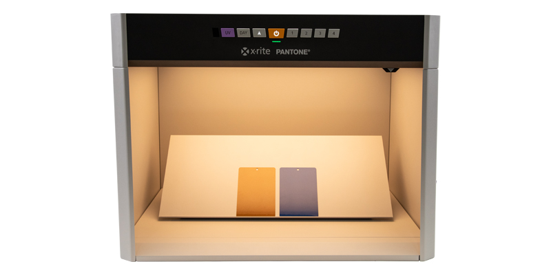
Color Matching Machines for Retail Paint Solutions In the world of retail paint, precision in color matching is crucial. Having the right tools to ensure accurate color matching can make all the difference. Enter the color matching machine—a revolutionary tool that ensures your paint colors are consistent, vibrant, and true to your customer's vision. What is a Color Matching Machine? A color matching machine is a device designed to measure and match colors with high precision. These mach...
Posted 11 July 2025 by X-Rite Color

X-Rite Video Gallery- Your Ultimate Resource for Color Education Welcome to the X-Rite Video Gallery Whether you're a novice or an experienced professional, the X-Rite Video Gallery offers in-depth color education and practical training to enhance your color management skills. Our carefully curated collection of videos provides valuable insights and expert tips designed to help you master color accuracy and optimize your workflow. In this blog, we'll highlight five must-watch videos that sho...
Posted 08 July 2025 by X-Rite Color

Ensuring color consistency is not just a matter of aesthetics; it's a critical component of brand identity and consumer trust. Imagine a world where Coca-Cola's iconic red varies from can-to-can, or where the blue labels of Alcon eye drops don’t match on the shelf. Such inconsistencies can confuse customers and dilute brand recognition. For big brands, maintaining brand color consistency across all platforms and materials is paramount. This guide will introduce the essential s...
Posted 08 July 2025 by X-Rite Color

When it comes to achieving precise and consistent color measurement, investing in a high-quality spectrophotometer is essential. Spectrophotometers are critical to color quality because they provide repeatable and reliable data that ensure products meet strict color standards. Whether you're in the business of manufacturing durable goods, apparel, cosmetics, or building materials, the right spectrophotometer can make all the difference by detecting even the slightest variations in color. These ...
Posted 11 March 2025 by X-Rite Color

리테일 LED 조명의 시각적 색 평가를 위한 산업 표준의 필요성 소매업계에서 조명은 고객의 제품 인식에 영향을 미치는 중요한 요소입니다. 그러나 표준화된 LED 조명이 부족하면 소매업체와 소비자 모두에게 영향을 미칠 수 있는 상당한 어려움이 발생합니다. 일관성 없는 색상 재현 표준화된 LED 조명이 없을 때 주요 문제 중 하나는 색상 재현에 일관성이 없다는 것입니다. 각각의 LED 조명마다 다양한 색온도와 스펙트럼 분포가 나타날 수 있으며, 따라서 조명 조건이 다를 경우 제품의 보이는 모습에 차이가 생깁니다. 이러한 불일치로 인해 매장에서 보이는 제품과 집에서 보이는 제품이 달라 보여 고객 불만이 발생하고 반품 가능성으로 이어질 수 있습니다. 브랜드 평판에 영향 일관성 없는 조명은 고객 만족도에 영향을 미칠 뿐만 아니라 브랜드 평판에 폭넓은 영향을 미칩니다. 조명의 편차로 인해 제품 모습이 예상대로 나타나지 않으면 브랜드에 대한 신뢰가 떨어질 수 있습니다. 고객은 제품의 품질과 ...
Posted 11 February 2025 by X-Rite Color

The unveiling of Pantone’s Color of the Year is always an exciting moment across industries, and for 2025, PANTONE 17-1230 Mocha Mousse has taken center stage. This rich, warm brown evokes comfort, reliability, and sophistication, making it a perfect choice for consumer-packaged goods (CPG) brands aiming to establish a strong shelf presence. However, managing the consistency of such a nuanced color across diverse packaging materials and suppliers is no small feat. That’s where a Pri...
Posted 30 January 2025 by X-Rite Color

포장된 소비재(CPG)의 세계에서 색상은 고객을 유치하고 브랜드 정체성을 전달할 때 중요한 역할을 합니다. 탄산음료 캔의 생생한 빨간색이든 스킨케어 제품의 차분한 파란색이든 색상 일관성은 브랜드 인지도와 신뢰성 유지를 위해 중요합니다. 이 블로그에서는 포장재 디자인에서 색상의 중요성, 그리고 X-Rite Pantone이 브랜드사로 하여금 포장 디자인과 실행 시에 우수한 색상 일관성을 달성하도록 어떻게 지원하는지 알아보겠습니다. 포장재 디자인에서 색상 일관성이 중요한 이유 포장 디자인에서 색상의 일관성은 여러 가지 이유로 필수적입니다. 첫째, 진열장에서 브랜드가 즉시 인식되도록 합니다. 고객이 모든 제품에서 동일한 색상 조합을 보면 브랜드 정체성이 강화되고 신뢰가 형성됩니다. 반면에 일관되지 않은 색상은 고객을 혼란스럽게 하고 제품이 전문적이지 않게 보일 수 있습니다. 둘째, 포장 디자인의 색상 일관성은 포장재의 매력을 유지하기 위해 중요합...
Posted 15 January 2025 by X-Rite Color

브랜드사의 예산에 컬러 항목이 포함되어 있지 않을 수 있지만, 컬러는 다양한 방식으로 순이익에 영향을 줄 수 있습니다. 실제 컬러 비용을 이해하면 출시를 앞당기고, 낭비를 줄이고, 수천 달러를 절약할 수 있습니다. 쇼핑객이 진열대에서 품목을 선택하는 데 2~7초밖에 걸리지 않는다는 점을 고려할 때 색상은 구매 결정 시 큰 역할을 합니다. 눈에 띄려면 브랜드사는 새로운 종류와 계절별 특매품을 출시하기 위해 흥미로운 디자인을 도입해야 하며, 새로운 포장이 브랜드 인지도와 지속 가능성 목표에 미치는 영향을 고려해야 합니다. 포장을 재창조하기 위한 이 모든 노력의 과정에서 새로운 디자인의 컬러 비용이 종종 간과됩니다. 컬러 비용의 이해 음료 회사가 새로운 4팩 소다용 골판지 포장을 도입하는 시나리오를 생각해 보겠습니다. 디자인 팀은 원활한 컨셉 구현을 예상하면서 색상을 선택합니다. 그러나 흰색 라벨에서는 눈부신 색이 갈색 크라프트지에서는 탁하고 칙칙해 보입니다. 그 이유는 소재와 인쇄 공...
Posted 12 November 2024 by Cindy Cooperman
.jpg?h=350&iar=0&w=700&hash=CD4D45962C5CDB5CD0CC2B06E45102DC)
브랜드사는 제품을 대표할 새로운 색을 선택할 때 많은 시간과 자원을 투자합니다. 인쇄 후에 색상이 기대치와 일치하지 않으면 해당 로트가 낭비되고 모두가 색상이 어디에서 잘못되었는지 궁금해하게 됩니다. 일반적 시나리오는 다음과 같습니다. 브랜드사는 제품 포장에 사용할 시즌 컬러를 선정하여 디자이너에게 전달합니다. 디자이너는 색을 디자인에 통합하고 이를 프리미디어 팀에 전달하여 인쇄 가능한 파일로 변환합니다. 생산을 위해 파일을 위해 세 곳의 인쇄업체로 전송합니다. 인쇄하는 동안 각 인쇄업체는 최선을 다해 디자인 표준과 일치시킵니다. 그런데 패키지를 진열대에 함께 모아놓으면 색이 일치하지 않습니다. 무슨 일이 벌어졌을까요? 색이 어디에서 잘못되었을까요? 반드시 디자이너, 프리미디어 회사 또는 인쇄 공급업체의 오류 때문이라고 할 수는 없으며, 일반적으로 컬러 커뮤니케이션 방식과 사람이 색을 인식하는 방식의 주관적 특성 때문에 발생하는 것입니다. 컬러 매칭 작업이 왜 그렇게 어려운...
Posted 13 September 2024 by X-Rite Color

X-Rite 제품과 서비스를 관리하는 중앙 위치를 찾고 계세요? My X-Rite에서 확인하세요. 제품 정보나 지원, 서비스 세부 정보 또는 학습 리소스에 대한 액세스가 필요한 경우 몇 번의 클릭만으로 무료 온라인 포털을 이용할 수 있습니다. 연중무휴 24시간 액세스 가능: 컴퓨터나 모바일 장치에서 24시간 내내 개인 대시보드에 쉽게 액세스할 수 있습니다. 맞춤형 대시보드: 편리한 단일 위치에서 가장 중요한 정보들을 확인할 수 있습니다. 간편한 서비스 및 지원: 서비스 및 지원 티켓을 제출하고 추적할 수 있습니다. My X-Rite란 무엇인가? My X-Rite는 한 곳에서 장치를 관리하고, 주문 추적, 송장 확인, 서비스 및 지원 티켓을 모니터링할 수 있는 온라인 포털입니다. 맞춤형 대시보드를 사용하면 이메일이나 전화를 보내지 않고도 하루 24시간, 일주일 내내 컴퓨터나 모바일 장치에서 가장 중요한 정보를 확인할 수 있습니다. My X-Rit...
Posted 25 April 2024 by X-Rite Color

스타벅스가 4가지 새로운 축제용 컵 디자인으로 다시 한번 연말연시 시즌을 시작했습니다. 올해 스타벅스의 크리에이티브 디렉터인 크리스티 카메론은 “전통적인 할러데이 컬러를 향상하고 빨간색을 더욱 밝게 보이도록 만드는” 마젠타색 액센트로 우리를 놀라게 했습니다. 할러데이 시즌의 쇼핑의 열기 속에서 패키징은 잠재 구매자의 시선을 사로잡는 데 중요한 역할을 합니다. 그러나 경쟁 우위를 유지하고 브랜드 품격을 유지하면서 끊임없이 변화하는 소비자 선호도에 맞춰 패키징 디자인을 조정하는 일은 어려운 작업이 될 수 있습니다. 이미지 제공: Starbucks Stories & News 오늘은 브랜드 업체가 품질과 매력을 저하시키지 않고 할러데이 패키징디자인을 신속히 제작할 수 있도록 도와주는 몇 가지 주요 전략을 공유하겠습니다. 패키징 디자인을 신속히 전환하기 위한 5가지 전략 민첩성과 유연성 유지. 변화하는 시장 요구를 충족하...
Posted 01 November 2023 by Cindy Cooperman

If ensuring color consistency is part of your job description, you’ll want to learn more about PantoneLIVE. Our customers report that it helps them get products to market an average of four times faster! PantoneLIVE is an end-to-end, digital color communication ecosystem that helps everyone involved in a packaging workflow visualize and communicate color. It shows which colors are achievable, and which are not, across everything from flexible packaging to corrugated board. And, since the digital...
Posted 15 March 2023 by X-Rite Color

What happens when you have more than 2,000 brand colors to manage across a complex global packaging supply chain? Things get complicated! Although it may seem easier to create a new color than to dig through databases or binders of color drawdowns to find the closest match, the problem comes later when you’re faced with a huge, unmanageable library. One of our clients, a well-known fast-moving consumer packaged goods (FMCG) company, understands how easily things can get out of control. Th...
Posted 15 March 2023 by Cindy Cooperman

소비자의 선택에서 모든 것은 2~7초 안에 결정됩니다. 그렇습니다, 소비자는 이 짧은 시간 안에 자그마한 스냅샷을 보고 상품에 대한 대부분의 구매 결정을 내립니다. 바로 이것이 마케팅에서 흔히 거론되고 연구되어지는 "First Moment of Truth" (FMOT) 입니다. FMOT에서 컬러는 매우 중요한 요소이며, 그 영향력을 생각해 볼 때, 컬러가 소비자의 주의를 끌고 소통을 해야만 합니다. 이 것이 바로 올바른 컬러가 만들 수 있는 영향력이며, 브랜드와 소비자 간의 관계에 매우 중요한 역할을 합니다. 브랜드 매니저 또는 패키징 디자이너로서, 많은 시간과 에너지를 쏟아 제품의 알맞는 얼굴을 제작합니다. 제품의 패키징과 언박싱은 제품 어필 그 자체에 추가되는 소비자와의 경험과 소통이 반복적으로 이루어집니다. 이것이 제품과 소통할 때마다 소비자 경험에서 일관성이 생기는 구성 요소 입니다. 특히 패키징 대량 생산의 경우 출력된 패키징...
Posted 15 March 2023 by Cindy Cooperman

This time of year, the internet is full of Top 10 Countdowns. It’s a tradition we’ve embraced since 1940 when the Billboard published its first chart ranking the top selling recorded songs. Since then, others have jumped on the bandwagon to highlight the most popular trends of the previous year. We’ve been publishing our top-read blogs since 2016, and we’re happy to see some educational topics like color perception, tolerancing, and spectrophotometers continue to r...
Posted 28 December 2022 by X-Rite Color

It’s important to ensure design intent is realized each time and everywhere a product appears. But with so many variables to impact print quality, how can brands utilize suppliers around the world and still achieve consistent color? Our X-Rite Pantone Packaging Color Experts have designed a series of consulting services and workshops to help you get the most from your print, packaging, plastic or textile value chain. Offered both online and onsite, these interactive sessions i...
Posted 06 December 2022 by Cindy Cooperman

Metallized substrates like two-piece metal packaging are expensive to produce and make print color control a challenge. While many in the metal decorating sector are resistant to embracing color measurement, it is the fastest, most accurate and cost-effective way to produce consistent color across processing plants and achieve sustainability initiatives. Today we’ll discuss: The shortcomings of visual evaluation in a color control program, The components of a digital color solutio...
Posted 06 October 2022 by X-Rite Color

색상 관리는 이미징 워크플로우에서 각 장비를 식별하고 특성을 파악하여 모든 장비가 동일한 기준을 적용하도록 지원하는 프로세스입니다. ICC(International Color Consortium)에서 정의한 바와 같이 색상 관리 워크플로우는 측정에서 교정, 최종 출력에 이르기까지 예측 가능하고 일관되며 반복 가능합니다. 디지털 색상 관리를 사용하면 인쇄 워크플로우에 관련된 모든 사람들이 지정된 컬러 스펙트럼 값을 참조하고 진행 과정의 여러 단계에서 정확성을 확인할 수 있습니다. 디지털 색상 워크플로우 디지털 색상 관리를 적용할 경우 브랜드 기대치와 디자인, 잉크조색실, 프리프레스, 프레스 운영자 간의 편차를 줄여 좋은 품질을 보장합니다. 디자인 과정에서는 최종 재료에 재현할 색상을 정확히 지정하고 교정된 모니터 를 통해 달성된 결과물을 이해하는 것을 의미합니다. 잉크 조색실의 경우 올바른 색상을 신속히 배합 ...
Posted 29 September 2022 by X-Rite Color

We’re very excited to announce the launch of our eXact 2 spectrophotometer! With innovative new features like an on-board high-resolution camera, integrated scanning wheels, and software connectivity (just to name a few), this device is going to be a game changer for printers, converters, and ink suppliers. Available in three models, you might be wondering which eXact 2 is right for you. This blog lays out the differences between the eXact 2, eXact 2 Xp, and eXact 2 Plus to help you decid...
Posted 14 June 2022 by X-Rite Color
