직물, 자동차 부품, 오렌지 주스, 플라스틱 조각, 인쇄된 포장재 생산 등 여러 측면에서 컬러는 브랜드 아이덴티티와 고객 충성도와 관련하여 매우 중요한 의미를 갖습니다. 정확한 제품 및 포장의 색상은 긍정적 연상을 일으키지만, 부정확한 또는 불일치한 색상은 소비자로 하여금 다른 브랜드를 찾게 만들 수 있습니다.
제품 디자인 및 개발 과정에서 올바른 컬러를 적용하는 것은 분위기와 스타일을 반영하고 시선을 사로잡는 중요한 디자인 요소입니다. 디자인 과정에서 표준을 적용하면 신속한 디자인 승인이 가능하고 명확한 색상 기대치를 설정할 수 있습니다. 생산 과정 전반에서 표준은 지속적인 색상 일치를 보장하는 인증된 참조 자료가 될 수 있습니다.
디지털 컬러 표준
디지털 컬러 표준은 스펙트럼 컬러 값을 제공하므로 모든 사람이 생산 오류를 방지하기 위해 동일한 목표를 지향하도록 합니다. X-Rite와 Pantone은 브랜드사와 제조업체가 글로벌 공급망 전반에 걸쳐 디지털 표준을 쉽게 채택하고 실시간 모니터링 및 프로세스 제어를 가능하게 하며, 이러한 디지털 표준을 컬러 워크플로 내에서 승인된 모든 이해 관계자들이 이용하도록 보장합니다. 이 전략의 핵심 요소는 브랜드 컬러 및 맞춤형 컬러 표준을 디지털 방식으로 전달하도록 설계된 클라우드 기반 솔루션인 PantoneLIVE입니다.
PantoneLIVE 라이브러리 사양
New
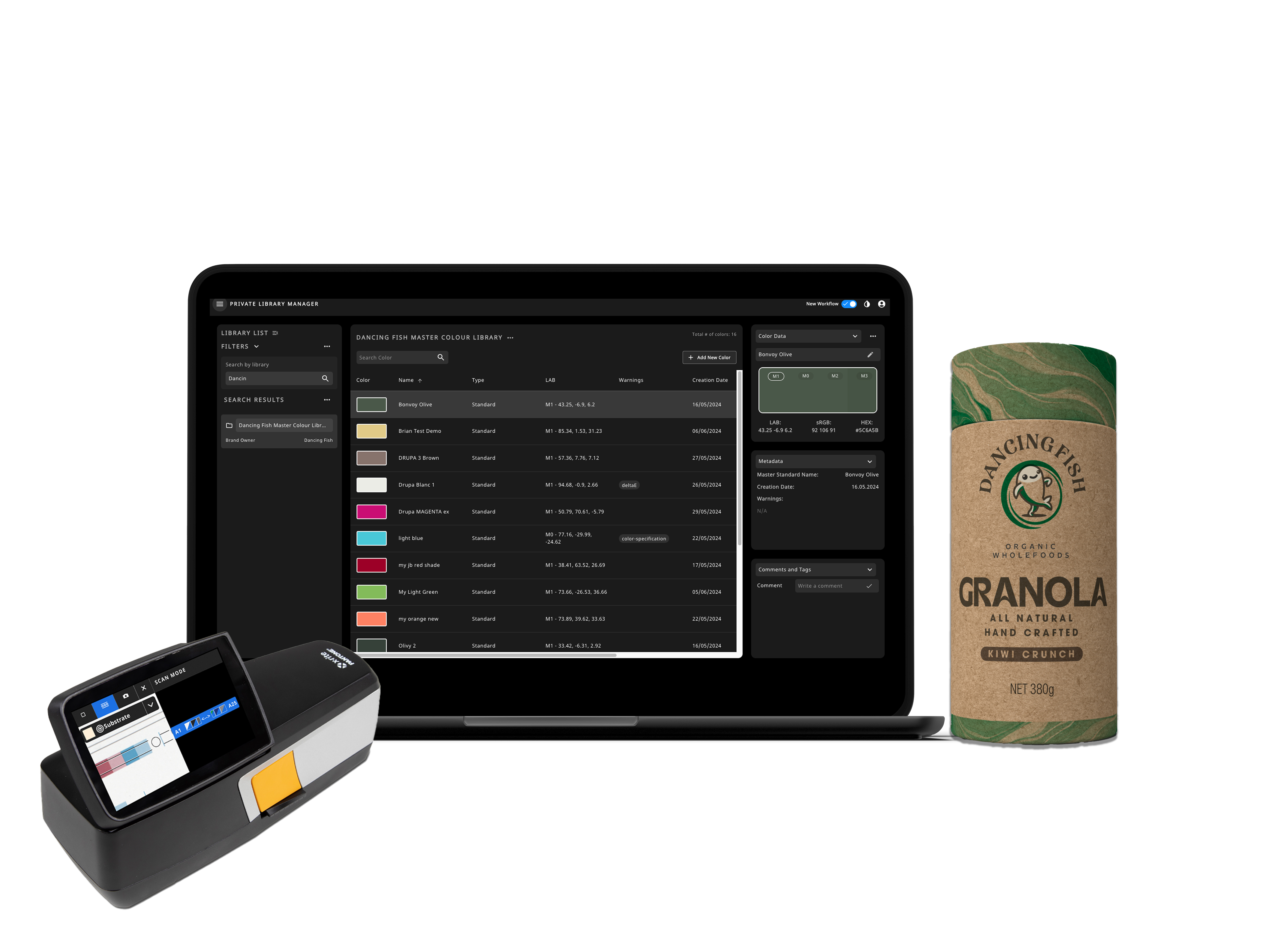
PantoneLIVE 프라이빗 라이브러리 관리자
맞춤형 컬러의 저장 및 공유
프라이빗 라이브러리 관리자로 PantoneLIVE의 기능을 확장하세요! 맞춤형 / 브랜드 컬러의 정확한 스펙트럼 데이터를 디지털화, 업로드, 저장, 공유하고 중앙에서 접근 / 제어할 수 있습니다.
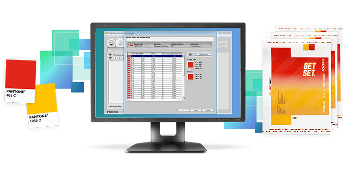
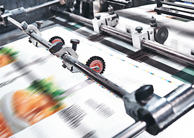
PantoneLIVE Production
인쇄 및 패키징용
PantoneLIVE Production을 사용하면 생산 공정 전체에서 별색에 대한 순수 스펙트럼 값을 활용하여 사용된 소재, 인쇄 기술이나 잉크 유형에 관계없이 정확하고 반복 가능한 색상을 보장합니다.
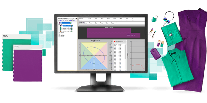
PantoneLIVE Production
플라스틱, 코팅 및 직물용
PantoneLIVE Production – Plastic, Coatings and Textile libraries gives color specifiers and manufacturers’ instant access to the most up to date Pantone colors for Plastic, Coatings and Textile applications in a digital format to ensure design intent is achieved, and color is produced quickly and accurately.
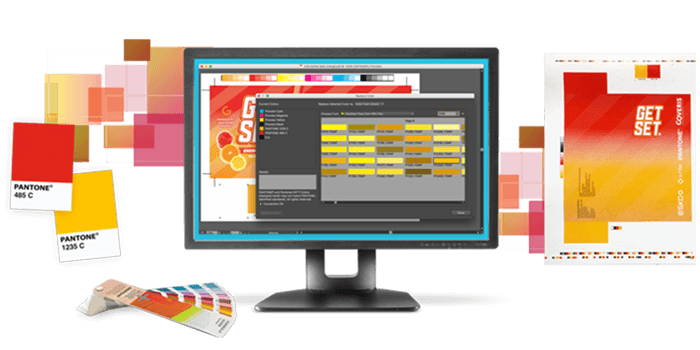
PantoneLIVE Design
PantoneLIVE Design은 디자이너와 프리프레스 팀에게 Pantone 디지털 컬러 라이브러리와 자체 브랜드 컬러 라이브러리에 대한 액세스를 제공하므로 아이디어 도출, 제작 및 프리프레스 단계에서 활용할 수 있습니다. 이 라이선스를 통해 Adobe Illustrator에서 PantoneLIVE를 사용할 수 있습니다. 무료 PantoneLIVE Adobe Illustrator 플러그인이 필요합니다.
Benefits of Digital Standards
-
Offer brand owners peace of mind that the specifications they communicate will be produced.
-
Enable designers to specify accurate color on a given substrate for consistent reproduction.
-
Can be used in software to specify and communicate expectations, formulate ink and colorants, and control quality.
-
Provide suppliers quantifiable goals and the confidence to work faster and more efficiently.
-
Stored in one central location, so spectral data for the same color target can be retrieved from sites around the world.
Physical Standards
Ineffective communication of color expectations can lead to extra costs and rework and lost profits due to lack of retail shelf appeal. A physical color standard can be used to evaluate color by comparing the standard (target color) to the trial (production color) to see if they visually match following a few best practices.
-
Physical color standards are affected by a variety of factors, such as light, heat, age and other ambient variables. It is important to ensure the standard has been stored correctly and not affected by light, temperature, heat, age, or other ambient variables.
-
The appearance of color can change based on the material on which it is produced. In fact, some colors are not achievable on a certain material. The standard should accurately represents the product color and material (such as plastic, nylon, cotton, polyester, special effect paints, etc.) surface texture, gloss, angular dependency attributes, colorants, inks, and pigments, etc.
-
Standardized lighting is also an integral part of visual evaluation. Using a light booth can verify color continues to match under different light sources.
Pantone Colors
Pantone provides a universal language of color that enables brands, designers, and producers to make color-critical decisions through every stage of the workflow. Product and graphic designers often use Pantone colors as a certified reference material to help define, communicate and control color across various materials and finishes for graphics, fashion and product design.
Pantone Color Systems
Pantone has two color systems: The Pantone Matching System (PMS) and the Pantone Fashion, Home + Interiors (FHI) system. Each proprietary color space is designed to feature market-relevant colors; for example, fashion designers use more whites, blacks, and neutrals, while print and package designers require more vibrant Pantone colors. Pantone color libraries are backed by scientific achievability to meet market and manufacturing needs and are globally available.
Munsell Color Standards
Munsell Color Standards are used in a many industries and disciplines, including business, industry, government, and academia. Along with a huge library of color standards, Munsell Color can also produce custom physical standards to validate specific color and appearance aspects for perfect reproduction, including texture, gloss, fluorescence, and special effects.
Why are Color Standards Important?
- For Color Communication
First, we all perceive and interpret color differently. Using a color standard enables brands to communicate precise color requirements, graphic designers to use reproducible color in designs, and suppliers to fulfill color requirements in a language that is recognized around the world.
- To Characterize Substrates
Reproducible color can vary based on the material. Physical and digital color standards set clear expectations for how color will appear on a particular substrate.
- To Establish Clear Expectations
When working with more than one supplier, variations in processes and equipment can lead to discrepancies in color results. Color standards can ensure that multiple sites aim for the same target to reduce costs and achieve consistent results.
- For Consistent Production Runs
Color needs to be consistent throughout and between production runs. A color standard can be used to verify color formulas and ensure consistent color from run to run, no matter when or where it is produced.
Learn More About Standards
Resources for Digital Color Standards:
- Blogs
- How Digital Color Standards Streamline Plastic Color Production: Digital color standards help plastics manufacturers set clear color expectations and achieve color accuracy with less waste for a more sustainable workflow.
- Choosing the Best Device to Create Digital Color Standards: To create digital color standards, you need an accurate, repeatable master spectrophotometer. Learn if the Ci7860 benchtop spectrophotometer is right for you.
- Digital Color Technology Connects Packaging Tasks: Color control and consistency in printed packaging can seem difficult to achieve, especially when you need large scale production of the packaging. Here are tools and resources to help.
- Choosing a Spectrophotometer for Digital Color for Textiles: Using digital color for textiles speeds time to market. Read our blog to learn how to choose the right spectrophotometer for on-screen color.
- Digitally Exchange Physical Samples with PANTORA: With the PANTORA desktop application and a Ci7000, MetaVue VS3200, or MA-T12 spectrophotometer, you can digitize physical samples for 3D previews and approvals.
- Webinars
- PantoneLIVE - The Criticality of Using Physical and Digital Color Standards
- Take Ownership of Your Brand Color with a Digital Print Quality Program: The importance of color cannot be overstated. Join our webinar to learn how brands that implement a Digital Print Quality Program can drive continuous improvement with their suppliers.
- Using Digital Standards: Join us for this webinar to will learn how digital standards can streamline color quality control and reduce the time you waste correcting color issues.
- Implement a Digital Workflow with Spectral Data: In this webinar, you will learn how a digital workflow can streamline the color matching process, reducing waste and rework while speeding time to market.
- Digitize your Brand Standards: Attend this webinar to learn more about our latest digital Pantone tools and how they can help you standardize your brand colors.
- Capturing Digital Color Data: Join this free webinar to learn why it’s important to include digital color data in your quality control program so you can stop guessing and measure with confidence.
- Simple Tools for Print & Packaging Series | Webinar #2 - Organize and Communicate Digital Color on Different Substrates: Join us for a free, three-part webinar series where we will introduce simple print and packaging tools to help you achieve accurate color, even across sites.
- How to Capture and Use Digital Appearance Data for Automotive Paint: Learn how to capture, store, edit, and communicate complex material characteristics, like automotive paint, throughout the digital design workflow using digital appearance data.
- Whitepapers
- 4 Keys to Implementing a Digital Color Workflow: In this whitepaper, you will discover new tools and techniques for implementing a digitally-enabled workflow, including 4 keys that you won’t want to miss.
Resources for Physical Color Standards:
- Blogs
- How to Talk Color with Customers and Suppliers: Talking color with suppliers and customers doesn’t have to be a challenge. Learn how to speak the same language and avoid costly mistakes by sharing accurate color information.
- Munsell Custom Color Standards: Learn how Munsell custom color standards simulate your desired color outcome, including color, texture, finish and even acceptable color deviations.
- Munsell Color Standards: From validating stop sign color to choosing which crops are suitable for sale, the US government relies on Munsell to ensure products are up to standard.
- The Ultimate Guide to Caring for Physical Samples: Physical standards are a great way to communicate color and surface appearance. Learn how to care for physical samples so quality isn't compromised.
- Webinars
- Uses and Limitations of Physical Standards: Physical standards have their limitations. Join the webinar to learn more how adding digital information to your workflow can help you better communicate color.
- Industry or Custom Standards – What’s Right for You?: Join us to learn how printing to standards provide repeatable production and reduce rejects.
- Whitepapers
- A Scientific Approach to Visual Color Evaluation: This whitepaper explains why standardized lighting is important for visual color evaluation, the primary sources used in a light booth, and how to set up a successful program.
Sometimes, getting “Back to the Basics” is the quickest way to get ahead. Highlighting industry best practices, this free whitepaper breaks down the complexity of color management for print and packaging professionals.

This free whitepaper discusses challenges of color accuracy and consistency and offers solutions.
