Building Greater Confidence in Color Measurement In today's manufacturing environments, color decisions happen faster and across more locations than ever before. Production teams, quality managers, suppliers, and brand owners all rely on measurement data to determine whether a color meets specification. But what happens when confidence in that data begins to break down? Many organizations experience a familiar challenge. Color measurements taken in one location may differ slightly from measurem...
Posted 11 September 2026 by X-Rite Color

Why Connected Color Workflows Matter More Than Ever Manufacturing has never moved faster. Today's color supply chains often span multiple factories, suppliers, converters, and brand owners across different regions of the world. Teams are expected to make decisions quickly, maintain strict quality standards, and deliver products to market faster than ever before. Yet many color quality processes still rely on disconnected systems, spreadsheets, email attachments, manual data entry, and fragment...
Posted 11 September 2026 by X-Rite Color

Understanding the Two Foundations of Measurement Consistency When organizations invest in color measurement technology, they expect every measurement to support the same objective: consistent color decisions. But achieving measurement consistency across a modern manufacturing environment requires more than simply using accurate instruments. Companies often operate multiple facilities, collaborate with suppliers around the world, and rely on different types of devices throughout the color workfl...
Posted 10 September 2026 by X-Rite Color

Windows 10 Support Has Ended: What You Need to Know Windows 10 End of Support: What It Means for Your Business Microsoft officially ended support for Windows 10 on October 14, 2025. This means no more security updates, patches, or technical support—leaving systems running Windows 10 increasingly vulnerable to security threats and compliance risks. If your business relies on legacy software or hardware, now is the critical moment to plan your upgrade path and ensure your operations remain ...
Posted 07 November 2025 by X-Rite Color

Discover the Unified My X-Rite Portal: One Platform for All Customers At X-Rite, our mission has always been to make it simple, seamless, and efficient for you to manage your devices, software, and services. With the My X-Rite online portal, we’ve already taken major steps to give you one place to handle service requests, track orders, and access important product information. Now, we’re excited to share the next big evolution: merging X-Rite Link and My X-Rite into a ...
Posted 23 October 2025 by X-Rite Color

Why Benchtop Spectrophotometer Inter-Instrument Agreement & Repeatability Matter for Brand Suppliers
In today’s global supply chain, brand suppliers are under constant pressure to deliver products that meet strict color standards, regardless of where or how they are produced. The key to achieving this consistency lies in the performance of benchtop spectrophotometers—specifically, their inter-instrument agreement and repeatability. What Is Inter-Instrument Agreement? Inter-instrument agreement refers to how closely two spectrophotometers of the same make and model can replicate a c...
Posted 22 October 2025 by X-Rite Color

Top Manufacturing Trends in 2025 The manufacturing industry is undergoing a seismic shift in 2025, driven by rapid technological innovation, sustainability imperatives, and the need for greater agility. As manufacturers adapt to these changes, color accuracy and quality control remain critical to maintaining brand integrity, reducing waste, and meeting customer expectations. At X-Rite, we’re uniquely positioned to help manufacturers navigate these trends with confidence. According to indu...
Posted 14 October 2025 by X-Rite Color

Originally published May 3, 2024 from https://canmaker.com/light-touch/ Industry stakeholders came together to explore ink and proofing standards for two-piece beverage cans. Nisa Ali reports from Manchester Leading companies across canmaking industry supply chains are considering general guidance for PantoneLIVE colours in the production of two-piece beverage cans. Following a series of seminars discussing the role of PantoneLIVE colour libraries in the design, proofing and printing process ...
Posted 26 August 2024 by X-Rite Color

Accelerate ROI, digital transformation, and sustainability with a digital textile color program. Hiccups in getting to market can be devasting for any type of business. For fashion, soft goods, apparel, and footwear brands, a major concern is missing out on the opportunity to increase sales and establish or reinforce brand credibility. Brands simply can’t afford any unnecessary slowdowns during the execution of a design due to delays in preliminary steps such as the color approval process....
Posted 11 June 2024 by X-Rite Color

Looking for a centralized location to manage your X-Rite products and services? Check out My X-Rite. Whether you need product information or support, service details, or access to learning resources, our free online portal is just a few clicks away. 24/7 Access: Easily access your personal dashboard from your computer or mobile device around the clock. Personalized Dashboard: See what matters most to you in one convenient location. Effortless Service & Support: Submit and track...
Posted 25 April 2024 by X-Rite Color
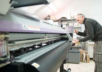
In the sign and display graphics business, as in many other segments of the printing industry, shorter runs and reduced cycle times can stress even the most efficient wide format printing operations. By implementing a color-managed RIP-to-roll (or RIP-to-rigid media) workflow, these operations can ensure that color is right the first time and every time to help speed work through the shop and meet color expectations. Photo by Peter Saunders Today we are share tips from our Color Experts that c...
Posted 23 April 2024 by X-Rite Color

Working in prepress holds a unique challenge. Even if your color workflow is tight, everything can fall apart if the customer’s file isn’t color managed. We’ve all seen it. You receive a file that the customer claims is ready to print, yet when you open it on your computer, the colors don’t look right at all. You can’t send it to print without knowing for sure, because you’re the one who will take the hit for wasted time and materials if it’s wrong....
Posted 23 August 2023 by Mark Gundlach

The environmental footprint of fashion is out of control. According to the National Resources Defense Council (NRDC), “Textile mills generate one-fifth of the world's industrial water pollution and use 20,000 chemicals, many of them carcinogenic, to make clothes.” Fabric being dyed in factory. Image from NRDC.org. A Problem That Impacts Everyone Did you know it takes about 200 tons of water (enough to fill several swimming pools) to produce one ton of cott...
Posted 12 April 2023 by X-Rite Color

This time of year, the internet is full of Top 10 Countdowns. It’s a tradition we’ve embraced since 1940 when the Billboard published its first chart ranking the top selling recorded songs. Since then, others have jumped on the bandwagon to highlight the most popular trends of the previous year. We’ve been publishing our top-read blogs since 2016, and we’re happy to see some educational topics like color perception, tolerancing, and spectrophotometers continue to r...
Posted 28 December 2022 by X-Rite Color

It’s important to ensure design intent is realized each time and everywhere a product appears. But with so many variables to impact print quality, how can brands utilize suppliers around the world and still achieve consistent color? Our X-Rite Pantone Packaging Color Experts have designed a series of consulting services and workshops to help you get the most from your print, packaging, plastic or textile value chain. Offered both online and onsite, these interactive sessions i...
Posted 06 December 2022 by Cindy Cooperman

サステナビリティを重視するウォルマート社(Walmart社)は、カラーの仕様設定と管理において業界をリードし続けています。2022年初め、ウォルマート社はアパレルおよび家庭用品のサプライヤーに対し、新たな認定プログラムを通知しました。このプログラムは、従来のカラー承認プロセスにかかる時間とリソースの浪費を削減し、地球環境への影響を軽減することを目的としています。 それ以来、ウォルマートの家庭用品事業部では、色評価プロセスの改善が進められ、処理時間、輸送コスト、材料費が削減されました。この取り組みにより、ウォルマートの顧客に対する色の一貫性が向上し、サプライチェーン全体でのサステナビリティ推進が可能となりました。 アパレルや家庭用品を繊維、プラスチック、セラミック、その他の素材で製造する場合、すべてのウォルマートサプライヤーは認定を受け、物理的なサンプルではなくデジタルカラーを提出して承認を受ける必要があります。 ウォルマートのデジタルカラープログラムの利点: 物理的なカラー確認に伴う手間を排除 製品出荷時のカラー品質と一貫性を向上 廃棄物と手直しを削減 ...
Posted 05 December 2022 by X-Rite Color

カラーモデルには、加法混色法と減法混色の 2 種類があります。本日は、加法混色について解説します。 人間の目は、RGB 加法混色の 3 原色である赤、緑、青をさまざまな組み合わせと強度で混色し、再現された自然界のあらゆる色を認識します。純粋な赤、緑、青が混色された反射光は「白」として知覚します。光が存在しない場合は「黒」を知覚します。これが、RGB カラーモデルによる色再現の基礎となっています。 RGB はさまざまな波長の光を組み合わせて、白色光を再現する加法混色です。 加法混色:入力・出力装置 RGB を活用した入力・出力装置は、暗闇で黒い表面やディスプレイ上に赤い光、緑の光、青い光の照明を加え、色を表現します。RGB の入力装置には、デジタルカメラやスキャナーなどがあります。RGB の出力装置は、テレビやパソコンのモニターなどです。もちろん、スマートフォンやタブレット端末のように、RGB の入力装置と出力装置の両方として機能するものもあります。 加法混色 RGB 装置は、暗闇で黒い表面やディスプレイ上に赤、緑、青の照明を加え、色を表...
Posted 15 July 2022 by X-Rite Color

Are your customers rejecting shipments due to incorrect color? Are you identifying color issues during quality control? If your bottom line depends on color accuracy, you need to ensure your spectrophotometer is not the cause. Color drift is a big issue for a lot of companies. Even worse, many don’t even know it’s happening. Here are some ways to make sure your spectrophotometer is operating within specification to always capture accurate and consistent measurement data. Causes of Sp...
Posted 24 February 2022 by Tim Mouw

When choosing a beverage product from the store shelf, consumers not only demand superb taste, but also consistency in the way the beverage looks to the human eye. Color and transparency are essential markers for quality - any imperfection can indicate contamination, impurities in the raw materials, or process variations caused by heating and oxidation. However, drinks like fruit and vegetable juice, beer, and blended cocktails are difficult for manufacturers to control during production. Natura...
Posted 21 January 2022 by X-Rite Color

.upcoming-webinar-block { width: 100%; display: table; margin-bottom: 20px; } .upcoming-webinar-left { width: 120px; padding-right: 20px; display: table-cell; } .upcoming-webinar-left img { margin-top: 10px; } .upcoming-webinar-right { vertical-align: top; display: table-cell; } Color measurement devices have been around since the 1940s, but they’ve come a long way since then. Built by Jules Duboscq in France in 1870, t...
Posted 19 January 2022 by X-Rite Color

The best way to visualize how color will react in real world lighting conditions is to use a quality light booth. Traditional light booths contain common illuminants like daylight, incandescent, and fluorescent to replicate how color will look in the retail store and post-purchase in outdoor and home lighting. Today, the increased use of LED lamps in home, commercial, and retail environments is impacting decades of standardized lighting procedures. How LED is Changing the Game LED li...
Posted 03 November 2021 by X-Rite Color

Color Matching Software for Retail Paint In the retail paint environment, customer service is key. When a customer brings a paint sample to the counter for a custom match, formulas must be accurate and formulation time must be fast. The faster and more accurately you can match customer paint samples, the more likely they will return with future business. With the right equipment, you can empower your paint counter associates to be true color matching experts and convert your paint department in...
Posted 03 November 2021 by X-Rite Color

色測定/測色は、色の重要な作業において、色の品質を指定・定量化・伝達・定形化・検証するために必要です。色の感じ方は人それぞれ異なるため、測色は目視評価より正確な結果を得られます。そのため、正確な測定を行うには、用途や精度に応じた色測定器や色測定機器の使用が欠かせません。 色測定とは? 色測定は、サンプルによって放射・透過・反射される光の量をとらえ、スペクトルデータとして定量化することで、光源の変化分も捉えることが出来ます。測色計(分光測色計)で行う色測定は、目視評価より正確です。なぜなら、人間の色認識は差を表すのは得意ですが、定量的に示すことは不得意です。色に関わる重要な作業には、色を識別・定量化・伝達・区別するための分光測色計の導入を強く推奨します。 色波長の測定方法 色を測定するには、分光測色計と呼ばれる測色装置でサンプルに光を当て、人間の目に見える波長範囲である380nmから780nmの範囲で透過または反射した光の量をとらえます。分光測色計は波長範囲にわたるスペクトル波長測定に基づき、計算を行い、スペクトルデータを定量化します。 色測定器/色測定機器とは? 色測定器/...
Posted 24 August 2021 by X-Rite Color

Learn about light, reflection curves, optical brighteners, and more. Illuminants Electro magnetic radiation in the wavelength range from 380 nm to 730 nm is seen as light by our eyes. Low wavelengths show as blue light, then the spectrum continues from green to yellow, orange, and red. UV radiation is located in the range below 380 nm; the range above 730 nm is called infrared radiation. The visual impression of a colored body changes by the composition of the incoming light. ...
Posted 22 July 2021 by X-Rite Color

People often ask how X-Rite got its name and how we came to be a leader in the art and science of color. It’s really a great story – one that focuses on innovation, entrepreneurship and determination. What’s in a name? X-Rite was founded in 1957 by a group of engineers and business entrepreneurs who had a desire to start a business based on innovation. The members brainstormed new product ideas ranging from can openers to sheet metal tools to collapsible car cots. After buildin...
Posted 11 May 2021 by X-Rite Color

減法混色は、加法混色と同様、光を混ぜ合わせ、私たちが色として認識するものを作りだします。しかし、減法混色は、光を加えるのではなく、顔料やインクを使って、光を減算します。 2つの純粋な加法原色を組み合わせると、減法原色になります。シアン、マゼンタ、イエローの減法原色は、赤、緑、青それぞれの反対色です。 シアンは赤の反対色 マゼンタは緑の反対色 イエローは青の反対色 2つの減法原色を重ねると、加法原色を生じます。3つの減法原色が等量に重なると、すべての光が差し引かれます。この場合、人間は黒、つまり光のない状態を知覚します。 印刷業界での減法混色とは? 紙に色を表現するために、プリンターは反射光と減法カラーインクを使用します。シアン、マゼンタ、イエローの顔料を白色の反射基材上に置くことにより、それぞれが白色光から反対色の顔料を吸収(減色)します。 イエローは青を吸収し、赤と緑を残し、それを合わせてイエロ...
Posted 28 September 2020 by X-Rite Color

Recently we had the opportunity to sit down with Laura Guido-Clark, a consumer products designer of color, material, and texture. She has been dubbed an “Experience Consultant,” which reflects her interest and study of human reactions to the look and feel of new products. Photo by Laura Flippen. We asked Guido-Clark to speak with us because we also appreciate the importance of color in our lives. Q. What inspired you to pursue a career in color? A. When I wa...
Posted 01 September 2020 by X-Rite Color

As the industrial plastics market grows increasingly competitive and demands more sustainable practices, manufacturers need new ways to formulate and produce accurate color faster, with less waste. Digital color standards are one of the most effective tools to bridge this gap. They also enable color work and communication from remote locations. With digital color standards, brands and designers can set clear expectations with supply chains. In turn, suppliers can achieve color goals wit...
Posted 31 July 2020 by Tim Mouw

As the world reopens, retail stores are making functional changes to ensure customers and employees are safe and healthy. For starters, the notoriously social activity of shopping now requires associates and customers to maintain distance and wear masks. Customers need to feel comfortable when they sit down at the cosmetic counter, too. While the role of the beauty consultant is not going away, demo makeup applications and cosmetic testers are. This leaves retailers seeking ...
Posted 15 July 2020 by Matthew Adby

Whether you work with plastics, coatings or textiles, you must consistently achieve in-tolerance color or your product could be rejected before it even makes it to the shelf or showroom. This is especially true for brands that rely on off-site suppliers and manufacturers for raw materials and parts that come together at assembly, such as the plastic dashboard, fabric seats, and coated interior panels of a car. Even if each site produces in-tolerance color, it must be monitored an...
Posted 12 June 2020 by Tim Mouw

競争の激しい市場において、ブランド企業とパッケージデザイナーは、店頭に並んだ自社製品を差別化する方法を模索しています。その対策は、色だけでなく、箔、特殊ワニス、ソフトタッチの仕上げなどの装飾オプションまで広がっています。また、デザイナーは従来の印刷だけでなく、より強いソリッドカラーや蛍光色、虹色なども使用するようになっています。デジタル ソリューションにより、パッケージのバリエーションを増やせ、稼働時間の短縮やサイクル タイムの短縮に対応できるようになります。 鮮やかな色や仕上げは、パッケージを店頭で目立たせますが、この傾向はパッケージ印刷のコンバーターに多くの課題をもたらします。消費者に鮮やかな色や仕上げを与える光の物理学的性質が、測定上の課題にもなっています。見る人に輝きを与えるよう、光が反射したり屈折したりすると、分光測色計で捉えるのが難しい鏡面成分も生じます。 ここでは、パッケージ印刷業者とコンバーターがデザイン意図に沿って、強いソリッドカラーと特殊な仕上げを施したパッケージを製造するための5つのヒントをご紹介します。成功している企業には、大きなビジネス成長のチャンスがありま...
Posted 04 June 2020 by Ray Cheydleur

No matter the industry, our customers are all working toward the same goal: Achieve accurate color and keep production moving. Even in the best conditions, color data can be a challenge to capture and share. COVID-19-related travel bans and social distancing guidelines are making it harder than ever. Today we’ll share three easy ways to remotely share color data so you can achieve your color goals without shipping physical samples or making onsite visits. The Benefits of Digit...
Posted 30 April 2020 by Tim Mouw

Flexible film does a lot more than protect goods on the store shelf. When done right, film packaging design can capture attention and increase product sales. But measuring color on film substrates can be challenging, even for the most sophisticated converter. Here's what you need to know to successfully control print color on flexible film. Does your film exhibit interference? When you measure flexible film with a traditional 45°:0° spectrophotometer, the way you position the instr...
Posted 29 April 2020 by Ray Cheydleur

G7® is a proof-to-print process control method that allows you to reliably and efficiently match the visual appearance of the output from multiple printing devices. It works by defining the gray balance and NPDC curves in conjunction with the traditional method of measuring tonal value increase (TVI/dot gain) for each color. G7 can be applied to any type of printing, regardless of the type of ink or printing method, including all types of digital, offset, flexo, gravure printing. It&r...
Posted 27 February 2020 by Mark Gundlach

Appearance is more than just color. It’s an all-inclusive look at everything inherent to an object, including texture, gloss, transparency, translucency, and special effects like sparkle and shimmer. When viewed from different angles or under different lighting conditions, appearance effects can change our perception of color. That's why it’s important to control both color and appearance throughout design and development. Durable goods brands use appearance effects to captur...
Posted 20 February 2020 by X-Rite Color

Spectrophotometers are color measurement devices that measure color to ensure it remains consistent from the time it’s specified until final quality check. They can be used to measure everything from liquids and plastics to paper, metal, and fabrics for just about every industry. Here Are Our Top Spectrophotometer Picks for 2019. Best Spectrophotometer to Create Digital Standards Using a digital standard is the most accurate way to specify and communicate color, des...
Posted 16 August 2019 by X-Rite Color

When choosing a food product, consumers demand consistency in both taste and appearance. While a lighter batch of oranges may still produce a delicious juice blend, a pale color can jeopardize USDA approval and leave consumers questioning the quality. Unfortunately for food and beverage manufacturers, the color of food – especially drinks like fruit juice and blended cocktails – is one of the most difficult things to control during production. Here’s why. 1. Liquid is hard to...
Posted 15 August 2019 by X-Rite Color

Each color has its own appearance based on three key attributes – hue, chroma (saturation), and value (lightness). When you’re describing a color, it’s important to use all three of these attributes to accurately identify the color and distinguish it from others. What is hue? Hue is defined as how most of us perceive and name a color – using the colors of the rainbow (red, orange, green, blue, etc.). Reference the color wheel, below, to see how colors shift from one...
Posted 15 August 2019 by X-Rite Color

There’s been a lot of research around the role color plays in how we expect food to taste. The fact is, we judge flavor by the color of the food or drink, even before the first taste. We expect red foods to taste sweet like strawberries or cherries. White should taste like vanilla, and green is probably limey and tart or minty. Color cues can even determine whether we take that first bite. Most of us won’t even consider trying a food like mashed potatoes or pumpkin pie if it is ...
Posted 12 August 2019 by Tim Mouw

Controlling color on cylindrical-shaped items like cups, cans, and tubes is a challenge because it’s hard to properly align the measurement device with the sample. Many printers and manufacturers cut a piece from the finished product and lay it flat to take a measurement. While this method works, each sample takes time to cut, wastes product, and risks the safety of the employees who are cutting the samples. A Faster, Safer Solution X-Rite’s Cup and Cylinder Fixture works ...
Posted 17 July 2019 by Bob Binder

With so many requests for innovative bases, transparency, and special effects, formulating color for paint, coating, and plastic applications can be a challenge. To keep up, formulation software needs to be innovative, too. We recently launched version 10 of our Color iMatch formulation software, and it is our smartest version yet. It allows you to select cost-reducing parameters, such as lowest cost or fewest colorants, and will determine the best formula for your application. It work...
Posted 10 July 2019 by Rich Knapp

As we move through spring and into summer, we’re revisiting Pantone Color Institute’s Spring/Summer 2019 Fashion Color Trend Report. This season’s report features the top 12 stand out colors as well as current takes on four classic neutrals. Images extracted with permission from PANTONEVIEW Colour Planner Spring/Summer 2019. According to Leatrice Eiseman, Executive Director of the Pantone Color Institute, “This new mindset underscores a...
Posted 10 June 2019 by X-Rite Color

色が間違った状態で出荷してしまうと、コストがかかります。色を正しく修正するには、再調色のためラボに持ち帰るか、顧客先で着色をするためのスタッフを派遣するか、最悪の場合、すべて廃棄してやり直しということもあります。むだな時間と材料の費用に加えて、顧客の満足度も落ちます。 効率的に調色を行うための5つのステップ 塗料およびコーティングの業界では、適切なツールとプロセスにより、効率かつ正確な調色を行うことができます。 1. 正確な基準を決める まず、調合する色のターゲットを設定する必要があります。このステップでは、最も高精度のあるエックスライト Ci7x00シリーズをお勧めします。調合を開始する前に、サンプルと分光データを発注先に提出し、承認を得た方が良いでしょう。 2. 手作業で調色して時間を無駄にしないでください . 目視で調色を行う場合、指定の色を許容範囲内に調色できるまで十数回の繰り返し作業が必要になることがあります。この回数は、毎日行う調色のタスクで計算すると、あっというまに数週間の時間と数十万円の材料を無駄にしてしまいます。この問題を解決するには、エッ...
Posted 29 May 2019 by Rich Knapp

When you think of Albert Munsell, do you think of dirt, food and electrical wires? The United States government does. Munsell Color Standards are used for more than just design and Fine Art. They’re also used to ensure safety and reliability, and to maintain compliance with federal regulations. Today we’ll look at some of the government agencies and trade associations that rely on Munsell’s exacting standard color codes. French Fries, Anyone? From tomatoes to pumpkins, Munse...
Posted 30 April 2019 by Art Schmehling

Your customer rejected your latest shipment due to color. You checked the color before you sent it and it passed tolerance… You did everything the same way last time and it passed tolerance… So why did it get rejected now? We get this question from our customers all the time. The Dreaded “Error Stack” Color rejections create waste and increase production costs. Unfortunately, there are a lot of variables that contribute to the color you produce,...
Posted 07 March 2019 by Tim Mouw

ベンチトップ分光測色計は、ガラス、液体、繊維など、さまざまな不透明、透明のサンプルの色を透過または反射モードで測定・定量化することができます。本記事では、透過測定と反射測定の違いを説明し、どのベンチトップ分光測色計を選ぶと良いか、ご説明します。 透過測定と反射測定 透過測定と反射測定が可能な分光測色計は、フラッシュを照射し、透過または反射された光を測定し、360~750nmの間のすべての光の波長の分光透過率または分光反射率を作成します。反射して戻ってくる主波長がその色を示します。青紫、藍、そして青は、波長が短く、400~550nm。緑はその中間で、550~600nm。黄、オレンジ、赤は最も長い波長を示します。OBAと蛍光剤含む場合は、100%以上のピークに達します。 反射測定の分光測色計は、サンプルの表面に光を照射し、10ナノメートル単位で反射率を測定することで色を測定します。完全に不透明な表面を測定する場合、反射測定の分光測色計で十分です。 一方、透過測定の分光測色計は、サンプルを通して光を投影できます。反対側にある検出器は、透過した光の波長と量をとらえ、平均透過率も数値化できま...
Posted 26 February 2019 by Mike Huda

For the last few Decembers, we’ve provided you with a list of “top color measurement blogs” for that respective year. As we reviewed this year’s list, we noticed that your favorite/ the most-read blogs could be categorized into a few buckets. So, without further ado, here’s 2018’s top blog topics! 2018’s Most Popular Color Measurement Topic: Tolerancing Not to our team’s surprise, Tolerancing – what it is/what it means for your busines...
Posted 20 December 2018 by X-Rite Color

The Gabriel-Chemie Group, a leading masterbatch manufacturer in Europe, has partnered with X-Rite Pantone to provide their customers with an innovative solution to improve daily color requests, expanding their existing product portfolio to include solutions that keep pace with the move towards digitization and industry 4.0. The Challenge As a leader in masterbatch manufacturing, Gabriel-Chemie is always looking for ways to sharpen their customers’ experiences and solve production challenge...
Posted 13 December 2018 by X-Rite Color

Each year, Pantone announces its highly anticipated “Color of the Year”. The selection is intended to serve as a strategic direction for design and color-conscious industries as well as a conversation piece around our culture, where it is going and what we collectively need…and it certainly gets everyone talking about color! Color is no longer just something we see and appreciate - it enhances and influences the way we experience life. Color, as a strategic element of d...
Posted 06 December 2018 by Tim Mouw

地理座標 (経度、緯度、高度) と同様に、L*a*b* 表色系は色を座標として特定し、色を伝える手段を提供します。 L*a*b*表色系の歴史 1940年代、リチャード・ハンターは三刺激値モデルLabを発表しました。これは、知覚される色差の間隔がほぼ均一になるように尺度化されたものです。 ハンターのLabは、絶対的な色座標と色差をプロットするための事実上のモデルとして採用されましたが、国際標準として正式に認められることはありませんでした。 1976年に、CIEはハンターのLabの改訂版であるL*a*b*表色系を発表しました。CIE LABと呼ばれるものです。 正しい発音は「Lスター、aスター、bスター」ですが、「シーラブ」とも、呼ばれています。一部のアプリケーションや機器では単にL、A、B、またはLabと表記される場合もあります。 L*a*b*は何の意味ですか? どの表色系名で...
Posted 08 October 2018 by Tim Mouw

To understand how color management works, you need a basic knowledge of the additive and subtractive systems of color reproduction. Both use a small number of primary colors that combine to produce a large number – or gamut – of colors… but the way they do that is quite different. In our Color Perception Part 1: The Effect of Light post, we explained how the visible color spectrum (we know it as the rainbow) encompasses light wavelengths from approximately 380 to 720 nm....
Posted 10 August 2018 by Tim Mouw

To control color, you need to be able to compare very small differences, determine their impact, and understand how to address that impact. But words alone can’t give us enough information to precisely describe colors, or the difference between them. In this three-part series we will look at the color science behind tolerancing – the color analysis that paved the way, the role of light, and the difference between a color space and a color model – so you can make ...
Posted 21 February 2018 by Tim Mouw

A senior design leader at a large beverage company recently shared his thoughts on the definition of Design Thinking on LinkedIn, asking other members of the community to contribute their own thoughts alongside his. Hundreds of comments ensued. The post appears to be part of a multi-week campaign to position Design Thinking as a way to approach business problems and garner attention from business executives. And we know that this attention has been hard to capture. A survey of over 600 designers...
Posted 21 December 2017 by Adrián Fernández

For over a decade omni-channel has been a term used to describe digital and physical marketing. While many have strived to achieve an omni-channel strategy, unifying the digital and physical customer experiences have been an ongoing challenge for marketers. However, that may be changing. Advances in augmented reality (AR) can help to bring these two worlds together. Over the next few years, I believe we will see significant adoption of AR technology by brands and retailers as a way to engage con...
Posted 19 December 2017 by Shoshana Burgett

Using a light booth to visually judge color is a great start to a successful color evaluation program. It allows you predict how color will look under multiple light sources so there won’t be any color surprises when the light changes over the life of the product. Introducing a color measurement device to capture spectral data is the next logical step. For a really great color program, you need to use both a light booth AND a spectrophotometer. This dynamic duo offers benefits you can&rsqu...
Posted 18 December 2017 by Mike Huda

The Pantone Color Institute just announced PANTONE® 18-3838 Ultra Violet as the Pantone Color of the Year 2018! This news is always exciting because it sets the stage for upcoming trends for everything from housewares to fashion to packaging design. In fact, we have already seen shades of Color of the Year used in packaging and graphic design by forward-looking brands in the CPG, luxury, and beauty worlds as well as by personalities and artists seeking to stand out. Part of butt...
Posted 11 December 2017 by Mark Gundlach

If you work behind a paint counter, you know customers can surprise you with interesting and unique objects to color match. Many samples are relatively easy to measure, but when a customer shows up with a curved baseboard panel, a square of shag carpet, or a plush toy, things can get a little tricky. A few years ago, we learned just how challenging it was for our retail paint customers to color match unique samples. We took in a bag with textured and multi-colored items and asked the person behi...
Posted 04 December 2017 by Tim O'Rourke

Recently we blogged about how appearance affects color. In this article we look at some of the characteristics that impact an object’s appearance, such as texture, gloss, transparency, and special effects, and explain why it’s crucial to describe appearance in the early stages of the design workflow. While 3D programs have attempted to address appearance aspects for years, there has been a missing link in virtual product design: the ability to integrate characteristically &ldqu...
Posted 29 November 2017 by Thomas Meeker
You think you’re doing everything right, but your color isn’t consistent. Why? Through the years, designers have used many tools to help them specify color. Color swatches, style guides and product prototypes have been effective, but with the advent of the digital world, these physical tools are no longer enough. To be efficient, designers need to be SPECIFIC. X-Rite Pantone President Ron Voigt recently published an article in MediaPost that explains why. To be effective, designers n...
Posted 17 November 2017 by Cindy Cooperman

If you’re reluctant to buy clothing and home decorating products online or in the store because you’re not sure how the color will look when you get home, you’ll love X-Rite’s newest color-matching solution. Color-Eye® uses a calibration card and smartphone app to help consumers shop for items that match or complement things they already have at home, like a paint color that looks great with the curtains, a handbag and shoes that coordinate with a special occasion dress, or a jacket that will ma...
Posted 15 August 2017 by Matthew Adby

I spent a few years working in Paris, where the Seine River has played a pivotal role in the shaping of the city’s personality. As I stayed longer and got to know the city and its people better, one of the things that became clear to me was that the Seine River physically separated two distinct cultures of the city. Image courtesy of www.aparisguide.com The left bank, including the Latin Quarter, Montparnasse, and Sorbonne, is all about creativity, design and ideation. The right bank is more sop...
Posted 01 August 2017 by X-Rite Color

If you recently invested in a spectrophotometer or colorimeter, you know there’s a lot more to learn about color measurement than just how to use your new device. To help you begin exploring the exciting world of color, we’ve compiled seven blogs that explain how to set up your color measurement device, care for it, and use it to its maximum potential. 5 Tips for Setting Up Your Spectrophotometer Using a spectrophotometer (“spectro” for short) to measure color doesn...
Posted 25 July 2017 by Mike Huda

FUSE 2017 provided a wealth of valuable industry insight by showcasing how today’s brands are not only surviving, but thriving. While each scenario presented unique challenges and obstacles, one constant seemed abundantly clear: brands must create a human connection between themselves and their consumers. Humanizing brands reinvigorates (or, in some cases, generates) a level of trust from consumers that is currently eroding. Speakers at FUSE highlighted a few specific examples of ways companie...
Posted 19 July 2017 by X-Rite Color

Did you read our blog: Are You Using The Right Tolerancing Method? If not, check it out. Today we’re taking the topic one step further to investigate how tolerances are chosen in different industries. A pass-fail tolerance is the amount of color variation that is considered commercially acceptable. In part, tolerances are driven by customer expectations. While color tolerances are very tight in the automotive, plastics, and paint & coatings worlds, they can be much less strict in other...
Posted 02 May 2017 by Mike Huda

With today’s complex cross-media campaigns, accurate profiling is even more important for managing customer expectations across the color supply chain. Our i1Pro 2 solutions help photographers, videographers, prepress and digital printers create profiles for the best color on monitors, scanners, projectors, printers, and online web-to-print submission tools. But with so many to choose from, how do you know which is the right tool for your color workflow? Whether you’re looking to add a new comp...
Posted 11 April 2017 by Ray Cheydleur

It’s been said that everything you need to know you learned in kindergarten. Does this phrase ring true for print and packaging designers? In the spirit of spring, we attempted to use a simple childhood activity—dyeing eggs—to solve some of the most perplexing color issues facing the packaging designer/printer relationship. Here are three lessons to learn about color in print and packaging from our annual egg dyeing ...
Posted 06 April 2017 by Shoshana Burgett

Have you seen the Academy Award-Winning La La Land, where the stars dance through the cosmos and experience alternate realities? Or the commercial, where a famous freestyle dancer slides down the street, up the walls, over the marquee and beyond, transported by his next-gen earphones? Maybe you’ve seen this Russian packaging that superimposes conflicting scales. Surrealism is bleeding into our reality, and I kind of think it’s a zeitgeist. Simply defined, surrealism strives to reconcile our dre...
Posted 22 March 2017 by X-Rite Color

Consistent color is a journey. A few weeks ago I blogged about the most common pitfalls people run into when starting a color program… Wrong lighting Less-than-perfect color vision Inaccurate physical standards Inconsistent device color measurement …And introduced some inexpensive color tools to help overcome them. But the journey doesn’t stop there. Even if you’ve been successfully managing color for years, advances in inks, dyes, and substrates are introducing new challen...
Posted 13 March 2017 by Shoshana Burgett

At X-Rite Pantone, we pride ourselves on our ability to help customers specify, communicate, formulate, and produce consistent color. You’re probably familiar with our major markets, like plastics, industrial coatings, and print & packaging. You may also be aware of the more “common” things we measure, like paint, printed surfaces, and textiles. But, as you look for the emergency exit on a plane, watch a butterfly float by, or choose the freshest package of cheese from the ...
Posted 23 February 2017 by Mike Huda

At X-Rite Pantone, we love color, and we’re passionate about helping you get yours right. That’s why we offer a full-service training program, staffed with Color Experts from many of the industries we serve. From beginner to advanced, lowest investment to highest return, we offer a variety of options to teach you everything you need to know to be successful. Are you new to color, wondering where it fits in your business objectives? Do you already have a color workflow, but ...
Posted 09 February 2017 by X-Rite Color

If you didn’t catch my Industry 4.0: What Commercial Printers Need to Know article, you’ll want to check it out now. Today’s blog is a continuation, touching on the most interesting print color management tie-ins: PQX, iccMAX, mobile control and new materials. Here’s what on the horizon for color-managed workflows. Image courtesy of Esko.com. Print Quality eXchange PQX was a global effort developed by Idealliance, and is now moving to ISO to be issued as a standard. It ...
Posted 25 January 2017 by Ray Cheydleur

If you’re a commercial printer who wants to improve color quality and consistency and stay current on industry trends, you need to be aware of Industry 4.0. Industry 4.0 can mean different things to different people, but it generally refers to the fourth industrial revolution, which incorporates trends in automation, data exchange, smart systems, and the Internet of Things. Image courtesy of Christoph Roser at AllAboutLean.com. Today I’ll explain what Industry 4.0 means for co...
Posted 24 January 2017 by Ray Cheydleur

Looking forward to the X Games? Kicking off next week in Aspen, the annual sporting competition draws thrill seekers from around the world to participate in Xtreme events, such as skiing, snowboarding, and snowmobiling. Image courtesy of www.bleacherreport.com. Of course, this living-on-the-edge lifestyle isn’t for everyone. Luckily, with X-Rite you don’t have to be a daredevil to enjoy Xtreme color! Here’s a list of our most innovative solutions to help you achieve the greatest possible results...
Posted 17 January 2017 by Tim Mouw

Earlier this week my colleague, Shoshana Burgett wrote about six manufacturing trends to watch for in 2017. It’s now time to look into my crystal ball and see what trends converters, commercial printers and graphic designers should be following in the next 12 – 18 months. Extended/Expanded Gamut 2017 could be the year where extended gamut printing really breaks out. This year both industry professionals and standards organizations have been taking a look at printing beyond traditional 126...
Posted 10 January 2017 by Ray Cheydleur

As we close out 2016, it’s time to look ahead to 2017 and the upcoming manufacturing trends that will influence how we do business in the New Year. With rapidly changing technology, it’s difficult to know exactly what’s coming next, but we can definitely make some predictions. Over the past year, I have interviewed many customers across a variety of manufacturing industries to learn more about their industry concerns, the design and manufacturing challenges they face, and the t...
Posted 09 January 2017 by Shoshana Burgett

Our color measurement devices are used by designers, brand owners, formulators, printers, and manufacturers around the world. Ranging from portable handheld devices, to large benchtop instruments, to spectrophotometers mounted inline, they can measure just about anything to help formulate and maintain a perfect color match. Many of our customers, especially those in the paint industry, are asked to color match some pretty interesting things, and we love to hear about them. We recently asked 40 p...
Posted 28 December 2016 by Tim Mouw

Our society loves customizing its surroundings. Personalized merchandise preserves memories, and when given as a gift, shows the recipient that you put a lot of thought into the choice. It also creates an emotional bond, and (if done right) encourages brand loyalty. Image courtesy zazzle.com While the personalized merchandise market used to be dominated by photo books and calendars, advances in technology have opened the door to personalizing a wide range of materials like wood, ceramics,...
Posted 19 December 2016 by Shoshana Burgett

It’s the most wonderful time of the year! A time to reminisce… to celebrate our successes, and to explore areas that may need a little more attention in 2017. If color accuracy is on your list of things to improve, this article is for you. We’ve compiled a list of the blogs our readers found most helpful and interesting in 2016, so you can start working toward your goal of more accurate color in the New Year. Did your favorite blog make the list? Top 10 X-Rite Blogs of 2016 ...
Posted 13 December 2016 by Tim Mouw

When you walk into a salon for a manicure or visit your favorite beauty products store, are you overwhelmed by the number of nail polish colors to choose from, but can’t actually find the color you want? This is a problem Ashley Morgan set out to solve. Morgan, who has a fine arts degree, has spent the last 15 years designing video games. She’s both creative and tech savvy. “I’m a nail polish advocate, and I don’t mind spending the time choosing a nail polish color,” she says. “But the availabl...
Posted 06 December 2016 by Tim O'Rourke

When judging color, background can be a major distraction for the human eye. In fact, surrounding colors and patterns can actually change the perception of the color you’re trying to focus on. One of the wonderful things about color measurement instruments like colorimeters and spectrophotometers is that they can’t be distracted. They aren’t susceptible to variables such as fatigue, age or color vision deficiency. They aren’t even aware that a surround exists – they...
Posted 01 December 2016 by Mike Huda

If you’re a commercial printer who wants to improve color quality and consistency, this blog is for you. X-Rite color management solutions for print and packaging deliver excellence in quality control, formulation and automation. Ray Cheydleur is a printing industry veteran of more than 20 years, a standards guru, and our Portfolio Manager for Printing and Imaging Products. Passionate and very knowledgeable about color, he has a talent for helping printers improve their color quality and c...
Posted 10 November 2016 by X-Rite Color

K 2016 begins today in Düsseldorf and runs through October 26th. As the #1 trade fair for the plastics and rubber industries, it’s a huge event featuring industry news, product demos, and networking. We’ll be in Hall 8b / Stand H65 showcasing our end-to-end X-Rite Pantone workflow solutions to help rubber manufacturers, compounders, masterbatchers, and converters get consistent color in a plastics workflow. Don’t miss your chance to speak with our color experts! (Here...
Posted 18 October 2016 by X-Rite Color

We’re intrigued by color, and that’s no surprise. From starting conversations to subconsciously moving people to make decisions, color inspires and motivates people on a daily basis. As a company, we want to help our customers understand this impact. Through our work with artists, designers, brand owners, and manufacturers, we define and control color, and this event was a great opportunity to showcase this passion. That’s part of the reason we get so involved in ArtPrize as sponsors, volunteer...
Posted 14 October 2016 by X-Rite Color

In color production, mistakes can happen anytime, anywhere… during specification, formulation, manufacturing, assembly, quality control, or (unfortunately) all of the above. Every mistake adds up to wasted time and materials, and stacking errors across a production workflow can get expensive very quickly. How can you stop this error stack from happening? If your job requires you to get color right, spectral data should be your best friend. One of our favorite eLearning courses to help customers...
Posted 06 October 2016 by Mark Gundlach

Passionate about color? We are too. As a company that prides itself on its color knowledge and enthusiasm, X-Rite Pantone is excited about the various ways ArtPrize showcases the power of color. Each fall, ArtPrize installs over 1000 works of art in downtown Grand Rapids, attracting thousands of visitors. By using consistent colors in its guides, signs, banners, flags, and merchandise, ArtPrize creates a colorful map that helps both visitors and locals see the city through a different perspectiv...
Posted 03 October 2016 by X-Rite Color

ArtPrize®, the nation’s largest art competition, begins today. As a leadership sponsor and a proud Grand Rapids-based company, we are honored to contribute to this creative and inspiring community event. ArtPrize attracts artists from around the world who use a mix of colors, textures, and substrates to express themselves in unique ways. Their creations, often demonstrating the color challenges that color professionals have in their plants or print shops, are installed indoors and outdoors throu...
Posted 20 September 2016 by X-Rite Color

Each year Printing News asks their readers which new products made the most difference in their productivity. We’re excited to announce that our very own i1iSis 2 and i1iSis 2 XL are among the winners! These two automated chart readers are the latest members of the popular i1iSis solutions family for pre-press, pre-media, photo, and pressroom color management and profiling. In high production environments such as photo processing, large format, fine art and high-speed digital printing, frequen...
Posted 16 September 2016 by X-Rite Color

Tim Mouw is our Manager of Applications Engineering & Technical Support for the Americas. Tim is so knowledgeable about the impact of color in many industries, and his stories always intrigue us. Tim has authored many X-Rite Pantone blogs, including: What is metamerism, and why should you care? Effective ways to measure reflective surfaces What’s sabotaging your sustainability efforts? 5 color evaluation pitfalls to avoid Why is controlling color so hard? We recently sat down with him to...
Posted 12 July 2016 by X-Rite Color

Whether it’s using Munsell Color Standards or one of our many color measurement devices, X-Rite helps manufacturers around the world achieve accurate color. We talked to our support team to learn about some of the most interesting ways people have used our equipment to measure and control color. From archeologists to fur traders and gastroenterologists, here are a few of our favorites. In 2014, the city of Los Angeles used one of our handheld spectrophotometers to help remove more than 37 millio...
Posted 05 July 2016 by X-Rite Color

For many of us, fun in the sun can lead to a summertime tan. The science behind this sun + skin interaction is melanin, a skin pigment our body releases to block the UV rays found in sunlight. The more time we spend in the sun, the more melanin is released, and the darker (or more freckled) our skin becomes. This shift in skin tone doesn’t matter for most people, but for prosthetic wearers even a slight change can be a big deal. Here’s how Royal Preston hospital in the United Kingdom is using co...
Posted 24 June 2016 by Matthew Adby

If so, we’d like you to know there’s an easier way. An upgrade from the original IntelliTrax, IntelliTrax2 is an automated, non-contact scanning system that makes it easy for busy pressrooms to measure color bars and press sheets without the risk of human error. Adding press-side quality control into your color workflow can shorten your makeready, reduce waste, and help you get to optimum color quality fast. IntelliTrax2 is an ideal color management solution for high-end, high-speed commercial ...
Posted 21 June 2016 by Scott Harig

drupa 2016 was such a success! It’s not often we get to spend so much time talking one-on-one with our customers from around the world, and we enjoyed every minute! We met so many wonderful people and learned so many things. Although it’s hard to pick, here are a few of our favorite experiences from drupa 2016. 1 – THE SYNERGY! This time at drupa, we decided to join forces with Esko, Enfocus and Pantone to showcase our end-to–end color management solutions. Although the drupa orga...
Posted 17 June 2016 by X-Rite Color

When visually evaluating color, everyone accepts or rejects color matches based on their color perception skills. In manufacturing, this subjectivity can lead to confusion and frustration between customers, suppliers, vendors, production, and management. Are these acceptable color differences? This is why color measurement devices are important in so many industries. By measuring colors using a spectrophotometer, you can communicate and compare spectral data for exact results. To aid in color...
Posted 15 June 2016 by Tim Mouw
In an effort to reduce costs and keep up with demand, many U.S. textile and apparel companies are turning to global markets for their raw materials. According to a recent study by The University of North Carolina at Greensboro, this trend has been spurred by trade agreements, and it’s putting a lot of pressure on manufacturers to find suppliers with high quality raw materials at low prices. Since final products are only as consistent as their raw materials, working with a v...
Posted 08 June 2016 by Mike Huda

Using a blend of art and color science, Pantone and X-Rite are making it easier for women around the world to choose the best foundation for their skin type. Back in December we blogged about how the CAPSURE Cosmetic spectrocolorimeter and the CAPSUREme mobile app are revolutionizing the way women buy makeup. Today we’ll visit the X-Rite Cosmetics Lab for a behind-the-scenes look at how we build these custom skin tone product databases so manufacturers can take advantage of CAPSURE Cosmetic and ...
Posted 24 February 2016 by Matthew Adby

Extended gamut printing is becoming more and more popular in the printing industry. With Pantone’s new EXTENDED GAMUT Guide, printers and designers have a visual guide to help predict how close of a match is possible when they use 7-color process in place of spot inks. Ron Voigt, President of X-Rite Pantone, was recently interviewed on the topic by Cary Sherburne, senior editor at WhatTheyThink. According to Voigt, the EXTENDED GAMUT Guide helps printers visualize how well Pantone...
Posted 15 February 2016 by X-Rite Color

Dear Manufacturers, Valentine’s Day is a kind-hearted holiday, with everyone from spouses to grandparents to co-workers sharing their love and appreciation for each other. We’re happy to report that it might be extra profitable for you this year. According to the National Retail Federation, Americans are opening their wallets a little wider than they did in 2015. A Consumer Spending Survey conducted by Prosper Insights and Analytics predicts 54.8 percent of consumers will celebrate Valentine’s D...
Posted 11 February 2016 by X-Rite Color

The Color Management Group is a blend of certified consultants and resellers who provide products and services to many industries around the world, including graphic arts, photography, textile, and printing and packaging. CMG members have years of experience and a long list of industry certifications. They also have a reputation for providing fast and effective solutions to help businesses of any size implement color management, process control, and standardization. The Color Management Group wa...
Posted 03 February 2016 by X-Rite Color

In a perfect world, you should be able to put ink in the press and run a job. Unfortunately, there are so many variables that affect color that printing operations often waste thousands of pounds of substrate, and thousands of dollars in press time, making adjustments. Advancements in technology have made it easier to measure color, but the variables still exist. To help you over come them, we’ll be featuring a series that points out many of the reasons your color could go wrong at press side....
Posted 01 February 2016 by Scott Harig

We’re The Global Leader in Color Science and Technology. X-Rite Pantone has more than 150 collective years of experience in defining, specifying, measuring and managing accurate color — right the first time, right all the time. Together under the X-Rite umbrella, Pantone® and Munsell Color deliver an integrated set of products and services designed to ensure the ultimate in accuracy and reliability in color specification, communication, measurement and management. We’re Color Collabo...
Posted 01 February 2016 by X-Rite Color

Mark Gundlach is a Solutions Architect with X-Rite Pantone. He visits facilities to assess their current workflow and help them come up with solutions – whether it be training, software or hardware – to improve their productivity and lower their costs. He is also an expert in the Pantone Certified Printer Program. Recently we sat down with him to learn more about the program, and what it takes to become Pantone Certified. Mark, can you tell us about the Pantone Certified Printer Program and wh...
Posted 30 December 2015 by X-Rite Color

Many print shops use more than one color measurement instrument, especially for cross-media color reproduction. But if you’ve ever measured the same color with different instruments, you’ve probably noticed that the numbers don’t always match. Why is that? Spectrophotometers measure color by capturing the ratio of reflected or transmitted light from the surface of the sample and comparing it to a known reference standard. The result is a spectral fingerprint for that color. But since calibration...
Posted 24 December 2015 by Scott Harig

Color is a critical factor when selecting cosmetics and skin tone products. Women everywhere venture into stores, compare sample after sample trying to find the closest match, and hope for the best. With hundreds of different options, product lines and color palettes, buying makeup can be an expensive and frustrating process. Color technology to the rescue. Today we’ll look at how the CAPSURE Cosmetic spectrocolorimeter and the CAPSUREme mobile app are revolutionizing the way women buy makeup. ...
Posted 15 December 2015 by Matthew Adby

Pantone®, an X-Rite company, recently announced a pair of complementary shades as its 2016 Color of the Year: PANTONE 15-3919 Serenity and PANTONE 13-1520 Rose Quartz. The PANTONE Color of the Year announcement is always exciting because it sets the stage for upcoming trends. The Color of the Year selection process is very thoughtful and a lot of consideration is given to the color choices. To arrive at the selection each year, Leatrice Eiseman, Executive Director of the Pantone Color Institut...
Posted 11 December 2015 by X-Rite Color

Using a spectrophotometer to measure color doesn’t necessarily mean you’re going to capture accurate data. The most common reason for incorrect measurements and inconsistent readings among instruments is using the wrong device settings. Today we’ll look at five things you must consider when setting up your device and taking measurements. Illuminant and Observer angle The illuminant describes the color of the light under which you’re judging colors. To accurately determine how the color will...
Posted 03 December 2015 by Scott Harig

If accurate color is a must in your world, then you know the importance of color measurement instrumentation. Spectrophotometers are used in many industries to identify, formulate, measure and communicate color. They can compare samples and standards to identify even the smallest differences. From concept through formulation and production, spectrophotometers are an invaluable part of any color-managed workflow. But have you ever stopped to think how these devices were developed? Today we’ll tak...
Posted 16 November 2015 by X-Rite Color

The trick to color success isn’t just selecting the right tools. You need to know how to use them. Even the most expensive spectrophotometer won’t be helpful if you don’t know which aperture size to choose during setup or which tolerancing model to follow. Since color workflows are specific to industry, products, and color needs, it’s not possible to establish one single process that works for everyone. That’s where X-Rite Color Experts come in. Whether you need hel...
Posted 09 November 2015 by X-Rite Color

If you use eXact with BestMatch™, the answer might be yes. BestMatch helps you determine if you can achieve a closer match to a specified color by adjusting ink on press. Formulating ink for a press run can be tricky because there are many things that go into it. The vehicle, colorants, and solvents are just a few of the things that impact ink quality, and whether it comes from your ink supplier or you mix it yourself, ink can vary in thickness or concentration. With BestMatch, you can confirm t...
Posted 03 November 2015 by Scott Harig

As an Applications Engineer and Technical Support Specialist at X-Rite, I get a lot of calls from frustrated customers who don’t understand why they can’t get their color right. They’re tired of the trial and error, rework, and wasted materials that are impacting their bottom line and credibility with customers. They just want their color workflow to WORK and FLOW. Why is it so hard? Today we’ll walk through the top 8 reasons color control programs fail, so you can evalua...
Posted 19 October 2015 by Tim Mouw

As ArtPrize Seven comes to a close, I wanted to thank everyone involved in this year’s event, including the artists, visitors, venues, volunteers, sponsors and event organizers, for making this such a colorful and engaging art experience. It brought excitement to our community, and inspired visitors from around the world. As a leadership sponsor and Grand Rapids-based company, X-Rite Pantone was honored to be such a big part of ArtPrize Seven, an art event like no other. Much of the X-Rite Pant...
Posted 12 October 2015 by X-Rite Color

What happens to products when color goes wrong? It’s wrong color that keeps discount stores in business. Copy paper that isn’t quite bright enough, a label with the wrong color red, or a pillowcase that’s a shade off from the rest of the sheets, and the product is rejected. A discounter can buy the whole lot for a fraction of the cost and sell it for profit. This, of course, is not good for manufacturers, and it is the real reason color control in manufacturing is so important. From color speci...
Posted 05 October 2015 by Mike Huda

Over the past few weeks, X-Rite Pantone has profiled some of this year’s ArtPrize Seven artists who use color as a way to express their creativity and encourage viewers to think about art differently. If you are not from the Grand Rapids area, ArtPrize is an international art competition that spans 10 miles and includes over 1,500 artists. As a leadership sponsor, X-Rite is using this event to highlight the intersection of the art and science of color in our everyday lives. Our last artist profi...
Posted 01 October 2015 by X-Rite Color

Whether you’re printing on press or replicating a brand’s colors on the web, PANTONE’s Color Systems are the gold standard for communicating color specification and quality control. They provide a common language for color so specifiers and manufacturers can be sure they understand the customer’s expectations and reproduce those colors, even if they’re a world away. The PANTONE PLUS SERIES COLOR BRIDGE Set provides process color simulations of all solid PANTONE Colors as a side-by-side compariso...
Posted 22 June 2015 by Shoshana Burgett

Density only tells us one thing about a color – how light or dark it is. To compare and communicate accurate color in print and packaging, you also need to measure hue and saturation. Today we’ll take a look at the two most commonly used color models: CIELAB and L*C*h°, and the tolerancing methods that help us describe color difference. The concept behind CIELAB and L*C*h° is similar to longitude, latitude and altitude … with three coordinates, you can describe the exact location of any place o...
Posted 15 June 2015 by Mark Gundlach

Accurate color is important to brand owners and print shops alike. Brand owners want to know their specified colors can be reliably produced each and every time, and printers need a fail-proof workflow to consistently achieve those colors without rework and waste. The PANTONE® Certified Printer™ Program makes it all possible. PANTONE Certification helps printers establish and maintain effective SOPs and implement benchmark processes, from the ink kitchen through prepress and production. It’s a ...
Posted 08 June 2015 by Mark Gundlach

Warm weather is just around the corner and spring is in the air! Fluffy yellow chicks… Delicate pink tulips… Soft green sprouts poking through the ground… And, of course, spring M&M'S®! Advertisers target our springtime emotions through pastel colors. Pastels have a calming effect, and everywhere you look companies are using them to feed our desire to feel a bit of spring. Today we’ll take a look at the psychology of color, how marke...
Posted 01 April 2015 by Shoshana Burgett