

L’empreinte écologique de la mode est hors de contrôle. Selon le Conseil de défense des ressources naturelles (NRDC, Natural Resources Defense Council), "les usines textiles génèrent un cinquième de la pollution industrielle de l’eau dans le monde et utilisent 20 000 produits chimiques, dont beaucoup sont cancérigènes, pour fabriquer leurs vêtements". Teinture de tissu en usine. Image de NRDC.org. Un probl&egr...
Posted April 12, 2023 by X-Rite Color

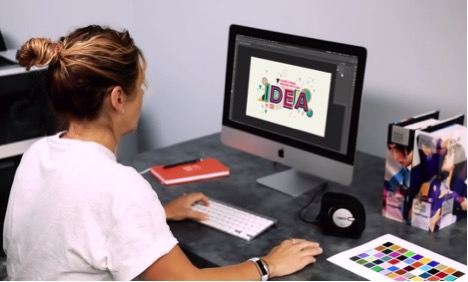
Il suffit de 2 à 7 secondes. Tout à fait, ce minuscule laps de temps représente ce qu’un consommateur consacre à la prise de nombreuses décisions d’achat. Voilà le « premier moment de vérité » dont on parle tant et qui fait même l’objet de recherches. Les solutions de gestion des couleurs d’X-Rite pour l’impression et l’emballage assurent l’excellence en matière de contr&oci...
Posted March 15, 2023 by Cindy Cooperman
It’s important to ensure design intent is realized each time and everywhere a product appears. But with so many variables to impact print quality, how can brands utilize suppliers around the world and still achieve consistent color? Our X-Rite Pantone Packaging Color Experts have designed a series of consulting services and workshops to help you get the most from your print, packaging, plastic or textile value chain. Offered both online and onsite, these interactive sessions i...
Posted December 06, 2022 by Cindy Cooperman
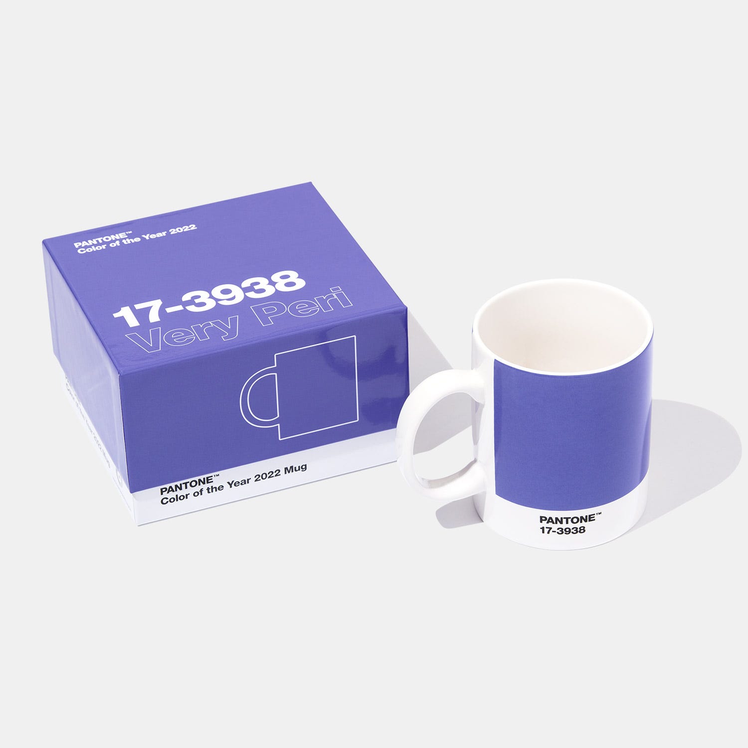
Last week Pantone announced the Pantone Color of the Year 2020 - Very Peri (PANTONE 17-3938). The Pantone Color of the Year announcement isn’t just important for designers. Since this color will set the stage for upcoming trends, brand owners should also take notice to capitalize on this trending color. Bring Very Peri to Market, Fast. Is Virtual Design the Answer? The fashion and apparel industry began embracing virtual design years ago. Luxury brands like Louis Vuitton, Burberry, ...
Posted December 14, 2021 by X-Rite Color
La gestion des couleurs ICC permet de disposer d’un flux de production prévisible, régulier et reproductible, de la capture à la sortie finale, en passant par l’épreuvage. Pour parvenir à un flux de production intégrant la gestion des couleurs, il est nécessaire d’étalonner vos instruments et de créer un profil ICC pour chacun d’entre eux, y compris l’appareil photo, l’écran, le projecteur, le scanner et l’imprimante. Pourquoi étalonner et créer des profils ? Afin d’obtenir les meilleu...
Posted January 27, 2021 by Ray Cheydleur
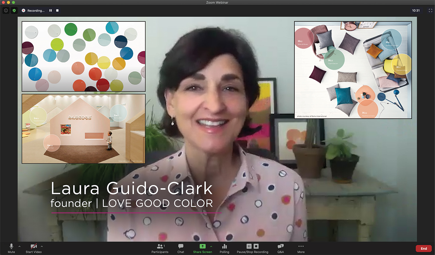
Recently we had the opportunity to sit down with Laura Guido-Clark, a consumer products designer of color, material, and texture. She has been dubbed an “Experience Consultant,” which reflects her interest and study of human reactions to the look and feel of new products. Photo by Laura Flippen. We asked Guido-Clark to speak with us because we also appreciate the importance of color in our lives. Q. What inspired you to pursue a career in color? A. When I wa...
Posted September 01, 2020 by X-Rite Color

Appearance is more than just color. It’s an all-inclusive look at everything inherent to an object, including texture, gloss, transparency, translucency, and special effects like sparkle and shimmer. When viewed from different angles or under different lighting conditions, appearance effects can change our perception of color. That's why it’s important to control both color and appearance throughout design and development. Durable goods brands use appearance effects to captur...
Posted February 20, 2020 by X-Rite Color

Virtual reality has re-imagined the art of apparel and footwear design. 3D design programs like MODO, KeyShot, CLO, Browzwear, Optitex, and Lectra augment the creativity of color and material designers to virtually construct patterns and render realistic 3D garments. This is exciting technology for brands that want to reduce waste for a greener footprint and accelerate design to keep up with fast fashion. However, designers are notoriously tactile. They need to touch, feel, and gain a...
Posted October 24, 2019 by Bruce Wright

Bien que les professionnels du plastique gèrent les problèmes de couleur dans le flux de production depuis de nombreuses années, la dynamique évolue à nouveau. De l’électronique grand public aux pièces automobiles et aux emballages souples, un nombre croissant de marques intègrent des finitions à effets spéciaux dans leurs produits. Si des rendus métallisés ou nacrés et d’autres effets complexes sont magnifiques et mettent les marques en valeur en rayon, ils n’en présentent pas moins de nouvell...
Posted October 03, 2019 by Thomas Meeker
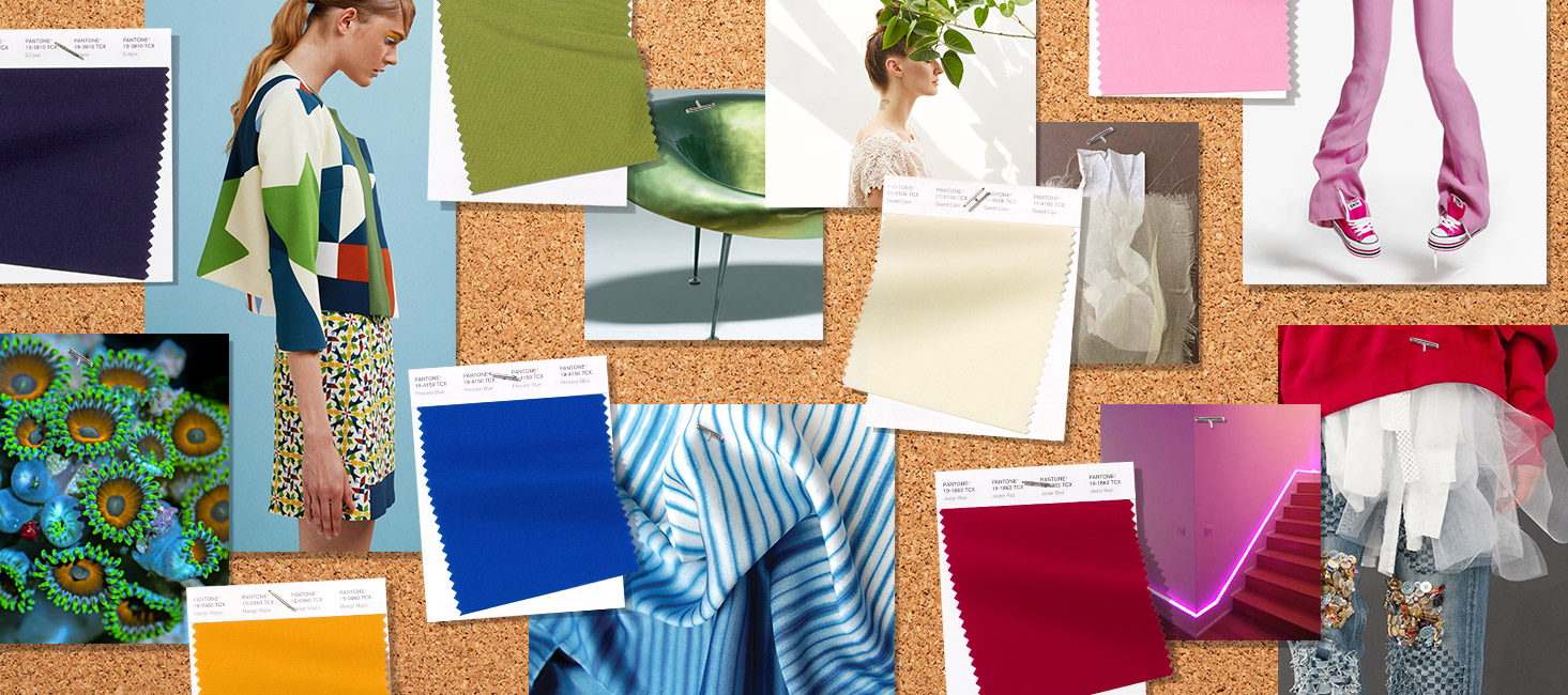
As we move through spring and into summer, we’re revisiting Pantone Color Institute’s Spring/Summer 2019 Fashion Color Trend Report. This season’s report features the top 12 stand out colors as well as current takes on four classic neutrals. Images extracted with permission from PANTONEVIEW Colour Planner Spring/Summer 2019. According to Leatrice Eiseman, Executive Director of the Pantone Color Institute, “This new mindset underscores a...
Posted June 10, 2019 by X-Rite Color
A senior design leader at a large beverage company recently shared his thoughts on the definition of Design Thinking on LinkedIn, asking other members of the community to contribute their own thoughts alongside his. Hundreds of comments ensued. The post appears to be part of a multi-week campaign to position Design Thinking as a way to approach business problems and garner attention from business executives. And we know that this attention has been hard to capture. A survey of over 600 designers...
Posted December 21, 2017 by Adrián Fernández

Nous avons récemment écrit sur l’influence de l’apparence sur la couleur. Cet article porte sur certaines des caractéristiques qui influencent l’apparence d’un objet, telles que la texture, la brillance, la transparence et les effets spéciaux, et explique pourquoi il est essentiel de décrire l’apparence dès les premières étapes du flux de conception. Alors que les programmes 3D tentent depuis des années...
Posted November 29, 2017 by Thomas Meeker
You think you’re doing everything right, but your color isn’t consistent. Why? Through the years, designers have used many tools to help them specify color. Color swatches, style guides and product prototypes have been effective, but with the advent of the digital world, these physical tools are no longer enough. To be efficient, designers need to be SPECIFIC. X-Rite Pantone President Ron Voigt recently published an article in MediaPost that explains why. To be effective, designers n...
Posted November 17, 2017 by Cindy Cooperman

Appearance is more than simply color. It’s a comprehensive look at everything inherent to each unique material we come in contact with, including texture, gloss, transparency, and special effects. Each of these characteristics plays a part and has an effect on overall appearance and understanding in relation to a single material. Objects may have several elements that affect appearance, such as the material’s surface texture, construction, overall geometry and micro-surface. The environ...
Posted October 24, 2017 by Thomas Meeker

I spent a few years working in Paris, where the Seine River has played a pivotal role in the shaping of the city’s personality. As I stayed longer and got to know the city and its people better, one of the things that became clear to me was that the Seine River physically separated two distinct cultures of the city. Image courtesy of www.aparisguide.com The left bank, including the Latin Quarter, Montparnasse, and Sorbonne, is all about creativity, design and ideation. The right bank is more sop...
Posted August 01, 2017 by X-Rite Color
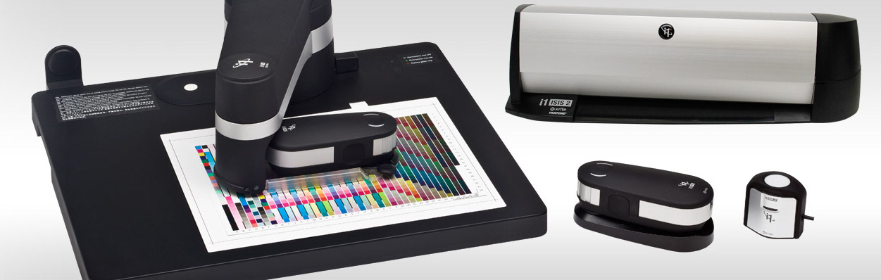
With today’s complex cross-media campaigns, accurate profiling is even more important for managing customer expectations across the color supply chain. Our i1Pro 2 solutions help photographers, videographers, prepress and digital printers create profiles for the best color on monitors, scanners, projectors, printers, and online web-to-print submission tools. But with so many to choose from, how do you know which is the right tool for your color workflow? Whether you’re looking to add a new comp...
Posted April 11, 2017 by Ray Cheydleur

FLEXO Magazine just published a study conducted by Clemson University, Sun Chemical, and X-Rite that verifies that PantoneLIVE Dependent Standard Targets can be achieved with 98% accuracy. This is big news for the many brand owners, designers, prepress professionals, printers and converters around the world who rely on PantoneLIVE to communicate and accurately produce their color. The focus of PantoneLIVE is to protect brand colors and ensure production consistency across everything from flexibl...
Posted August 31, 2015 by X-Rite Color
