

CiF3200으로 마침내 정확하게 측정할 수 있는 5가지 소재 문제 수년간 다양한 산업 분야의 색상 팀은 동일한 난제에 직면해 왔습니다. 최신 소재는 크기가 너무 작거나, 표면 처리가 복잡하거나, 질감이 너무 심하거나, 너무 복잡하여 기존 분광측색계로는 안정적으로 측정하기 어려운 것이 많습니다. 부품이 측정구를 완전히 덮지 못하거나, 다중 색상, 복잡한 패턴, 고르지 않은 표면이 포함된 경우 측정 가능한 옵션은 급속히 줄어듭니다. 많은 기업들이 육안 검사에 의존하게 되면서 생산 속도가 느려지고 주관적 판단이 개입하게 됩니다. CiF3200 은 이러한 문제를 해결합니다. 불과 2mm의 작은 가상 측정구가 있고, 복잡한 표면에서 색을 분리하는 이미징 기능을 갖춘 CiF3200은 기존에는 측정이 불가능했던 소재 측정 시 정확성과 반복성, 일관성을 제공합니다. 정밀한 색 데이터를 수집할 뿐만 아니라 공급망 전반에 걸쳐 디지털 표준을 공유함으로써 모호성 때문에 지연되었던 부분을 명...
Posted 16 March 2026 by X-Rite Color

오프셋 인쇄에서 정확한 색을 구현하는 작업이 항상 빠르고 쉬운 일은 아닙니다. 컬러 바를 측정하고 잉크 키를 조정하는 수작업은 시간이 많이 소요되고 작업자 오류의 가능성을 높입니다. 그동안 프레스는 계속 가동되어 용지와 잉크가 낭비됩니다. 정확하고 반복 가능한 색을 얻으려면 인쇄 공정을 효율적인 제조 공정으로 전환하고 모든 단계의 효율성을 높여야 합니다. 많은 경우에 폐쇄 루프 자동화 솔루션이 해답입니다. 폐쇄 루프 시스템은 프레스 시트에서 직접 스펙트럼 데이터를 캡처하고 잉크 키를 자동으로 업데이트하여 프로세스를 자동화합니다. 원하는 색 구현이 늦어질 때 발생하는 용지와 잉크 비용을 절감하고, 소량 인쇄의 수익성을 높이며, 작업자 개입을 최소화합니다. 기존 워크플로보다 훨씬 빠르고 정확하기 때문에 투자 비용을 거의 즉시 회수할 수 있습니다. 귀사의 인쇄 공정은 폐쇄 루프 솔루션을 도입할 준비가 되었습니까? 오늘은 업그레이드에 필요한 도구와 소프트웨어를 살펴보겠습니다. 프레스 시...
Posted 12 March 2026 by Ray Cheydleur

형광증백 처리 흰색의 관리가 어려운 이유 형광증백 흰색은 섬유 산업 전반에 걸쳐 널리 사용되지만, 측색 및 품질 관리 측면에서 가장 오해가 많은 분야 중 하나입니다. 형광증백제(OBA)는 자외선(UV)을 흡수하여 가시광선 스펙트럼의 청색 영역으로 재방출함으로써 지각되는 백색도를 높이기 위해 직물에 첨가됩니다. 이러한 효과로 인해 사람의 눈에는 흰색이 더 깨끗하고 밝게 보이지만, 공급업체가 이러한 물질을 일관되게 측정, 교정 및 관리하는 데 상당한 어려움이 있습니다. 생산 규모가 지역, 소재, 공급업체 측면에서 확대됨에 따라 그 어려움이 더욱 두드러집니다. 실험실에서 허용 가능한 수준으로 보이는 색상도 대량 생산 환경, 다른 조명 조건, 세탁 후에는 매우 다르게 나타날 수 있어 혼란과 지연, 재작업이 발생합니다. 이러한 복잡성 때문에 형광증백 흰색은 섬유/직물 산업 전반에서 계속 활발한 논의 주제로 거론되고 있습니다. OBA는 기존 색상과는 다르게 작용함 형광증백 흰색의 핵심 과제 ...
Posted 24 February 2026 by X-Rite Color

변동성 속에서 혁신 수용 섬유 산업은 경제적 불확실성, 변화하는 소비자의 우선순위, 급속한 기술 변화라는 중요한 전환점에 서 있습니다. 맥킨지 State of Fashion 2025 보고서에 따르면, 브랜드사들은 빠듯한 마진과 변화하는 글로벌 공급망 속에서 회복력과 효율성 향상을 위해 운영 방식을 재고하고 있습니다. 지속가능성, 디지털 전환, 가치 중심의 쇼핑은 이제 업계 전략의 핵심입니다. 섬유 산업을 이끄는 주요 트렌드 공급망 다변화 및 회복력 강화 브랜드사들은 특히 아시아 지역에서 공급처를 다변화하여 더욱 탄력적인 공급망을 구축하고 있습니다. 인도, 베트남과 같은 신흥 시장은 글로벌 네트워크를 재편하는 중요한 허브로 부상하고 있습니다. 근거리 생산(니어쇼어링)과 디지털화는 기업들이 시장 변화와 혼란에 더욱 빠르게 대응하도록 지원합니다. 지속가능성과 순환 ...
Posted 19 February 2026 by X-Rite Color

오늘날 섬유 산업에서 일관된 색상과 외관을 제공하는 것은 브랜드 평판과 고객 만족도 측면에서 매우 중요합니다. 디지털 전환이 가속화됨에 따라 브랜드사와 공급업체는 글로벌 공급망 전반에 걸쳐 색상 및 외관 데이터를 정확하게 전달하기 위해 표준화된 파일 형식을 이용하고 있습니다. CxF, AxF, QTX 이 세 가지 형식은 그 과정에서 핵심적 역할을 합니다. CxF, AxF, QTX란 무엇인가요? CxF (Color Exchange Format): X-Rite에서 개발하고 ISO 17972로 표준화된 CxF는 디지털 컬러 데이터 교환을 위한 업계 표준입니다. XML 기반 구조는 스펙트럼 컬러 데이터와 메타데이터(장치, 광원, 측정 조건)를 저장하여 색 정확성을 보장하고 장치 간 및 워크플로 전반에 걸쳐 상호 운용성을 제공합니다. CxF는 인쇄, 포장, 직물 및 자동차 코팅 분야에서 색 사양과 규정 준수를 위해 널리 사용됩니다. 왜 CxF를 선택하나요? CxF는 ISO 표준으로 인정받...
Posted 18 February 2026 by X-Rite Color

흰색 인쇄의 어려움 2026년 PANTONE 올해의 컬러 '클라우드 댄서'는 단순한 트렌드를 넘어 포장 패키징 업체들에게 기술적 과제를 제시합니다. 흰색은 단순해 보이지만, 소재 색상, 잉크 배합, 형광증백제(OBA) 첨가 여부에 따라 색 표현이 크게 달라집니다. 따라서 인쇄 업체의 목표는 모든 생산 라인, 모든 공장, 모든 지역에서 일관되고 정확한 흰색 구현하는 것입니다. 포장재의 흰색이 복잡한 이유 흰색은 소재의 고유 색상과 표면 처리에 매우 민감합니다. 밝기를 높이기 위해 용지에 첨가되는 OBA 때문에 다양한 조명 조건에 따라 흰색이 다르게 보일 수 있습니다. OBA를 "제어"할 수는 없으며, 그 영향을 측정하고 그에 따라 공정을 조정하는 것만 가능합니다. 색채 측정 과학: 소재 우선 ‘클라우드 댄서’ 구현의 출발점은 소재입니다. 분광측색계를 사용하여 소재의 L*a*b* 값과 백색도를 측정할 수 있습니다. 올바른 측정 모드(M...
Posted 22 January 2026 by X-Rite Color

Advancing Surface Texture Measurement for Accurate 3D Visualization In today’s digital design landscape, color and surface texture are inseparable when it comes to accurately visualizing materials. Whether you’re working with textiles, plastics, coatings, or automotive finishes, the way a surface interacts with light—its texture, gloss, and reflectivity—can dramatically alter perceived color and appearance. Why Surface Texture Matters Historically, color has been the pri...
Posted 11 December 2025 by X-Rite Color

2026년 Pantone 올해의 컬러인 PANTONE 11-4201 클라우드 댄서(Cloud Dancer)는 가볍고 부드러운 느낌의 흰색으로, 창의력, 고요한 사색, 그리고 평온함의 공간을 열어준다고 묘사됩니다. 따뜻함과 차가움을 동시에 지닌 이 흰색은 고요한 존재감을 통해 시끄러운 세상 속에서 명료함을 갈망하는 마음을 상징합니다. 그리고 지난주 이 색이 발표되자마자 오래된 논쟁이 다시 불거졌습니다. 흰색은 과연 컬러일까요? 흔히 흰색에는 “색이 없다”고 생각하지만, 색채 과학계는 그렇지 않다고 말합니다. 이 중요한 색을 이해하기 위해, 우리가 클라우드 댄서를 보는 방식과 그 생산 과정에 숨겨진 과학적 원리를 살펴보겠습니다. 색의 진정한 근원은 빛입니다 인간의 색 인식은 빛에서 시작됩니다. 물체는 본래 색을 가지고 있지 않습니다. 대신 특정 파장의 빛은 흡수하고 다른 파장의 빛은 반사할 뿐입니다. 반사된 빛의 혼합물이 우리 눈에 들어오고, 뇌는 그 신호를 색으...
Posted 10 December 2025 by X-Rite Color

Windows 10 Support Has Ended: What You Need to Know Windows 10 End of Support: What It Means for Your Business Microsoft officially ended support for Windows 10 on October 14, 2025. This means no more security updates, patches, or technical support—leaving systems running Windows 10 increasingly vulnerable to security threats and compliance risks. If your business relies on legacy software or hardware, now is the critical moment to plan your upgrade path and ensure your operations remain ...
Posted 07 November 2025 by X-Rite Color

Discover the Unified My X-Rite Portal: One Platform for All Customers At X-Rite, our mission has always been to make it simple, seamless, and efficient for you to manage your devices, software, and services. With the My X-Rite online portal, we’ve already taken major steps to give you one place to handle service requests, track orders, and access important product information. Now, we’re excited to share the next big evolution: merging X-Rite Link and My X-Rite into a single...
Posted 23 October 2025 by X-Rite Color

Why Benchtop Spectrophotometer Inter-Instrument Agreement & Repeatability Matter for Brand Suppliers
In today’s global supply chain, brand suppliers are under constant pressure to deliver products that meet strict color standards, regardless of where or how they are produced. The key to achieving this consistency lies in the performance of benchtop spectrophotometers—specifically, their inter-instrument agreement and repeatability. What Is Inter-Instrument Agreement? Inter-instrument agreement refers to how closely two spectrophotometers of the same make and model can replicate a c...
Posted 22 October 2025 by X-Rite Color

Top Manufacturing Trends in 2025 The manufacturing industry is undergoing a seismic shift in 2025, driven by rapid technological innovation, sustainability imperatives, and the need for greater agility. As manufacturers adapt to these changes, color accuracy and quality control remain critical to maintaining brand integrity, reducing waste, and meeting customer expectations. At X-Rite, we’re uniquely positioned to help manufacturers navigate these trends with confidence. According to indu...
Posted 14 October 2025 by X-Rite Color

5 Steps to Digitize Your Press Room and Defend Your Margins Margins in print are under pressure. Rising substrate costs, labor shortages, and energy volatility are squeezing profitability. At the same time, compliance audits—ISO, G7, internal reviews—are becoming more frequent and more demanding. Digitizing your press room isn’t just about passing audits. It’s about building a lean, smart operation that protects your bottom line. Here are five steps to get there: Step 1...
Posted 05 September 2025 by X-Rite Color

Sustainability in Manufacturing Is No Longer Optional From brand mandates to government regulations, sustainability is now a core requirement in print and packaging. But for many print teams, the path to greener operations feels like a trade-off: reduce waste or maintain quality—not both. The good news? You don’t have to choose. The Hidden Waste in Traditional Workflows Manual color control and fragmented workflows create more waste than you think: Reprints due to color mi...
Posted 05 September 2025 by X-Rite Color

For print and packaging, color accuracy isn’t optional—it’s essential. Yet many teams still rely on manual color control methods that introduce variability, slow down production, and quietly erode margins. If your workflow feels more reactive than repeatable, it may be time to modernize. Here are the 10 signs to watch for: Your color targets live in email threads Operators waste time searching or guessing—costing setup time and risking errors. Operators rely...
Posted 05 September 2025 by X-Rite Color

The Hidden Cost of Color Inconsistency on Packaging Color inconsistency in print and packaging isn’t just a visual issue—it’s a margin killer. Decentralized workflows, manual setups, and tribal knowledge create inefficiencies that quietly erode profitability. From wasted substrate to delayed approvals, the hidden costs add up fast. The Operational Fallout of Color Inconsistency Longer setup times as teams hunt for historical data Inconsistent output across p...
Posted 04 September 2025 by X-Rite Color

White ink is one of the most expensive and widely used inks in packaging production—but it’s often under-optimized. In this blog, we’ll explore how MeasureColor enables printers to maximize white ink opacity, reduce waste, and boost overall print performance. Why White Ink Matters White ink acts as the foundation layer when printing on transparent, metallic, or colored substrates. It ensures brand colors are vibrant and consistent. But due to its high-volume use and cost...
Posted 20 August 2025 by X-Rite Color

This is the third blog in our MeasureColor in Action blog series, which introduces key features to help you achieve smarter, more efficient print production. MeasureColor: Optimize Dot Gain for Better Print Quality Achieving consistent print quality hinges on your ability to control dot gain—a critical but often overlooked variable. Dot gain plays a major role in color accuracy, image sharpness, and overall visual impact, especially in packaging and extended gamut workflows. With MeasureC...
Posted 11 August 2025 by X-Rite Color

This is the second blog in our MeasureColor in Action blog series, which introduces key features to help you achieve smarter, more efficient print production. MeasureColor: Manage Digital Color Targets with Confidence In today’s complex and fast-moving print environments, managing digital color targets and ICC profiles efficiently is essential for delivering consistent, high-quality results. Without a structured system, it's easy to lose control over your color libraries—leading to ...
Posted 08 August 2025 by X-Rite Color

This is the first blog in our MeasureColor in Action blog series, which introduces key features to help you achieve smarter, more efficient print production. MeasureColor: A User-Friendly Interface for Faster Print Decisions In today’s print industry, finding skilled press operators is more challenging than ever. At the same time, production environments are becoming increasingly complex—often combining multiple printing techniques and a wide range of press makes and models. That&rs...
Posted 07 August 2025 by X-Rite Color
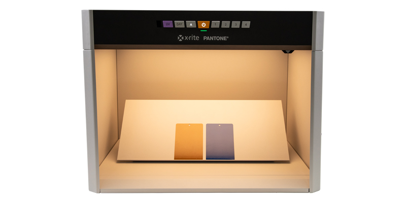
What’s the Difference Between a Light Booth and a Lighting Box? When it comes to achieving consistent lighting for color evaluation, photography, or product display, two tools often come up: light booths and lighting boxes. While they may sound similar, they serve different purposes and are designed for distinct use cases. In this post, we’ll break down the key differences between the two and help you decide which one is right for your needs. What Is a Light Booth? A light booth&mdas...
Posted 31 July 2025 by X-Rite Color

The Competitive Edge in Color and Appearance: Why Global Brands Trust Us In today’s fast-paced, quality-driven industries, precision in color measurement is essential—but it’s only the beginning. True leadership in the color space comes from a commitment to innovation, global service, and a holistic approach that transforms color into a strategic advantage. Decades of Expertise, Proven Results With over 60 years of experience in the color industry, we’ve helped define th...
Posted 29 July 2025 by X-Rite Color

Color Matching Machines for Retail Paint Solutions In the world of retail paint, precision in color matching is crucial. Having the right tools to ensure accurate color matching can make all the difference. Enter the color matching machine—a revolutionary tool that ensures your paint colors are consistent, vibrant, and true to your customer's vision. What is a Color Matching Machine? A color matching machine is a device designed to measure and match colors with high precision. These mach...
Posted 11 July 2025 by X-Rite Color

Why Traditional QC Processes No Longer Cut It for Global Brands In the world of textile manufacturing, quality control (QC) is more than a checkpoint—it’s a brand promise. For suppliers working with global leaders like adidas and H&M, the stakes are high. Any inconsistency in color or finish can lead to costly rework, rejected shipments, or worse—lost business from the brand. If your QC process still relies on visual assessments, manual logs, or physical standards, you m...
Posted 10 July 2025 by X-Rite Color

Five Important Components of a Quality Control Program Step 1: Quantify Color with a Spectrophotometer Human vision is subjective—terms like “a bit brighter” or “slightly darker” are open to interpretation. That’s why spectrophotometers are essential. These instruments measure color by analyzing how light transfers through or reflects off a surface, producing a spectral reflectance curve—essentially a color’s unique fingerprint. This data-driven ...
Posted 10 July 2025 by Tim Mouw

When your reputation relies on your print quality, accurate, repeatable color control isn’t optional— it’s a necessity. The combination of the eXact 2 Portable Spectrophotometer and MeasureColor Software delivers a robust, integrated solution that empowers print and packaging professionals to achieve precise, repeatable color across jobs, substrates, and devices. eXact 2: Precision Hardware for Next-Level Color Control The eXact 2 is X-Rite’s latest handhe...
Posted 08 July 2025 by X-Rite Color

X-Rite Video Gallery- Your Ultimate Resource for Color Education Welcome to the X-Rite Video Gallery Whether you're a novice or an experienced professional, the X-Rite Video Gallery offers in-depth color education and practical training to enhance your color management skills. Our carefully curated collection of videos provides valuable insights and expert tips designed to help you master color accuracy and optimize your workflow. In this blog, we'll highlight five must-watch videos that sho...
Posted 08 July 2025 by X-Rite Color

Ensuring color consistency is not just a matter of aesthetics; it's a critical component of brand identity and consumer trust. Imagine a world where Coca-Cola's iconic red varies from can-to-can, or where the blue labels of Alcon eye drops don’t match on the shelf. Such inconsistencies can confuse customers and dilute brand recognition. For big brands, maintaining brand color consistency across all platforms and materials is paramount. This guide will introduce the essential s...
Posted 08 July 2025 by X-Rite Color

Maintaining color consistency across global supply chains is one of the biggest challenges facing brands and packaging printers today. Whether you're producing folding cartons, flexible packaging, or labels, color variation can happen at any stage — from design to final production. But why does this happen, and more importantly, how can you fix it? Where Does Color Go Wrong? At the start of every print project, color expectations are set. Unfortunately, this is often where problems begin. ...
Posted 17 April 2025 by X-Rite Color

Ensuring color consistency in commercial printing and packaging is critical for maintaining brand integrity and meeting customer expectations. One of the most effective ways to achieve this is by leveraging quality control software that utilizes precise color tolerancing methods. In this blog, we will explore different tolerancing techniques and how QC software enhances accuracy in color control. The Challenge of Visual Color Assessment Many assume that visual inspection alone is sufficient for...
Posted 03 April 2025 by X-Rite Color

In the fast-paced world of print and packaging, achieving precise color accuracy is a critical challenge. Whether you're matching brand colors, controlling ink density, or ensuring quality consistency, selecting the right color measurement instrument can make all the difference. Understanding Color Measurement Instruments Selecting the right instrument for your print operation depends on factors such as production environment, measurement requirements, and industry standards. There are several ...
Posted 11 March 2025 by X-Rite Color

When it comes to achieving precise and consistent color measurement, investing in a high-quality spectrophotometer is essential. Spectrophotometers are critical to color quality because they provide repeatable and reliable data that ensure products meet strict color standards. Whether you're in the business of manufacturing durable goods, apparel, cosmetics, or building materials, the right spectrophotometer can make all the difference by detecting even the slightest variations in color. These ...
Posted 11 March 2025 by X-Rite Color

인쇄 시 색상 정확도는 매우 중요합니다. 그러나 색상 일관성 달성은 어려운 작업이 될 수 있으며, 인쇄 시 색 거부로 이어질 수 있습니다. 색 거부를 야기하는 일반적인 인쇄실 문제 7가지와 그 예방법을 소개합니다. 색 인식은 개인마다 다릅니다. 색 인식은 사람마다 상당히 다를 수 있다는 점을 알고 계셨나요? 이러한 가변성은 색상의 정확성에 대한 의견 불일치로 이어질 수 있으며, 인쇄 시 색상이 거부되는 결과를 초래할 수 있습니다. 이러한 상황을 완화하려면 표준화된 컬러 레퍼런스 및 도구를 사용하는 것이 필수적입니다. 환경 요인이 색 정확도에 영향을 미칩니다. 조명 조건, 온도 및 습도는 모두 색상 정확도에 영향을 줄 수 있습니다. 예를 들어, 자연광과 인공 조명에서 색이 다르게 보일 수 있습니다. 인쇄 시설에 통제된 환경을 유지하면 색 불일치를 줄이는 데 도움이 될 수 있습니다. 잉크 배합은 매우 중요한 역할을 합니다.&nbs...
Posted 24 February 2025 by X-Rite Color

컬러는 인쇄 및 패키징의 강력한 도구로서 소비자의 결정에 영향을 미치고 브랜드 정체성을 정의합니다. 고급 제품이든 일상용품이든 정확한 컬러는 브랜드 일관성을 유지하면서도 소재가 돋보이도록 합니다. 그러나 정확한 컬러를 얻는 것은 어려운 작업일 수 있으며, 특히 시각적 평가에만 의존하는 경우에는 더욱 그렇습니다. 제어된 조명이 어떻게 색 인식을 개선하는지, 그리고 효과적인 시각적 색상 평가를 위해 왜 필수품인지 그 이유를 살펴보겠습니다. 색상 정확도에서 제어된 조명의 역할 정밀한 장비와 소프트웨어로 색을 측정하더라도, 일관성을 보장하려면 여전히 시각적 평가가 필수적입니다. 제어된 조명은 생산 프로세스 전반에 걸쳐 정확한 색 평가를 보장하기 위한 표준 조건을 제공합니다. 예를 들어, ISO 3664:2009는 그래픽 산업의 관찰 조건에 대한 표준을 설정하여 ISO 13655:2009의 M1 조건과 같은 측정 표준과 일치하도록 보장합니다. D50 일광 또는 기타 표준 조명을 장착하여 적...
Posted 24 February 2025 by X-Rite Color

리테일 LED 조명의 시각적 색 평가를 위한 산업 표준의 필요성 소매업계에서 조명은 고객의 제품 인식에 영향을 미치는 중요한 요소입니다. 그러나 표준화된 LED 조명이 부족하면 소매업체와 소비자 모두에게 영향을 미칠 수 있는 상당한 어려움이 발생합니다. 일관성 없는 색상 재현 표준화된 LED 조명이 없을 때 주요 문제 중 하나는 색상 재현에 일관성이 없다는 것입니다. 각각의 LED 조명마다 다양한 색온도와 스펙트럼 분포가 나타날 수 있으며, 따라서 조명 조건이 다를 경우 제품의 보이는 모습에 차이가 생깁니다. 이러한 불일치로 인해 매장에서 보이는 제품과 집에서 보이는 제품이 달라 보여 고객 불만이 발생하고 반품 가능성으로 이어질 수 있습니다. 브랜드 평판에 영향 일관성 없는 조명은 고객 만족도에 영향을 미칠 뿐만 아니라 브랜드 평판에 폭넓은 영향을 미칩니다. 조명의 편차로 인해 제품 모습이 예상대로 나타나지 않으면 브랜드에 대한 신뢰가 떨어질 수 있습니다. 고객은 제품의 품질과 ...
Posted 11 February 2025 by X-Rite Color

Pantone’s Color of the Year for 2025: PANTONE 17-1230 Mocha Mousse, is a warm, inviting brown that evokes thoughts of chocolate mousse and rich lattes. With its subtle elegance and versatility, Mocha Mousse promises to influence design trends, especially in the textile industry, offering a versatile and sophisticated foundation for fabric designs and textile products. This earthy, warm color is the perfect balance of timeless elegance and contemporary appeal, making it ideal for manufactu...
Posted 31 January 2025 by X-Rite Color

The unveiling of Pantone’s Color of the Year is always an exciting moment across industries, and for 2025, PANTONE 17-1230 Mocha Mousse has taken center stage. This rich, warm brown evokes comfort, reliability, and sophistication, making it a perfect choice for consumer-packaged goods (CPG) brands aiming to establish a strong shelf presence. However, managing the consistency of such a nuanced color across diverse packaging materials and suppliers is no small feat. That’s where a Pri...
Posted 30 January 2025 by X-Rite Color

포장된 소비재(CPG)의 세계에서 색상은 고객을 유치하고 브랜드 정체성을 전달할 때 중요한 역할을 합니다. 탄산음료 캔의 생생한 빨간색이든 스킨케어 제품의 차분한 파란색이든 색상 일관성은 브랜드 인지도와 신뢰성 유지를 위해 중요합니다. 이 블로그에서는 포장재 디자인에서 색상의 중요성, 그리고 X-Rite Pantone이 브랜드사로 하여금 포장 디자인과 실행 시에 우수한 색상 일관성을 달성하도록 어떻게 지원하는지 알아보겠습니다. 포장재 디자인에서 색상 일관성이 중요한 이유 포장 디자인에서 색상의 일관성은 여러 가지 이유로 필수적입니다. 첫째, 진열장에서 브랜드가 즉시 인식되도록 합니다. 고객이 모든 제품에서 동일한 색상 조합을 보면 브랜드 정체성이 강화되고 신뢰가 형성됩니다. 반면에 일관되지 않은 색상은 고객을 혼란스럽게 하고 제품이 전문적이지 않게 보일 수 있습니다. 둘째, 포장 디자인의 색상 일관성은 포장재의 매력을 유지하기 위해 중요합...
Posted 15 January 2025 by X-Rite Color

자동차 분광측색계가 없다면 잘못될 수 있는 5가지 사항 자동차 분광측색계는 자동차 산업에서 중요한 도구이며, 특히 자동차 색상 관리 측면에서 중요합니다. 이러한 첨단 장비는 페인트 색상이 정확하게 일치하고, 일관되게 적용되고, 자동차 마감에 필요한 표준을 충족하도록 보장합니다. 자동차 분광측색계가 없으면 차량 페인트 작업의 품질, 효율성 및 전반적인 만족도에 영향을 미치는 여러 가지 문제가 발생할 수 있습니다. 잘못될 수 있는 다섯 가지 사항은 다음과 같습니다. 1. 부정확한 컬러 매칭 문제점: 자동차 산업에서 가장 큰 과제 중 하나는 차량 수리 또는 재도장 시에 완벽한 컬러 매칭을 달성하는 것입니다. 자동차 분광측색계가 없으면 조명, 페인트 노화 및 제조업체 색상 코드의 변화로 인해 페인트의 정확한 색조를 맞추는 것이 더 어려워집니다. 결과: 따라서 원래 영역과 재도장 영역 사이에 눈에 띄는 색 불일치가 발생하여 차량의 미적 품질에 영향을 미치고 잠재적으...
Posted 07 January 2025 by X-Rite Color

색상 일관성의 미래: 산업 표준을 위한 LED 조명 솔루션 수년 동안 형광등은 정확한 색상 평가가 필요한 산업에서 주요 품목이었지만, 점차 그 단점을 무시하기가 어려워지고 있습니다. 형광 조명은 예열 시간이 필요하고 색상 정확도를 왜곡할 수 있으며, 이 두 가지 이유로 생산이 지연되고 샘플 비용이 증가합니다. 더 중요한 것은 형광등에는 수은 등 유해 물질이 포함되어 있어 폐기 절차가 복잡하다는 것입니다. 이 마지막 요인 때문에 규제 기관이 신경을 쓰게 되었고, 마침내 조치가 필요하다는 데에 의견 일치를 보았습니다. EU의 형광등 금지 EU는 현재 2025년 2월에 본격적 형광등 금지를 시행할 준비를 하고 있습니다. 의류, 신발, 자동차, 소비자용 포장재, 건축 자재, 가전제품 등 정밀한 색상 평가가 필요한 산업은 이제 상당한 변화에 직면해 있습니다. 라이트박스와 같은 시각적 컬러 매칭 장치에 널리 사용되는 형광등은 곧 에너지 효율적 대안의 도입으로 단계적으로 폐지되어 기업에 도...
Posted 28 November 2024 by X-Rite Color
