 Passionate about color? We are too.
As a company that prides itself on its color knowledge and enthusiasm, X-Rite Pantone is excited about the various ways ArtPrize showcases the power of color.
Each fall, ArtPrize installs over 1000 works of art in downtown Grand Rapids, attracting thousands of visitors. By using consistent colors in its guides, signs, banners, flags, and merchandise, ArtPrize creates a colorful map that helps both visitors and locals see the city through a different perspective.
For most companies, this color consistency doesn’t come easily. Whether you’re color activating the most attended art event in the world, printing labels for a major brand, or mixing plastic pellets to manufacture a toy car, inconsistent color can cause consumers to question quality and can affect brand integrity.
Today we’ll look at why background and substrate color matters, and how ArtPrize successfully managed this variable in production.
Color palettes are not one size fits all.
The biggest struggle ArtPrize encountered when infusing Grand Rapids with color wasn’t choosing the colors themselves. It was how the different surfaces handled them.
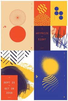
Here’s the color palette for ArtPrize Eight.
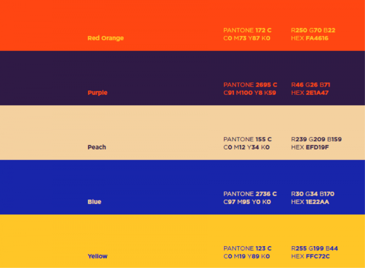
These colors are applied on city sidewalks, banners, guides, and a variety of merchandise.
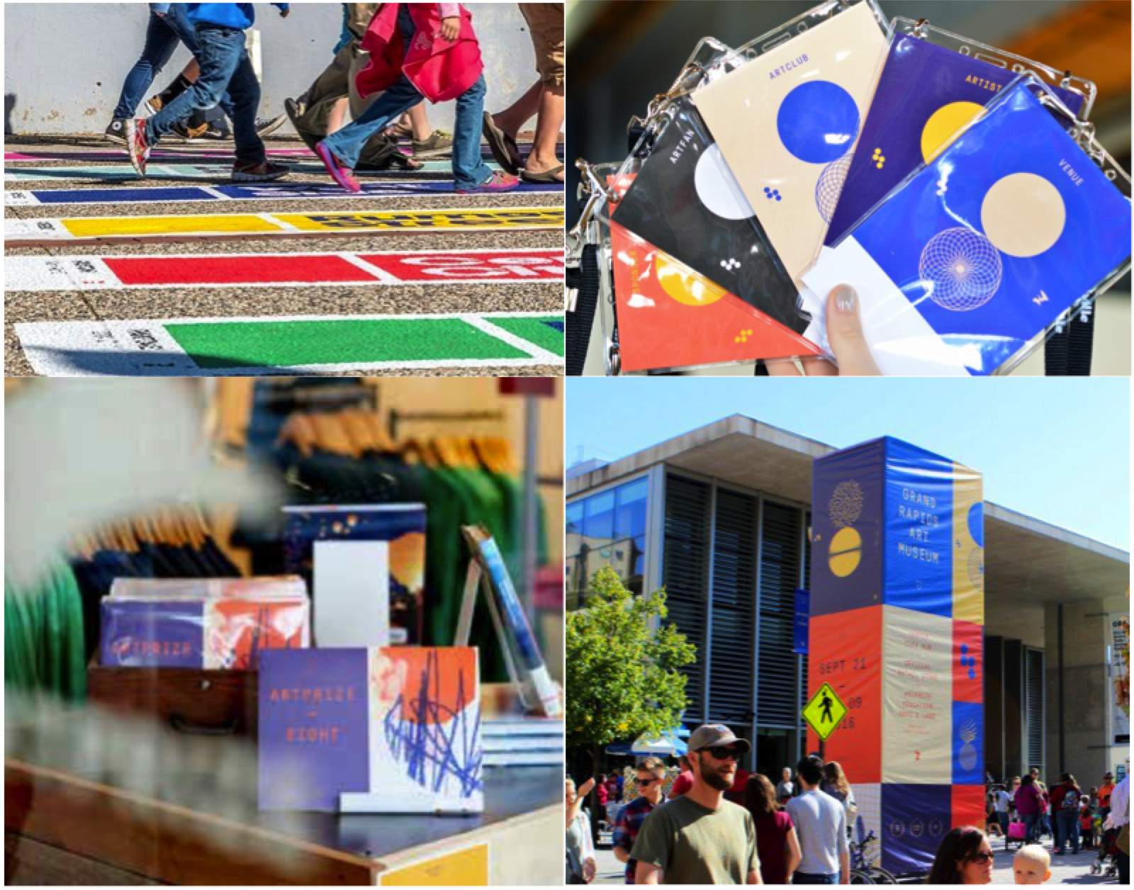
If ArtPrize used the same color for every application – the white corrugated cardboard, the brown newsprint, the nylon flags, the concrete sidewalk, and the multi-colored t-shirts and hats, the results would be far from consistent. That’s because background color can show through and mix with ink and dye to change a color’s appearance.
In addition, different materials absorb colorants in different ways. While some, like a cotton t-shirt, will readily accept dye, other surfaces are harder to color and require multiple coats or adjustments to the formula to get the color right.
Color management can help.
ArtPrize enlisted the help of local design firm Conduit Studio and X-Rite Pantone to ensure its colors remained consistent on every surface. Here is the color management process that worked for them.
1. They gave each color a name. Communicating color is very difficult. What may be dark red to you could signify a completely different color to someone else. This causes problems when the goal is to coordinate an entire event with multiple vendors producing color.
Like so many of our print and industrial customers, Conduit Studio used the gold standard to specify and communicate its ArtPrize palette – the PANTONE® Color Matching System. Sharing the PANTONE swatches with everyone involved in the production of color sets clear expectations and provides a physical resource to help determine whether to approve or reject jobs.

The new PANTONE MASTER COLLECTION for Graphic Designers includes 10,000 PANTONE Colors for instant matching.
2. They made adjustments for consistency. To achieve the target color, each application needed its own formulation that took into consideration the type of surface and the background color of the material. Using a small color measurement device, Conduit Studio measured the colors on each of the materials, compared them to the original inspiration colors to make sure they matched, and made adjustments to get the perfect color. Check out our What is a Spectrophotometer? blog to learn more.
Color measurement devices are essential tools for every color workflow. They come in many shapes and sizes and serve a range of uses, from small handheld devices for specifying and quality checking color around the factory, to the large benchtop instruments used to ensure color formulation is perfect before it’s sent to production.
![The small, handheld CAPSURE device is a favorite for designers wishing to select and communicate inspiration colors. [http://blog.xrite.com/capturing-color-inspiration/]](/-/media/modules/weblog/blog/managing-background-color/image004png.png)
The small, handheld CAPSURE device is a favorite for designers wishing to select and communicate inspiration colors.
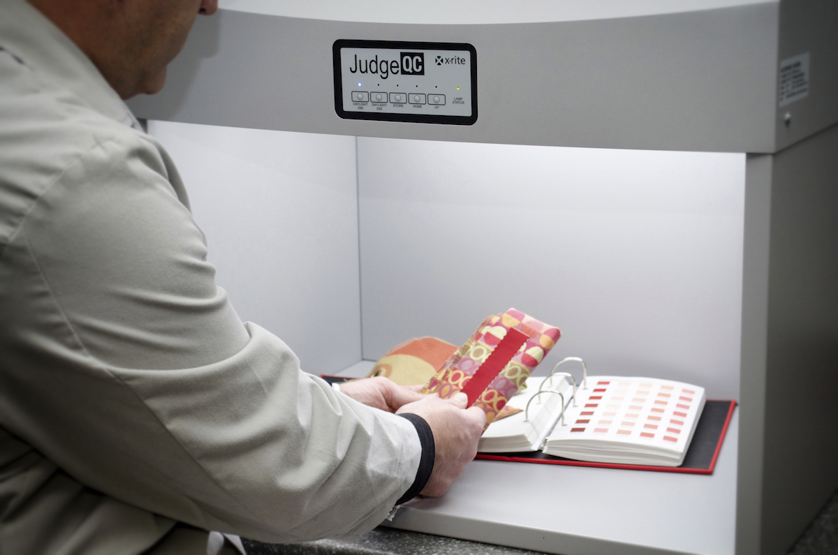
3. They considered lighting. As the signage and merchandise samples came in, staff viewed and compared them under all of the lighting conditions present in ArtPrize venues, such as outdoor, tungsten and fluorescent, to ensure the colors would remain consistent.
As strange as it sounds, objects themselves don’t have color. Their colorants have properties that determine which wavelengths of light are absorbed and which are reflected. It is the mixture of reflected light that enters our eyes and gives us the perception of color. So if the light around you has more blue, like sun on a partly cloudy day, colors will appear bluer. If the light is more yellow, like an incandescent bulb, everything will appear more yellow.
Light booths like this Judge QC help manufacturers compare target colors with samples under multiple lighting conditions to see if adjustments need to be made.
As a leadership sponsor of ArtPrize Eight, we have enjoyed watching color management bring this event to life with amazing accuracy. We look forward to helping you bring your color to life, too. Get in touch to learn more.
