It’s been said that everything you need to know you learned in kindergarten. Does this phrase ring true for print and packaging designers?
In the spirit of spring, we attempted to use a simple childhood activity—dyeing eggs—to solve some of the most perplexing color issues facing the packaging designer/printer relationship.
Here are three lessons to learn about color in print and packaging from our annual egg dyeing ritual.
1. Why do we need black in color printing?
If mixing cyan (blue), magenta (red) and yellow can create every possible color, including black, why do printers need black ink (K) in addition to cyan, magenta and yellow (the other components of CMYK)?
The experiment:
We created a black dye with equal amounts of cyan, magenta and yellow, starting with yellow, adding cyan next and then finally magenta.
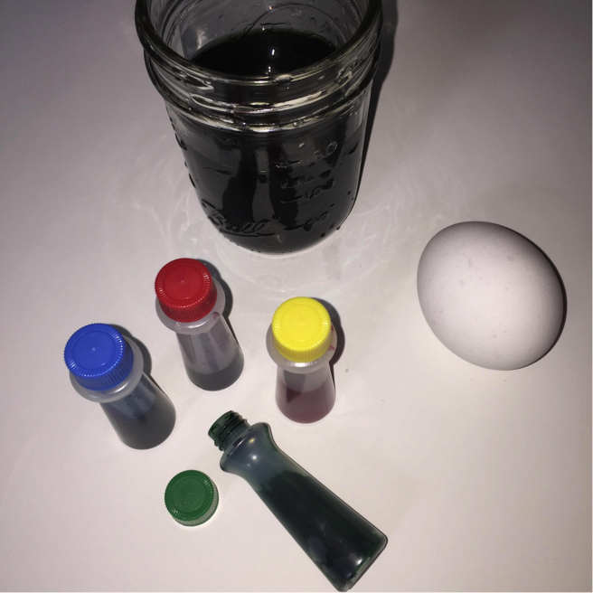
Then we dropped in a white egg and let it sit for 20 minutes. Will the egg come out black?

What did we learn?
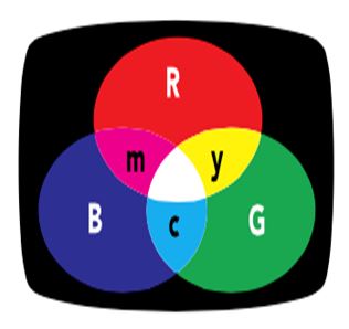
Mixing the additive primaries of red, green and blue in different combinations can create a full spectrum of colors. Combining two pure additive primaries produces a subtractive primary. The subtractive primaries of cyan, magenta and yellow are the opposing colors to red, green and blue.
Similar to our egg dyeing, many printers use cyan, magenta, and yellow to achieve a huge range of colors. When printed on a white substrate, each completely absorbs—or subtracts—its opposing counterpart from the white light. (You can learn more in our Additive vs. Subtractive Color Models post.)
So, if we really wanted to dye an egg black, what would we need to do?
We could either use a lot more cyan, magenta and yellow dye—or add a fourth color, black. In subtractive printing, black (or K, which stands for key) is added to CMY to make four-color printing—CMYK. Black is an important addition to the formulation because it is less expensive, helps neutralize images and graphics, and adds density to shadows.
2. Substrates can have color
You perfectly specify your design, but when you get the proof back from the printer the color isn’t right. What happened?
The experiment:
Eggs come in plenty of colors, and we found these beauties at our local farm.
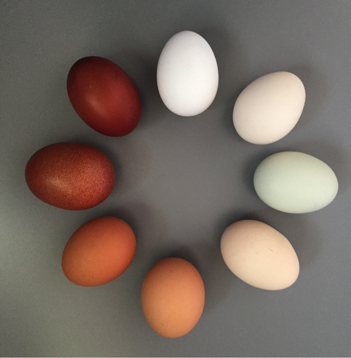
To see how different colors react to the same ink, we dropped them into the same pure red dye for exactly four minutes.

Did they all come out the same shade of red?
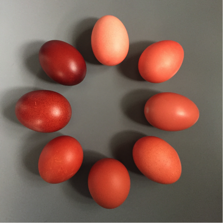
What did we learn?
The color of the background plays a pretty significant role in determining the final color of the dyed egg. Instead of red, each turned a shade of orange or brown.
This is an often-overlooked fact that plagues designers and printers everywhere. When specifying color and formulating ink, you must consider the color of the substrate. Red dye, or ink in the case of printing, will only look red on a pure white background.
Our example is obvious, but even a slight variation in substrate color will affect the final result. You must always consider this, especially when you’re printing the same design on multiple substrates.
3. Color communication is subjective
You want your printer to create “spring colors” for your carton. How do you know their idea of a spring color is the same as yours?
The experiment:
Using the CAPSURE handheld color-matching tool, we measured the color of bright spring flowers and found the closest Pantone Color match for each.

Then we used the color data to mix yellow, orange and red dye baths for the eggs.

Did we achieve our mission of spring colors?

What did we learn?
It’s common for designers to use colors around them for inspiration, then describe them to the printer in a subjective language the printer doesn’t understand. Sunny, peachy, fresh and springy are not colors that can be found in an ink can. Not establishing clear expectations will likely result in rework when the “spring color” your printer creates isn’t the same sunny shade you had in mind.
Be sure your printer understands what you expect. There are many ways to clarify color, including spectral measurements, Pantone Color Books and Munsell color standards.
Of course, we know there’s a lot more to specifying, communicating, and printing accurate color than what we learned in kindergarten. But sometimes going back to the basics can help us understand a lot of what we need to know.
A version of this article originally appeared in Packaging Digest on March 24, 2016.
