


Jeśli chodzi o drukowanie, dokładność barw odgrywa kluczową rolę. Osiągnięcie spójności barw może stanowić wyzwanie, prowadząc do niezgodności barw w druku. Oto 7 najczęstszych problemów w drukarni, które prowadzą do niezgodności barw, oraz sposoby na ich uniknięcie. Postrzeganie barw różni się w zależności od osoby. Czy wiesz, że postrzeganie barw może się znacznie różnić w zależności od osoby? Ta zmienność może prowadzić do nieporozumień co do teg...
Posted February 24, 2025 by X-Rite Color
.jpeg?h=285&la=pl-PL&w=400&hash=50877005D241D04F05332CACBB1CA73B73704151)
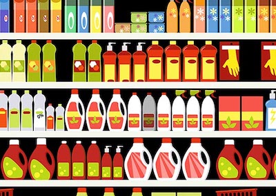
When all of final production packaging comes together on the store shelf, it’s a brand’s moment of truth. Do the stand-up pouches, overwraps, and corrugated POP displays match? How close is the color to its standard? We know you spend so much time and money designing, proofing, sampling, printing, and shipping… so where does the color go wrong? Is it an issue with accuracy, consistency, or both? Package designs come together on the shelf. Here you see pouches, labels, cartons, and corrugated wit...
Posted March 15, 2023 by Cindy Cooperman
Co się stanie, gdy masz ponad 2000 barw marki do zarządzania w złożonym globalnym łańcuchu dostaw opakowań? Jest to niewątpliwie trudne zadanie! Mogłoby się wydawać, że łatwiej jest utworzyć nową barwę niż przekopać się przez bazy danych lub segregatory próbek kolorystyczny, aby znaleźć najbardziej zbliżoną barwę. Jednakże problem pojawia się później, gdy masz do czynienia z ogromną, niemożliwą do zarządzania biblioteką. Jeden z naszych klientów, znana firma zajmująca się s...
Posted March 15, 2023 by Cindy Cooperman
Wystarczy od 2 do 7 sekund. Tyle czasu zajmuje podjęcie decyzji dotyczącej zakupu produktu. Rozwiązania X-Rite w zakresie zarządzania barwą dla druku i opakowań zapewniają osiągnięcie najwyższej jakości w zakresie kontroli jakości, recepturowania i automatyzacji. Barwa jest znaczącym czynnikiem w pierwszym zetnięciu z produktem. Uzyskanie właściwej barwy, za pierwszym razem, jest niezwykle istotne w tej relacji marki i konsumenta. Jako brand manager lub projektant opakowań inwest...
Posted March 15, 2023 by Cindy Cooperman
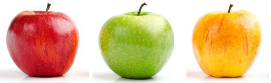
Kiedy ktoś mówi "jabłko", czy myślisz o czerwonym, zielonym czy żółtym? Co zrobić, jeśli klient poprosi Cię o wyprodukowanie barwy przy użyciu opisów, które nie są wystarczająco szczegółowe? Sprawdź, jak coś tak pozornie prostego, jak komunikacja dotycząca barw może określić, czy program do obsługi barw zakończy się sukcesem, czy niepowodzeniem. Obraz można namalować tysiącem słów, ale same słowa nie namalują tysiąca kolorów. Ciągłe rozmowy o kol...
Posted March 15, 2023 by Cindy Cooperman
.jpeg?h=285&la=pl-PL&w=400&hash=3378C75CC5BBCA04B68ECE73D8F28E30C893CA82)
Mówisz, że barwa jest ważna, ale czy wiesz, dlaczego tak jest? W rzeczywistości barwa jest kluczowym elementem w procesie produkcyjnym. Niestety, wielu producentów zdaje sobie sprawę, że uzyskanie właściwej barwy jest znacznie trudniejsze niż kiedyś, a marki, z którymi współpracują, wymagają spełnianie ściślejszych tolerancji. Oto dlaczego. Postępy w technologii kolorystycznej - na przykład metaliczne opakowania, perłowe wykończenia, niestandardowe tkaniny i nowe, ży...
Posted November 01, 2022 by Cindy Cooperman
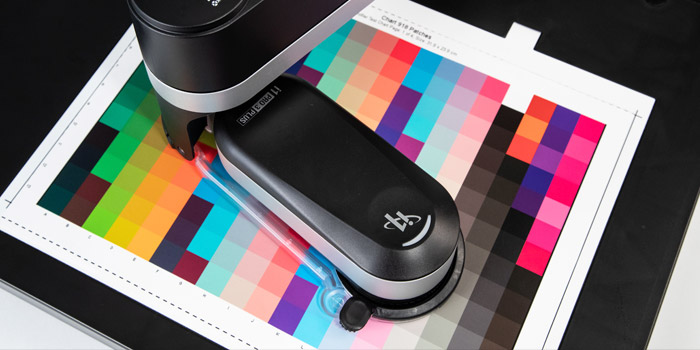
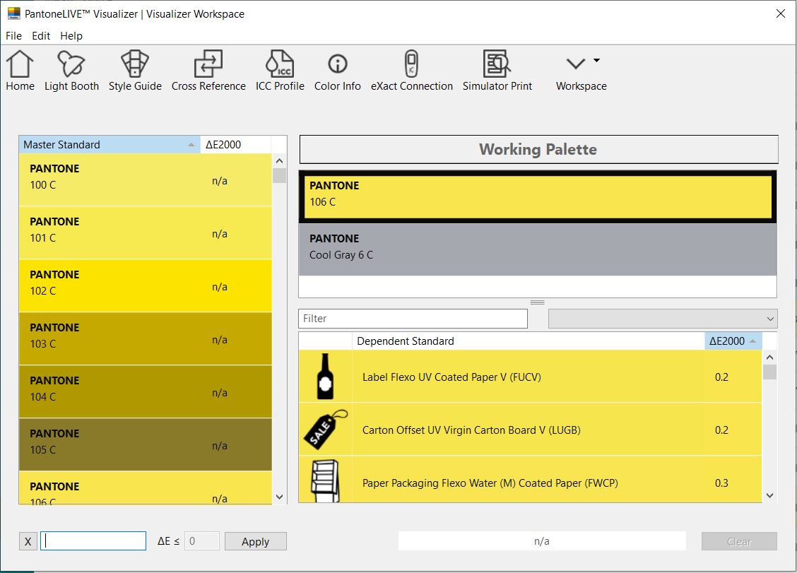
Zarządzanie barwą spowodowało zwiększenie możliwości pomiaru dla farb na różnych podłożach, takich jak papier, tkanina, ceramika, materiały przezroczyste i inne. Aby zapewnić stabilne barwy podczas produkcji, należy utworzyć profil drukarki dla każdej kombinacji drukarki, faby i podłoża. X-Rite oferuje odpowiednie narzędzia, dzięki którym tworzenie profili jest szybkie i łatwe. Narzędzia do pomiaru barw Rodzina produktów i1Pro 3 jest przygotowana na każde zadanie związane z drukiem. i1Pro 3 o...
Posted September 16, 2022 by X-Rite Color
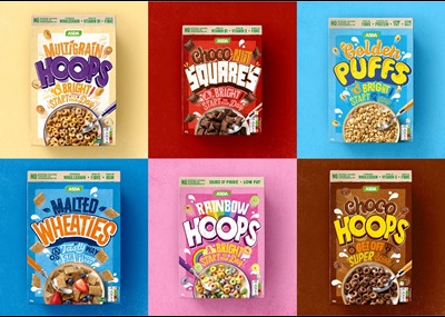
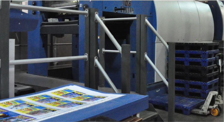
Asda brand packaging is printed globally across a variety of suppliers, print processes, and substrates. With a small team of print specialists, it was impossible and impractical for Asda to attend even a small percentage of press passes across all suppliers to validate print quality. Seven years ago, Asda adopted the X-Rite Pantone ColorCert Suite, a digital color program to help them streamline approvals and deliver brand presence and quality assurance on the shelf across their primary and se...
Posted May 02, 2022 by X-Rite Color
W idealnym świecie powinieneś być w stanie umieścić farbę w maszynie i po prostu uruchomić zadanie. Niestety, każdego roku drukarnie fleksograficzne i wklęsłodrukowe marnują farbę, podłoże i czas maszyn, próbując uzyskać właściwe barwy. Chociaż postęp technologiczny ułatwił osiągnięcie dokładnych barw, nadal istnieją zmienne, od których to zależy. W tej trzyczęściowej serii przedstawiamy kilkadziesiąt powodów będących przyczyną nieprawidłowych barw w maszynie. Omówili...
Posted October 18, 2021 by Scott Harig
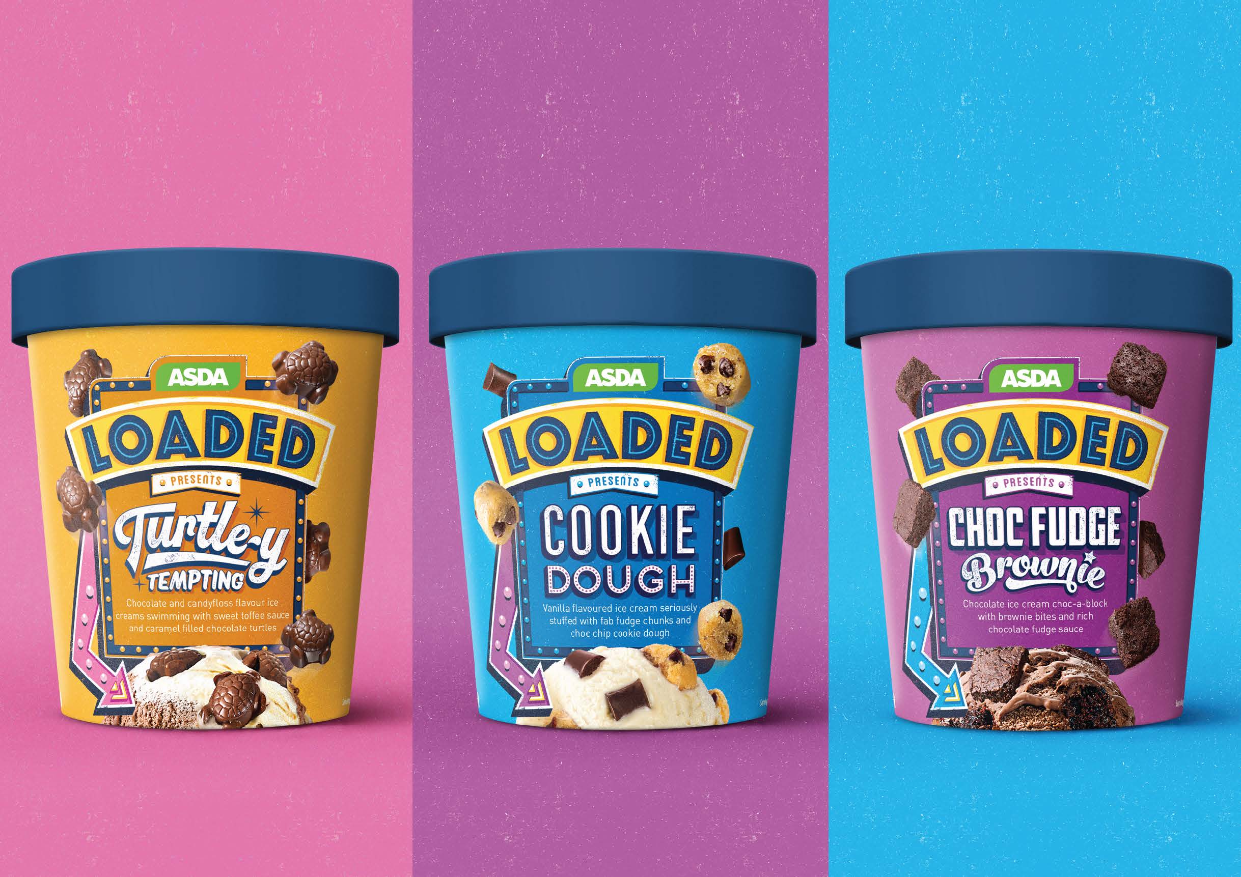
X-Rite Pantone has been working with Asda for several years, supporting the implementation of ColorCert, a digital color program to achieve time and cost savings and deliver brand presence and quality assurance on shelf. We recently published a case study that explains how digital color has helped Asda improve color and consistency scores by 200%. We encourage you to download the case study to learn more. With a tried and proven color management model in its Food and Non-Edible categories, Asda ...
Posted January 22, 2021 by X-Rite Color
The Pantone Color Institute just announced PANTONE 17-5104 Ultimate Gray + PANTONE 13-0647 Illuminating as the Pantone Color of the Year 2021. According to the Pantone Color Institute, PANTONE 17-5104 Ultimate Gray + PANTONE 13-0647 Illuminating, a marriage of color conveying a message of strength and hopefulness that is both enduring and uplifting. Illuminating is a bright and cheerful yellow sparkling with vivacity, a warming yellow shade imbued with solar power. Ultimate Gray is emblematic of...
Posted December 14, 2020 by X-Rite Color
Zrównoważony rozwój jest najwyższym priorytetem dla dużych organizacji zajmujących się opakowaniami konsumenckimi. Zrównoważony rozwój oznacza uwzględnianie potrzeb naszego środowiska i przyszłych pokoleń poprzez poszukiwanie sposobów na zmniejszenie ilości odpadów w całej produkcji. Jest to nie tylko społecznie odpowiedzialne, ale konsumenci często biorą pod uwagę praktyki zrównoważonego rozwoju marki, podejmując bardziej świadome decyzje zakupow...
Posted October 15, 2020 by X-Rite Color

As brand owners compete to make packaging stand out, commercial and flexible packaging converters and label printers are charged with achieving accurate color – on unique substrates – with shorter print runs. Many spend a lot of time mixing ink, then end up throwing it away when the color isn’t right. Others mix ink, store it, and spend way too much time trying to reuse it for future print runs. If you’re stuck in this cycle, you’re essentially paying for ink...
Posted August 13, 2020 by Rich Knapp
Reflective surfaces and metallic inks are very popular for printing and packaging applications. Consumers love the look; but for printers, these substrates and inks are expensive and make color control a challenge. Today we’re taking a look at the measurement options available for controlling these very marketable print and packaging applications to help printers and converters meet brand owner expectations and maintain the highest possible quality output. Sphere vs. 45°:0° - ...
Posted May 07, 2020 by Mark Gundlach
Flexible film does a lot more than protect goods on the store shelf. When done right, film packaging design can capture attention and increase product sales. But measuring color on film substrates can be challenging, even for the most sophisticated converter. Here's what you need to know to successfully control print color on flexible film. Does your film exhibit interference? When you measure flexible film with a traditional 45°:0° spectrophotometer, the way you position the instr...
Posted April 29, 2020 by Ray Cheydleur
Over the last few years, we have heard a lot about the circular economy and omnichannel marketing. While each is a trend in their own right, they are quickly converging on the print industry. To be successful in 2020, commercial printers will need to offer a wide range of print capabilities while demonstrating a commitment to sustainability and reducing waste. The Importance of Circular Economy and Omnichannel In a circular economy, the goal is to eliminate waste and maximize the con...
Posted December 19, 2019 by Ray Cheydleur

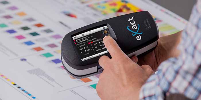
Spectrophotometers are color measurement devices that measure color to ensure it remains consistent from the time it’s specified until final quality check. They can be used to measure everything from liquids and plastics to paper, metal, and fabrics for just about every industry. Here Are Our Top Spectrophotometer Picks for 2019. Best Spectrophotometer to Create Digital Standards Using a digital standard is the most accurate way to specify and communicate color, des...
Posted August 16, 2019 by X-Rite Color
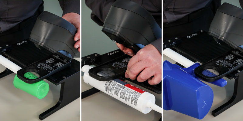
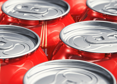
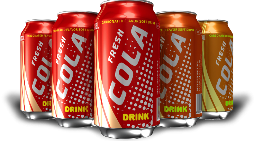
Controlling color on cylindrical-shaped items like cups, cans, and tubes is a challenge because it’s hard to properly align the measurement device with the sample. Many printers and manufacturers cut a piece from the finished product and lay it flat to take a measurement. While this method works, each sample takes time to cut, wastes product, and risks the safety of the employees who are cutting the samples. A Faster, Safer Solution X-Rite’s Cup and Cylinder Fixture works ...
Posted July 17, 2019 by Bob Binder

For over a decade omni-channel has been a term used to describe digital and physical marketing. While many have strived to achieve an omni-channel strategy, unifying the digital and physical customer experiences have been an ongoing challenge for marketers. However, that may be changing. Advances in augmented reality (AR) can help to bring these two worlds together. Over the next few years, I believe we will see significant adoption of AR technology by brands and retailers as a way to engage con...
Posted December 19, 2017 by Shoshana Burgett
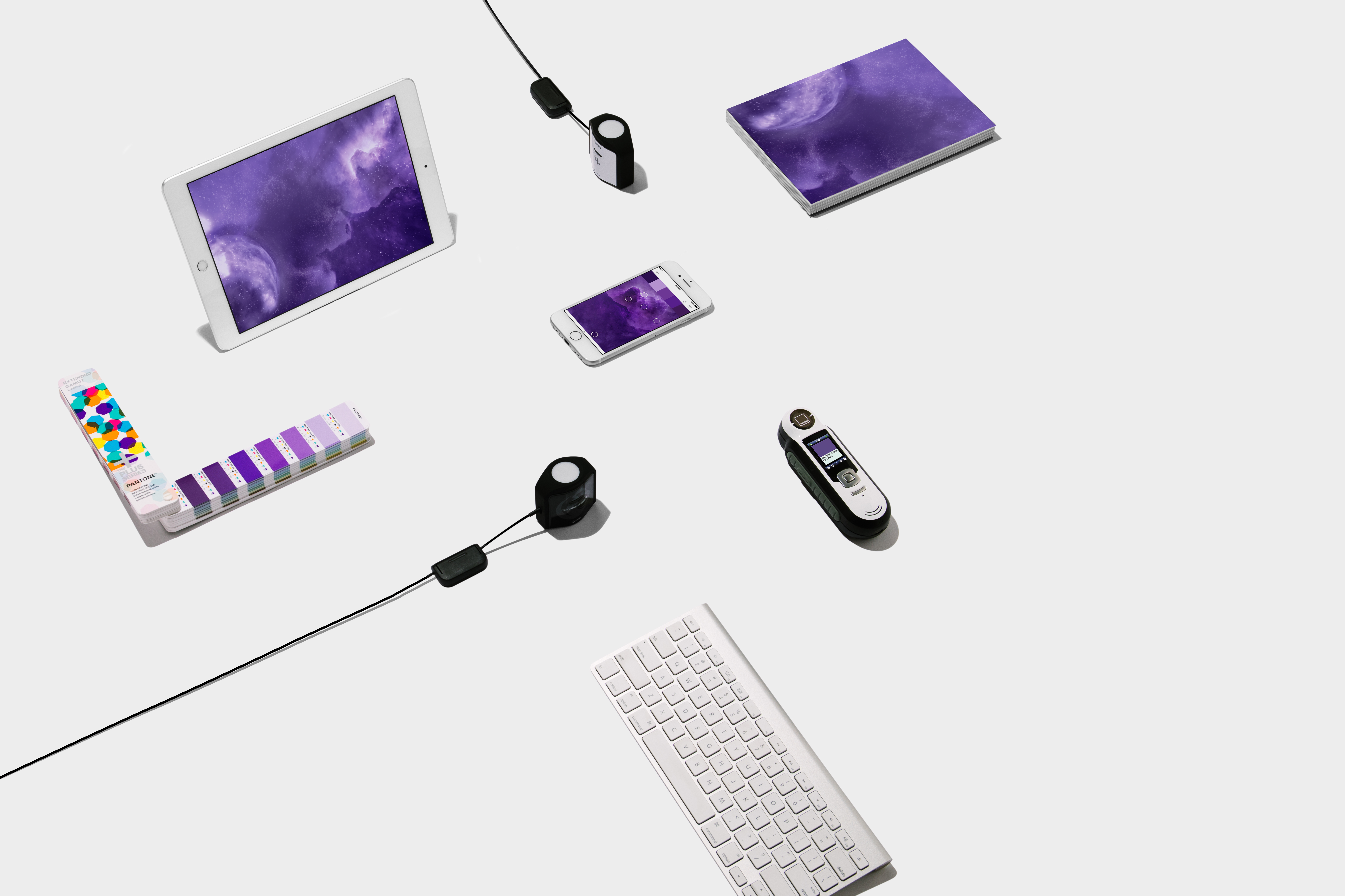
The Pantone Color Institute just announced PANTONE® 18-3838 Ultra Violet as the Pantone Color of the Year 2018! This news is always exciting because it sets the stage for upcoming trends for everything from housewares to fashion to packaging design. In fact, we have already seen shades of Color of the Year used in packaging and graphic design by forward-looking brands in the CPG, luxury, and beauty worlds as well as by personalities and artists seeking to stand out. Part of butt...
Posted December 11, 2017 by Mark Gundlach
