


Ślad środowiskowy mody wymknął się spod kontroli. Według National Resources Defense Council (NRDC), "Przędzalnie wytwarzają jedną piątą światowego zanieczyszczenia wody przemysłowej i używają 20 000 chemikaliów, wielu z nich rakotwórczych, do produkcji ubrań". Tkanina produkowana w fabryce.Obraz ze strony NRDC.org. Problem wpływający na każdego. Czy wiesz, że do produkcji jednej tony bawełnianej tkaniny potrzeba około 200 tons wody (wystarczającej do zapełnienia ...
Posted April 12, 2023 by X-Rite Color

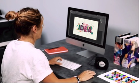
Wystarczy od 2 do 7 sekund. Tyle czasu zajmuje podjęcie decyzji dotyczącej zakupu produktu. Rozwiązania X-Rite w zakresie zarządzania barwą dla druku i opakowań zapewniają osiągnięcie najwyższej jakości w zakresie kontroli jakości, recepturowania i automatyzacji. Barwa jest znaczącym czynnikiem w pierwszym zetnięciu z produktem. Uzyskanie właściwej barwy, za pierwszym razem, jest niezwykle istotne w tej relacji marki i konsumenta. Jako brand manager lub projektant opakowań inwest...
Posted March 15, 2023 by Cindy Cooperman
It’s important to ensure design intent is realized each time and everywhere a product appears. But with so many variables to impact print quality, how can brands utilize suppliers around the world and still achieve consistent color? Our X-Rite Pantone Packaging Color Experts have designed a series of consulting services and workshops to help you get the most from your print, packaging, plastic or textile value chain. Offered both online and onsite, these interactive sessions i...
Posted December 06, 2022 by Cindy Cooperman
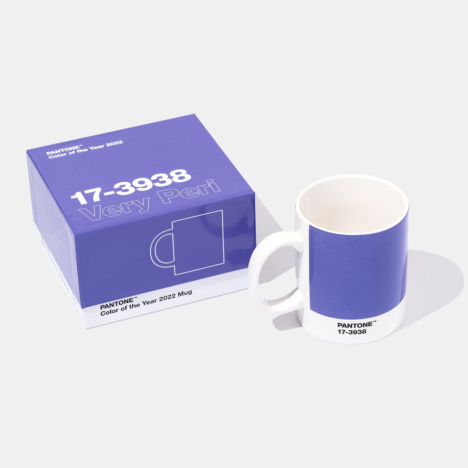
Last week Pantone announced the Pantone Color of the Year 2020 - Very Peri (PANTONE 17-3938). The Pantone Color of the Year announcement isn’t just important for designers. Since this color will set the stage for upcoming trends, brand owners should also take notice to capitalize on this trending color. Bring Very Peri to Market, Fast. Is Virtual Design the Answer? The fashion and apparel industry began embracing virtual design years ago. Luxury brands like Louis Vuitton, Burberry, ...
Posted December 14, 2021 by X-Rite Color
Zarządzanie barwami ICC oznacza przepływ zleceń, który jest przewidywalny, spójny i powtarzalny od uzyskania obrazu przez wydruki próbne do końcowego wyniku. Aby uzyskać przepływ zleceń w druku, należy skalibrować urządzenia i utworzyć profil ICC dla każdego komponentu, w tym aparatu, monitora, projektora, skanera i drukarki. Dlaczego warto kalibrować i profilować? Aby uzyskać najlepiej dopasowane barwy, należy skalibrować każde urządzenie, które uczestniczy w przepływie zleceń w celu ...
Posted January 27, 2021 by Ray Cheydleur
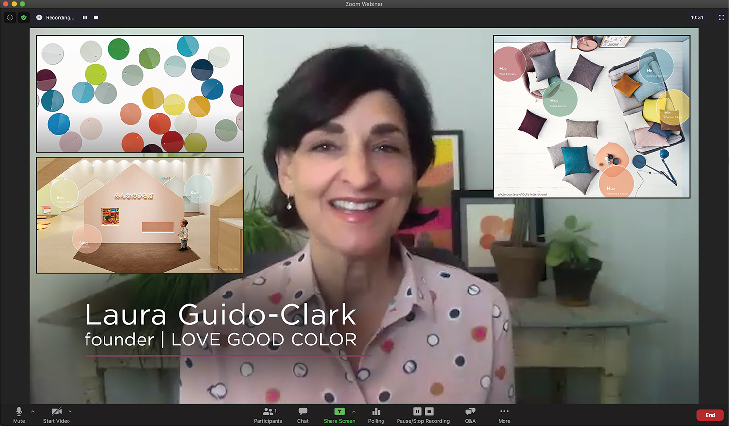
Recently we had the opportunity to sit down with Laura Guido-Clark, a consumer products designer of color, material, and texture. She has been dubbed an “Experience Consultant,” which reflects her interest and study of human reactions to the look and feel of new products. Photo by Laura Flippen. We asked Guido-Clark to speak with us because we also appreciate the importance of color in our lives. Q. What inspired you to pursue a career in color? A. When I wa...
Posted September 01, 2020 by X-Rite Color

Our customers who are now working remotely need to be aware that changing a small variable – such as approving color from home under a different light source, or emailing specifications instead of sending a physical sample – can introduce color issues that risk creating a larger color problem. The first and most critical stage to color control is accurate color communication. These resources will help you get started. The Importance of Color Communication Blog | Many color...
Posted March 27, 2020 by X-Rite Color
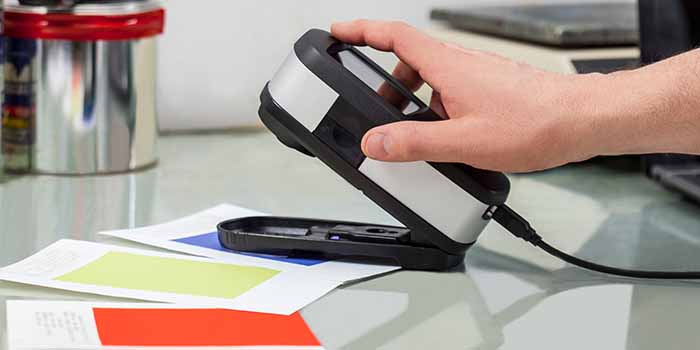
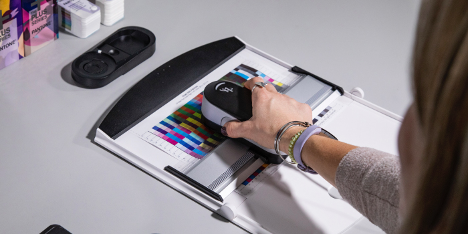
Spectrophotometers (“spectros” for short) are color measurement devices used to capture and evaluate color. As part of a color control program, brand owners and designers use them to specify and communicate color, and manufacturers use them to monitor color accuracy throughout production. Spectrophotometers can measure just about anything, including liquids, plastics, paper, metal and fabrics, and help ensure that color remains consistent from conception to delivery. &nb...
Posted March 27, 2020 by X-Rite Color

Phone and computer screens are the window into the digital world of color, but if you are approving colors via email or text you need to be aware of the limitations. For starters, each of your devices relies on a different color model to display color. Input devices – your camera and monitor – use the additive color model to display color. They start with darkness and add red, green, and blue light to create a spectrum of colors. Printers, on the other hand, use the s...
Posted March 27, 2020 by X-Rite Color
Does your quality control program include visual evaluation? Lighting plays a huge role in how we perceive color. It can help you verify whether the color of your product is acceptable and ensure it remains accurate in every possible lighting condition after purchase. Many of our customers are finding visual evaluation to be even more important as they transition color reviews and approvals to a different location, such as in the home office or to another remote environmen...
Posted March 27, 2020 by X-Rite Color

So much goes into the way you perceive color, including light, genetics, the environment, human traits, and even fatigue. You may also be among the 1 in 255 women and 1 in 12 men who have some form of color vision deficiency. Our online color challenge is a fun way to better understand your color vision acuity. Regardless of your color vision acuity, if you are communicating, evaluating, or approving color from a new location your eyes may trick you into making diff...
Posted March 27, 2020 by X-Rite Color

Color has always been a critical factor for our customers. Due to the COVID-19 pandemic, many are now trying to design, specify, communicate and ultimately achieve accurate color from remote locations or with less staff and fewer resources. Are you having trouble maintaining your color program in this unprecedented time? We've compiled our most popular resources – blogs, videos, whitepapers, webinars, and case studies – to help you connect with your supply chain and ...
Posted March 27, 2020 by X-Rite Color
Appearance is more than just color. It’s an all-inclusive look at everything inherent to an object, including texture, gloss, transparency, translucency, and special effects like sparkle and shimmer. When viewed from different angles or under different lighting conditions, appearance effects can change our perception of color. That's why it’s important to control both color and appearance throughout design and development. Durable goods brands use appearance effects to captur...
Posted February 20, 2020 by X-Rite Color
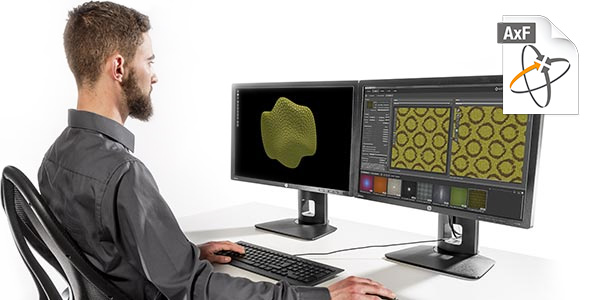
Virtual reality has re-imagined the art of apparel and footwear design. 3D design programs like MODO, KeyShot, CLO, Browzwear, Optitex, and Lectra augment the creativity of color and material designers to virtually construct patterns and render realistic 3D garments. This is exciting technology for brands that want to reduce waste for a greener footprint and accelerate design to keep up with fast fashion. However, designers are notoriously tactile. They need to touch, feel, and gain a...
Posted October 24, 2019 by Bruce Wright
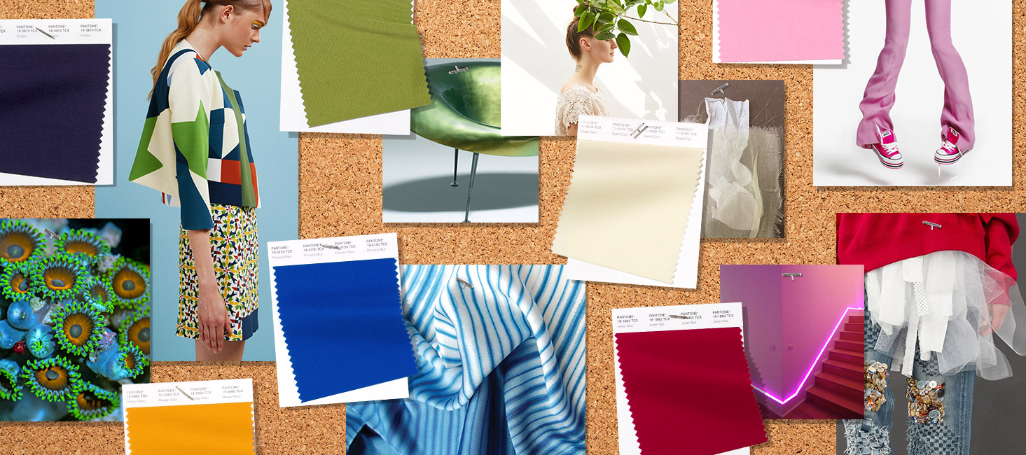
As we move through spring and into summer, we’re revisiting Pantone Color Institute’s Spring/Summer 2019 Fashion Color Trend Report. This season’s report features the top 12 stand out colors as well as current takes on four classic neutrals. Images extracted with permission from PANTONEVIEW Colour Planner Spring/Summer 2019. According to Leatrice Eiseman, Executive Director of the Pantone Color Institute, “This new mindset underscores a...
Posted June 10, 2019 by X-Rite Color
A senior design leader at a large beverage company recently shared his thoughts on the definition of Design Thinking on LinkedIn, asking other members of the community to contribute their own thoughts alongside his. Hundreds of comments ensued. The post appears to be part of a multi-week campaign to position Design Thinking as a way to approach business problems and garner attention from business executives. And we know that this attention has been hard to capture. A survey of over 600 designers...
Posted December 21, 2017 by Adrián Fernández
Niedawno pisaliśmy na blogu, jak wygląd wpływa na barwę. W tym artykule przyjrzymy się wybranym cechom wpływającym na wygląd przedmiotów, takim jak tekstura, połysk, przezroczystość i efekty specjalne, a także wyjaśnimy, dlaczego tak ważne jest opisanie wyglądu na wczesnych etapach projektowania. Podczas gdy programy 3D od lat starają się uwzględniać aspekty wyglądu, w wirtualnym projektowaniu produktów brakuje jednego ogniwa: możliwości integracji charakterystycznych „prawd...
Posted November 29, 2017 by Thomas Meeker
You think you’re doing everything right, but your color isn’t consistent. Why? Through the years, designers have used many tools to help them specify color. Color swatches, style guides and product prototypes have been effective, but with the advent of the digital world, these physical tools are no longer enough. To be efficient, designers need to be SPECIFIC. X-Rite Pantone President Ron Voigt recently published an article in MediaPost that explains why. To be effective, designers n...
Posted November 17, 2017 by Cindy Cooperman
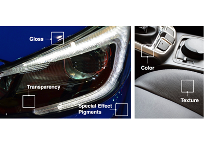
Appearance is more than simply color. It’s a comprehensive look at everything inherent to each unique material we come in contact with, including texture, gloss, transparency, and special effects. Each of these characteristics plays a part and has an effect on overall appearance and understanding in relation to a single material. Objects may have several elements that affect appearance, such as the material’s surface texture, construction, overall geometry and micro-surface. The environ...
Posted October 24, 2017 by Thomas Meeker

I spent a few years working in Paris, where the Seine River has played a pivotal role in the shaping of the city’s personality. As I stayed longer and got to know the city and its people better, one of the things that became clear to me was that the Seine River physically separated two distinct cultures of the city. Image courtesy of www.aparisguide.com The left bank, including the Latin Quarter, Montparnasse, and Sorbonne, is all about creativity, design and ideation. The right bank is more sop...
Posted August 01, 2017 by X-Rite Color
