Spectrophotometers are instruments that measure color. Manufacturers use them in every industry where accurate color is important, from paint and plastics to textiles, packaging, and even food. The data captured by spectros allow designers, brand owners, manufacturers, and quality control professionals to precisely communicate color and ensure it stays accurate throughout production.
Sometimes I’m asked which color is the hardest to measure and control. Can you guess what it is?
Overly saturated colors like black and dark blue are the hardest to manage in a color control program. That’s because spectros work by measuring the amount of reflection at the specific wavelengths at which light reflects from the surface of a sample. As a color gets darker, it reflects less light. Black has very little reflection on the visible spectrum, making it harder to gauge than medium or light balanced colors.
Color science can help… to a point.
To determine whether colors match, manufacturers measure the target color and the produced sample, then compare the spectral data. Color acceptability limits, called tolerances, give guidance on much color difference is acceptable. This difference is called Delta E.
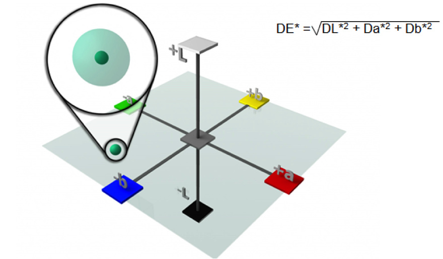
Any color that falls within this 1 Delta E sphere is within tolerance.
An untrained eye can generally determine a difference of 1 Delta E, but acceptable Delta E varies by industry and application. For instance, if you’re printing a billboard that will stand 20 feet in the air, a Delta E of 4 or 5 is probably good enough. But that amount of variance is not acceptable for something you hold in your hand, like a toy or garment.
Putting it in practical terms… Let’s say I have one 1 ml of liquid. I add another ml. Even though I’ve doubled the quantity, in reality it’s still just a small amount. The same goes for Delta E. If I’m comparing to a standard that has very little reflection and add a little more reflection, it will make a big difference in Delta E values, but not a huge difference in what we actually see.
People who measure a lot of saturated color work need to closely control the Delta E to ensure a good production match, but even that is not enough.
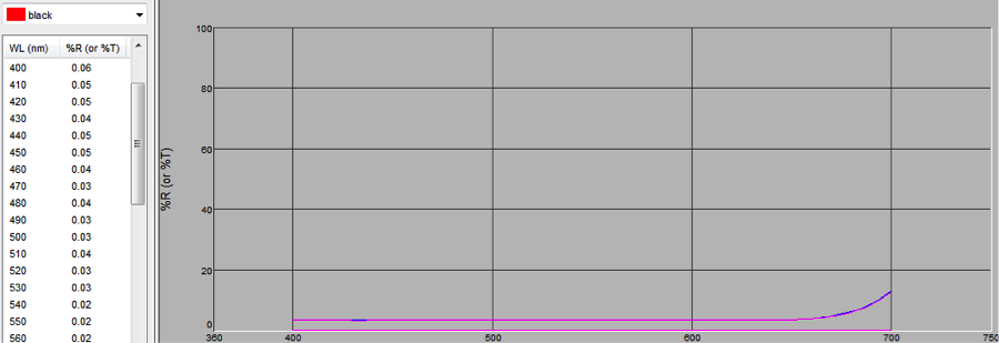
Reflectance curve of a black nylon measured with a Ci64 device using iQC software. Notice the low values of the % reflectance across the spectrum.
When dealing with overly saturated colors, you also have to worry about metamerism – a phenomenon that occurs when two colors appear to match under one lighting condition, but not when the light changes. Check out this blog by Tim Mouw to learn more.
Which products are most affected?
- Textiles with sewn parts that must match in any lighting or are sold together as sets. If you buy a navy suit, you want to be sure the sleeves match the lapel and the pants match the jacket!
- Automotive coatings, especially very deep black, or with a high level of jettness, as with a high concentration of carbon black pigment. The bumper has to match the hood!
- Plastic parts, especially navy or black with a shiny coating. Think assembled electronics and toys.
- Packaging with saturated images or lettering, especially if it the substrate is metallized or has to match other components on the shelf like labels, boxes, or advertising.
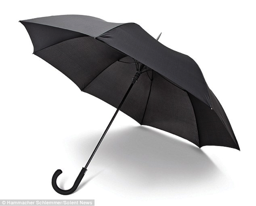
- Mixed substrate products that mix dark colored components, like black upholstery against the black legs of a chair, or an umbrella with a nylon canopy and black plastic handle.
Can saturated colors be controlled?
Sure… it’s not easy, but here are some tips to make it as efficient and effective as possible.
1. Make sure everyone is doing the same thing the same way.
Repeatability is a big problem for saturated colors, and the key to good spectrophotometry housekeeping. If you can’t consistently repeat a measurement, the instrument is no good to you. Since these dark colors are hard to measure and gauge, you need clear procedures in place to make sure everyone is doing the same thing the same way, every time, and that instruments have been properly maintained and calibrated.
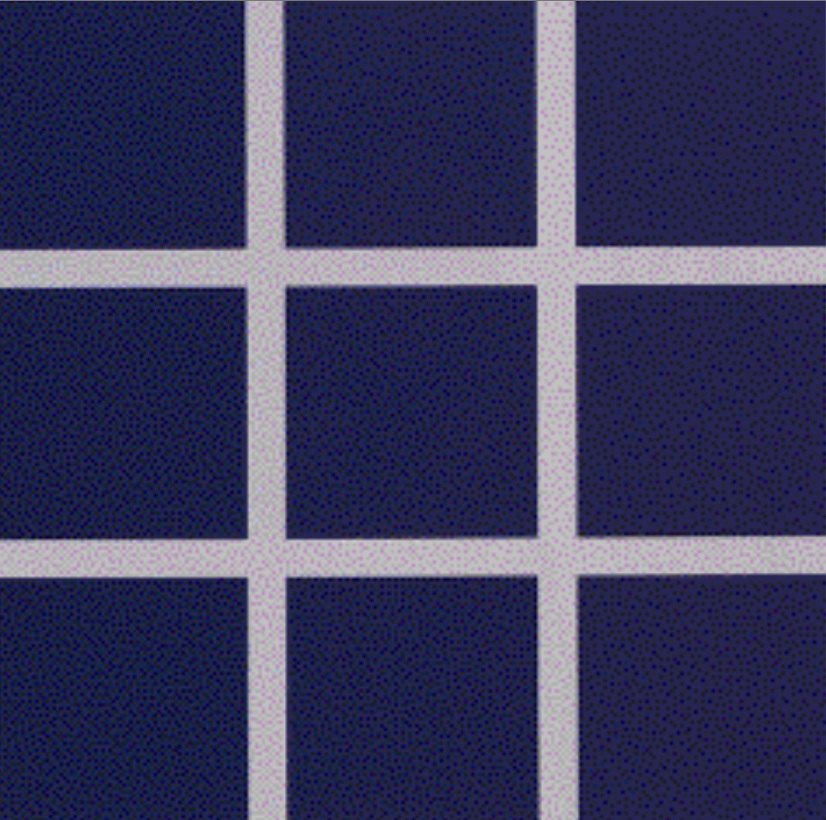
Are these saturated blues the same?
2. Test your quality control professionals for color vision deficiencies.
There are many factors that impact how we see color, including color deficiency, age, poor color memory, stress, disease, and medications. Visual evaluation testing, like X-Rite’s Farnsworth-Munsell 100 (FM 100) Hue Test, will ensure the people who are judging and evaluating color are qualified to do so. Although it’s not a substitute for the full test, the online color challenge is a fun way to check for color vision deficiencies.
3. Make sure it looks right, too.
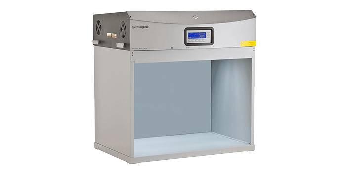
Although color measurement devices can tell you if your colors are within tolerance, you could still be sending out unsatisfactory parts if they don’t look right after they’re assembled. At some point during production, someone must visually evaluate these parts – next to each other and under different light sources – to make sure they are ready to ship. The SpectraLight QC and Judge QC are our two most popular light booth solutions for the job.
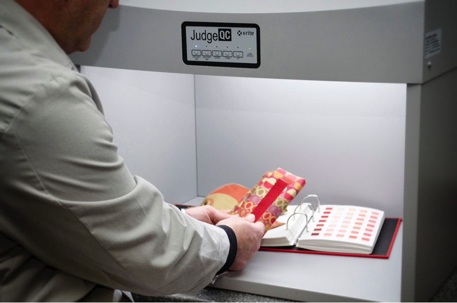
This Quality Control Manager is comparing a textile sample against the color standard in the Judge QC to ensure it is visually correct under different light sources.
4. Grab a buddy.
Even quality control professionals with superior color vision make mistakes, especially when dealing with tricky saturated colors. If there’s ever a question about color, bring in another person or two to look at it. A team approach is always best for visual color evaluation.
5. Trust the numbers… but use common sense.
Sometimes a spike in Delta E doesn’t mean the color is wrong, especially if there’s not much reflected light. Always pair spectral data with a common sense visual evaluation process.
We offer a variety of training programs to help you better understand and implement all five of these steps. Our Fundamentals of Color and Appearance seminar travels around the world – check to see if we’re coming to a city near you. We also offer eLearning options, including Color Measurement Essentials – a very affordable 13-module course you can take anywhere, anytime. Or, for those manufacturers who want extra guidance or easy training for the entire staff, we’ll even come to your site with custom training solutions.
Don’t be afraid of overly saturated colors. Although orange and brown have tried, there will never be a replacement for black!
Featured Color Management Solutions
Learn more about these featured products:
FM100 Hue Test
The FM100 Hue Test is an easy-to-administer test and a highly effective method for evaluating an individual's ability to discern color.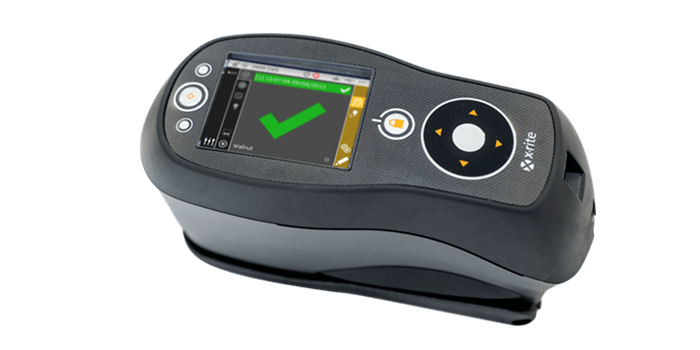
Ci64
The Ci64, X-Rite’s most precise handheld sphere spectrophotometer, is available in three models: with simultaneous SPIN/SPEX, correlated gloss, and a UV option.