

Umweltverträgliche Lösungen für eine bessere Zukunft In der heutigen schnelllebigen Welt ist Nachhaltigkeit für Hersteller in verschiedenen Branchen zu einem wichtigen Thema geworden. Da die Verbraucher immer umweltbewusster werden, wird die Forderung nach nachhaltigen Produktionsverfahren immer lauter. Diese Umstellung auf Nachhaltigkeit kommt nicht nur unserem Planeten zugute, sondern trägt auch zur Optimierung der Geschäftsprozesse und infolgedessen zu lan...
March 10, 2025 by X-Rite Color

5 Fehler, die ohne ein Spektralfotometer zur Farbmessung von Fahrzeuglacken auftreten können Ein Spektralfotometer zur Farbmessung von Fahrzeuglacken ist ein wichtiges Tool in der Automobilindustrie, insbesondere wenn es um die Farbkontrolle von Fahrzeugen geht. Diese innovativen Geräte sorgen dafür, dass Lackfarben präzise aufeinander abgestimmt sind, einheitlich aufgetragen werden und die erforderlichen Standards für die Fahrzeuglackierung erfüllen. Ohne ein Spek...
January 07, 2025 by X-Rite Color
Wie bei Ihnen stehen auch bei uns Digitalisierung und Nachhaltigkeit ganz oben auf der Agenda. Bei der Entwicklung von Textilien wird der Faktor Farbe jedoch häufig außer Acht gelassen. Die Digitalisierung der textilen Lieferkette und die Anwendung von Farbmanagement in jeder Phase zahlen sich letztendlich durch höhere Farbpräzision, schnellere Produktion und weniger Ausschuss aus. Mit über 60-jähriger Erfahrung als Anbieter von innovativen Lösungen für ...
March 13, 2023 by X-Rite Color
Um diese Zeit im Jahr ist das Internet immer voll von Top 10 Countdowns. Diese gute alte Tradition stammt aus dem Jahr 1940 – dem Jahr, in dem das Billboard-Magazin seine ersten Charts der meistverkauften Songs veröffentlichte. Seither sind viele auf diesen Zug aufgesprungen, um einen Blick auf die beliebtesten Trends des Vorjahres zu geben. Seit 2016 veröffentlichen wir unsere meistgelesenen Blogs und freuen uns, dass Wissensthemen, wie Farbwahrnehmung, Toleranzberechnung...
December 28, 2022 by X-Rite Color

Farbe spielt eine wichtige Rolle bei der Auswahl unserer Lebensmittel. Viele Lebensmittel, wie Schweizer Käse, Erdbeeren, Brokkoli und Kartoffelpüree, sehen immer gleich aus. Schon beim ersten Bissen wissen wir genau, was uns erwartet. Doch was wäre, wenn Kartoffelpüree grün wäre? Würde es anders schmecken? Würden Sie es trotzdem probieren? Warum die Farbanalyse für die Lebensmittelindustrie so wichtig ist In zahllosen Studien ging es da...
November 18, 2022 by X-Rite Color
.jpeg?h=285&la=de&w=400&hash=6734711576A3B968791DCDD752AA2891BF6AEFDA)
Behaupten Sie, dass Farbe eine große Rolle spielt, wissen aber nicht warum? In Wahrheit ist der Faktor Farbe eine kritische Komponente beim Herstellungsprozess. Leider müssen viele Hersteller feststellen, dass die richtige Farbwiedergabe weitaus schwieriger geworden ist. Zudem fordern ihre Kunden (Markenartikler) die Einhaltung enger Toleranzen. Und zwar aus folgenden Gründen: Fortschritte in der Farbtechnologie, wie etwa Metallic-Verpackungen, Perlglanzlacke, individuell gestal...
November 01, 2022 by Cindy Cooperman

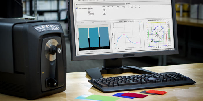
Quality control is an important aspect of any color workflow. While many of our customers use a handheld spectrophotometer for QC, there are times a benchtop spectrophotometer is a more appropriate choice. Today we’ll explore some of the reasons you might want to choose a benchtop for quality control and offer tips to ensure your QC workflow is the best it can be. Top 5 Reasons to Choose a Benchtop Spectrophotometer for Quality Control 1 - Your Color Tolerances are Tight While our handhel...
March 25, 2022 by X-Rite Color

When choosing a beverage product from the store shelf, consumers not only demand superb taste, but also consistency in the way the beverage looks to the human eye. Color and transparency are essential markers for quality - any imperfection can indicate contamination, impurities in the raw materials, or process variations caused by heating and oxidation. However, drinks like fruit and vegetable juice, beer, and blended cocktails are difficult for manufacturers to control during production. Natura...
January 21, 2022 by X-Rite Color
.upcoming-webinar-block { width: 100%; display: table; margin-bottom: 20px; } .upcoming-webinar-left { width: 120px; padding-right: 20px; display: table-cell; } .upcoming-webinar-left img { margin-top: 10px; } .upcoming-webinar-right { vertical-align: top; display: table-cell; } Geräte zur Farbmessung gibt es seit den 1940er Jahren, und haben seitdem einen langen Weg der Weiterentwicklung zurückgelegt. Das 1870 von ...
January 19, 2022 by X-Rite Color
In einer perfekten Welt könnten Sie einen Druckauftrag nach Zuführung von Druckfarbe ausführen. Bedauerlicherweise vergeuden Flexo- und Tiefdruckereien jedes Jahr Druckfarbe, Bedruckstoffe und Druckmaschinenzeit, um die richtigen Farben zu erzielen. Obwohl technische Fortschritte die präzise Farbwiedergabe erleichtert haben, gibt es immer noch Variablen, die sich auf Farbe auswirken. In dieser dreiteiligen Serie nennen wir über zwei Dutzend Gründe für mögliche Farbfehler bei der Druckausgabe...
October 19, 2021 by Scott Harig
In einer perfekten Welt sollte man in der Lage sein, Farbe in die Druckmaschine zu geben, einen Auftrag auszuführen und Farbkonsistenz zu erreichen. Leider verschwenden Flexo- und Tiefdruckbetriebe jedes Jahr Farbe, Bedruckstoff und Druckmaschinenzeit bei dem Versuch, die richtige Farbe zu finden. Obwohl die Fortschritte in der Technologie es einfacher gemacht haben, Farbgenauigkeit zu erreichen, gibt es immer noch Variablen, die die Farbe beeinflussen. In dieser dreiteiligen Serie stellen...
October 18, 2021 by Scott Harig

People often ask how X-Rite got its name and how we came to be a leader in the art and science of color. It’s really a great story – one that focuses on innovation, entrepreneurship and determination. What’s in a name? X-Rite was founded in 1957 by a group of engineers and business entrepreneurs who had a desire to start a business based on innovation. The members brainstormed new product ideas ranging from can openers to sheet metal tools to collapsible car cots. After buildin...
May 11, 2021 by X-Rite Color

Das Aussehen einer Oberfläche – die Oberflächeneigenschaften – kann Ihre Farbwahrnehmung ändern. Denken Sie beispielsweise an ein Hochglanzmagazin. Wenn das Licht direkt auf die Seite scheint, müssen Sie das Magazin u. U. schräg halten und den Reflexionswinkel ändern, damit Sie die Farben klar erkennen können. Ebenso kann die strukturierte Oberfläche eines Objekts farblich anders aussehen als die glatte Oberfläche des gleich...
March 30, 2021 by Tim Mouw

Black Friday. Not only is it the much anticipated start to holiday shopping, it’s also a day manufacturers have been preparing for all year long. Whether mass-producing holiday cards, candy canes, plastic toys, or festive clothing, accurate color is a must. Manufacturers can’t ship two of the same toy if they won’t match on the showroom floor, and holiday sweaters that are a shade off will end up at a discount store instead of a fashion boutique. Perfection is especially import...
November 25, 2020 by X-Rite Color
The color of liquid is one of the most difficult things to control during production. But it’s important. Would you choose a bottle of juice or cleaner that is lighter in color than the other bottles on the shelf? What about cough syrup? Liquid is hard to measure because it can range in transparency from translucent to opaque. It’s also hard to hold, and the measurement device can’t touch it or the optics and the sample will both be contaminated. Today&rsq...
October 27, 2020 by Tim Mouw

As brand owners compete to make packaging stand out, commercial and flexible packaging converters and label printers are charged with achieving accurate color – on unique substrates – with shorter print runs. Many spend a lot of time mixing ink, then end up throwing it away when the color isn’t right. Others mix ink, store it, and spend way too much time trying to reuse it for future print runs. If you’re stuck in this cycle, you’re essentially paying for ink...
August 13, 2020 by Rich Knapp

Textilien, Autoteile, Kunststoffelemente – was auch immer Sie herstellen, eine Regel gilt immer: Die Farben müssen einheitlich sein, sonst landet das Produkt im Ausschuss. Doch Farbfehler können sich in der Produktion leider auf vielerlei Weise einschleichen. Eine Möglichkeit zur Fehlervermeidung besteht in der Erstellung und Verwendung präziser digitaler Farbstandards. Digitale Farbstandards können in Software zur Farbspezifikation und -kommunikation, zur Rezep...
August 03, 2020 by Tim Mouw

Whether you work with plastics, coatings or textiles, you must consistently achieve in-tolerance color or your product could be rejected before it even makes it to the shelf or showroom. This is especially true for brands that rely on off-site suppliers and manufacturers for raw materials and parts that come together at assembly, such as the plastic dashboard, fabric seats, and coated interior panels of a car. Even if each site produces in-tolerance color, it must be monitored an...
June 12, 2020 by Tim Mouw

Reflective surfaces and metallic inks are very popular for printing and packaging applications. Consumers love the look; but for printers, these substrates and inks are expensive and make color control a challenge. Today we’re taking a look at the measurement options available for controlling these very marketable print and packaging applications to help printers and converters meet brand owner expectations and maintain the highest possible quality output. Sphere vs. 45°:0° - ...
May 07, 2020 by Mark Gundlach
Appearance is more than just color. It’s an all-inclusive look at everything inherent to an object, including texture, gloss, transparency, translucency, and special effects like sparkle and shimmer. When viewed from different angles or under different lighting conditions, appearance effects can change our perception of color. That's why it’s important to control both color and appearance throughout design and development. Durable goods brands use appearance effects to captur...
February 20, 2020 by X-Rite Color

Wenn es um unsere Farbwahrnehmung geht, lassen sich unsere Augen täuschen. Das liegt zum Teil an unserem „bescheidenen Gehirn“, das eine ungeheure Fülle von Informationen bestmöglich verarbeiten muss. Es kann auch mit unserer genetischen Veranlagung und Umgebung zu tun haben. Fakt ist: Jeder von uns hat eine andere Farbwahrnehmung. Die größte Auswirkung auf unsere Farbwahrnehmung hat auf jeden Fall LICHT. Ohne technisch ins Detail zu gehen, hier nur ei...
January 14, 2020 by Tim Mouw
Die Übereinstimmung zwischen den Geräten ist ein sehr wichtiger Aspekt bei der Auswahl von Farbmessgeräten für Ihren Arbeitsablauf. Leider ist dies ein so technisches Thema, dass es schwer zu verstehen ist, was es bedeutet und warum es so wichtig ist. Das Ci7860 Tisch-Spektralfotometer hat eine durchschnittliche Delta E*-Spezifikation von 0,06 zwischen den Geräten, die es Marken ermöglicht, die präzisesten Master-Farbstandards zu erstellen. Heute wollen wir ...
October 03, 2019 by Mike Huda

Obwohl Kunststoffhersteller Farbprobleme bei der Produktion jahrelang im Griff hatten, ändern sich die Zeiten mal wieder. Immer mehr Hersteller versehen ihre Produkte – angefangen von Unterhaltungselektronik bis zu Fahrzeugteilen und flexiblen Verpackungen – mit Effektlackierungen. Metallic-, Perlglanz- und andere komplexe Speziallackierungen mögen zwar schön aussehen und Markenartiklern dabei helfen, dass sich ihre Produkte im Verkaufsregal von Konkurrenzangeboten abheben, führen allerdings zu...
October 03, 2019 by Thomas Meeker

Spektralfotometer sind ausgezeichnete Werkzeuge, um Proben anhand ihrer Farbstandards zu messen, um Unterschiede zu vergleichen, aber es kann schwierig sein, eine Farbgenauigkeit für unregelmäßig geformte Produkte wie Flüssigkeiten, Kunststoffe, Dosen und Pulver zu erreichen. Wir entwerfen eine Vielzahl von Teilen und Zubehör - auch "Rigs & Jigs" genannt - für viele unserer Instrumente, um ungewöhnliche Formen und Größen zu messen. Teile & Z...
October 02, 2019 by Mike Huda

Spectrophotometers are color measurement devices that measure color to ensure it remains consistent from the time it’s specified until final quality check. They can be used to measure everything from liquids and plastics to paper, metal, and fabrics for just about every industry. Here Are Our Top Spectrophotometer Picks for 2019. Best Spectrophotometer to Create Digital Standards Using a digital standard is the most accurate way to specify and communicate color, des...
August 16, 2019 by X-Rite Color

When choosing a food product, consumers demand consistency in both taste and appearance. While a lighter batch of oranges may still produce a delicious juice blend, a pale color can jeopardize USDA approval and leave consumers questioning the quality. Unfortunately for food and beverage manufacturers, the color of food – especially drinks like fruit juice and blended cocktails – is one of the most difficult things to control during production. Here’s why. 1. Liquid is hard to...
August 15, 2019 by X-Rite Color
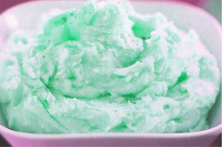
There’s been a lot of research around the role color plays in how we expect food to taste. The fact is, we judge flavor by the color of the food or drink, even before the first taste. We expect red foods to taste sweet like strawberries or cherries. White should taste like vanilla, and green is probably limey and tart or minty. Color cues can even determine whether we take that first bite. Most of us won’t even consider trying a food like mashed potatoes or pumpkin pie if it is ...
August 12, 2019 by Tim Mouw
With so many requests for innovative bases, transparency, and special effects, formulating color for paint, coating, and plastic applications can be a challenge. To keep up, formulation software needs to be innovative, too. We recently launched version 10 of our Color iMatch formulation software, and it is our smartest version yet. It allows you to select cost-reducing parameters, such as lowest cost or fewest colorants, and will determine the best formula for your application. It work...
July 10, 2019 by Rich Knapp

Farbfehler sind kostspielig. Zur Korrektur müssen Sie die Farbe im Labor neu rezeptieren lassen, einen Mitarbeiter zur Ermittlung des richtigen Farbtons beim Kunden abstellen oder die rezeptierte Farbe entsorgen und von vorne anfangen. Wie quantifizieren Sie den Verlust eines unzufriedenen Kunden – einmal abgesehen von den Kosten für den Zeit- und Materialaufwand? Fünf Schritte zur effizienten Farbrezeptierung Mit den richtigen Tools und Verfahren ist die präzis...
May 29, 2019 by Rich Knapp
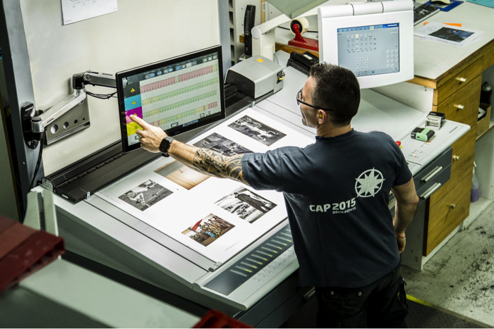
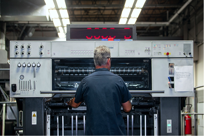
Hitting offset lithographic color targets isn’t always fast or easy. The manual process of measuring color bars and making ink key adjustments takes time and opens the door to operator error. Meanwhile, the press is running (and wasting) paper and ink. To achieve accurate and repeatable color, printers need to convert their printing operation to an efficient manufacturing process and drive efficiencies in all phases of their operation. For many, a closed-loop automated solution is the...
April 03, 2019 by Ray Cheydleur
