What happens to products when color goes wrong?
It’s wrong color that keeps discount stores in business. Copy paper that isn’t quite bright enough, a label with the wrong color red, or a pillowcase that’s a shade off from the rest of the sheets, and the product is rejected. A discounter can buy the whole lot for a fraction of the cost and sell it for profit.

This, of course, is not good for manufacturers, and it is the real reason color control in manufacturing is so important. From color specification through manufacturing to final quality inspection, the color has to stay true. And it if does stray, it must be caught early so adjustments can be made before too much time and money is wasted.

Although color evaluation can be subjective and emotional, today’s color measurement systems take that out of the equation by providing fact-based analysis and spectral data, so everyone is speaking the same language. By staying current with developments in tools, techniques and technologies for measuring, monitoring and managing, and communicating color, manufacturers can maintain color accuracy across sites and throughout their workflows.
Today we’ll look at the top seven places in a production workflow where color can go wrong. Compare this to your workflows to see how you can make sure your color stays right.
So, where can color go wrong?
-
During color specification
Color is a blend of art and science. It starts with a designer’s inspiration, then is specified as a color to be replicated in production. Of course, the designer or brand owner assumes the colors they choose will remain true on the final product. Unfortunately the wide range of variability and capability that exists within a color workflow can make this a costly and difficult proposition.
For starters, when I describe a color, you might understand what I mean, but you can’t possibly reproduce it based on my description alone. What is “cherry red?” Without very a very specific color reference, ambiguity arises and leaves room for unhappy clients. Plus, it’s a fact that humans have insufficient color vision and poor color memory. Light, retinal fatigue, background effects and more can influence our perception of color. In order to accurately specify and communicate color, you must know your limitations and understand how to overcome them.
X-Rite Pantone offers a fabulous course – The Fundamentals of Color and Appearance – that can help you gain a better understanding of color specification and teach you how to speak the language of color in a way that can be understood across the entire color supply chain.
-
In the course of color communication
Even if you know how to communicate color, you can’t assume everyone else will understand what you’re saying. That’s where PANTONE’s Color Systems come into play. Whether you’re printing on press, replicating a brand’s colors on the web, or looking for color consistency in paint, plastics or textiles, specifying a PANTONE Color Reference provides a concrete and tangible way to communicate each shade so that manufacturers are more likely to reproduce the right color.

PANTONE FASHION, HOME + INTERIORS Cotton Chip Set
For the highest level of consistency, many specifiers and manufacturers rely on a digital workflow using Digital PANTONE Standards. These can be shared with everyone involved in the color workflow to specify color, design packaging layouts, quality check incoming materials and formulate ink and other raw materials, without the fear of faded or damaged color samples – no ambiguity. Plus, when paired with Adobe® plug-ins like PantoneLIVE Color Book and Viewer, Digital PANTONE Standards provide a visualization of how a color will look once it is produced on a particular packaging substrate. Other software tools like PANTONE COLOR MANAGER make it easy to import the latest PANTONE Color Libraries into your design software of choice.
To help you maintain your Digital PANTONE Color standards, X-Rite offers a cloud-based ecosystem, PantoneLIVE, which stores Digital PANTONE Color packaging standards.
To learn more, check out our post on Getting The Best Results With PANTONE Colors .
-
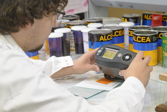
While taking measurements
Once a color is selected, it must be measured using a color measurement device to get precise spectral values. These values will be monitored throughout the workflow to ensure that the color that is specified remains true during production. Although this is a scientific process, things can still go wrong.

For starters, there is a wide range instruments available, and they don’t all have the same functionality or calibration standards. That means you can measure the same sample with two different spectrophotometers and get slightly different results. Spectrophotometers must also be calibrated and serviced regularly to maintain accurate measurement capability.
When you’re measuring standards and samples, you need to know how much variance from the target is acceptable – in other words, what your tolerances are. Standards for your industry and for each job must be carefully set and everyone involved in the color workflow must comply with them. The International Organization for Standardization (ISO) provides guidance to help bring consistency to color management techniques, but it doesn’t address instrument inconsistencies.
That’s why in 2010, X-Rite Pantone introduced the X-Rite Graphic Arts Standard (XRGA), a language that is optimized for today’s color business standards. XRGA is an open standard that operates with both current and legacy color measurement instruments, is integrated in new products from X-Rite Pantone, and is available to third parties so it can be applied to their instrumentation as well for better multi-vendor inter-instrument agreement.
-
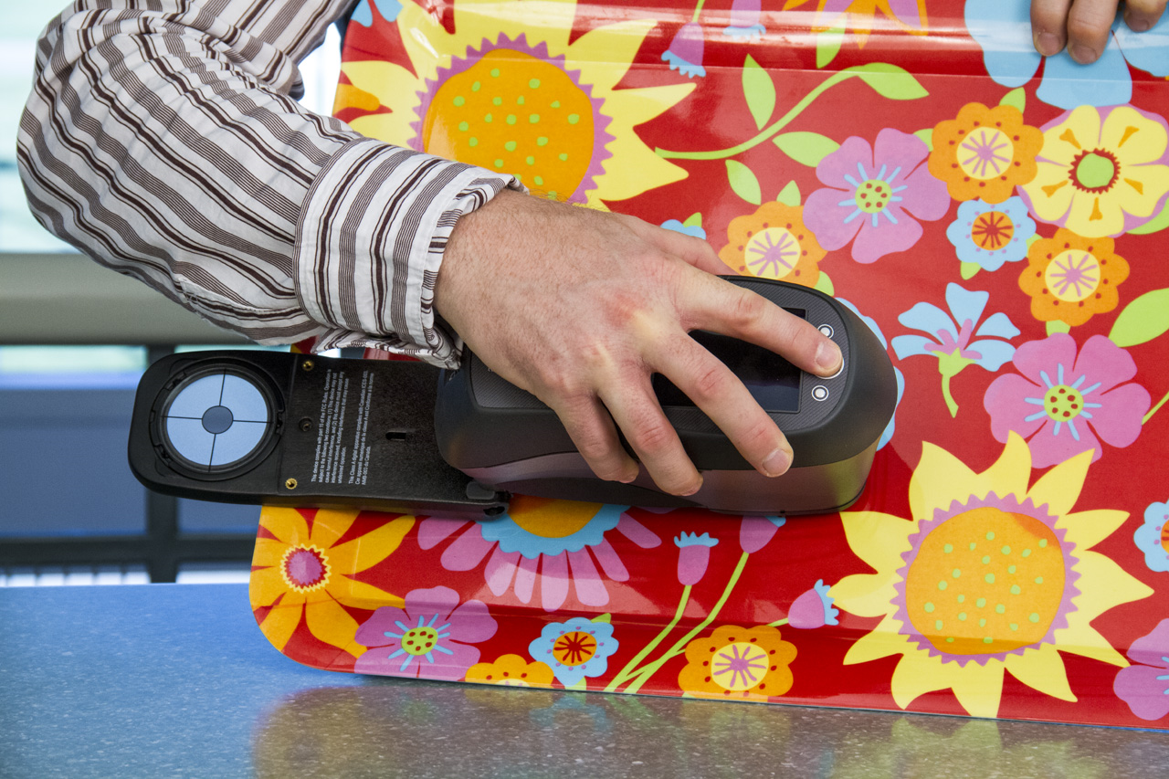
During raw material inspection
Everything from paper and inks for printing, to powders and pellets for plastics, to paint colorants and thread, fabric and dyes for textiles is comprised of raw materials. Each material should be measured to ensure it is within color tolerance. If not, that material should be rejected. After all, it’s much easier to start with consistent raw materials than to use trial and error processes and reformulate recipes until you get the color right. If color is off even a small amount at the beginning of the process, the color variance is likely to be even larger by the time you get to the final product. Starting with raw materials that comply with specifications reduces the overall potential for color errors across the manufacturing process.

-
While formulating color recipes
If the formula is wrong, there’s no way the color will be right. Trying to add a little of this or a little of that may get you there eventually, but the longer it takes to get the color right, the longer it will take to get it approved and into production. Time is money. By employing color formulation software like InkFormulation or Color iMatch, you can drastically reduce the time it takes to arrive at an accurate match, and greatly improve productivity.
-
In production
There are many ways color can go wrong during production, including natural color drift during a press or other production run; variances by operator, shift, location or production equipment type; and geographic differences. The ability to manage work in progress, including in-line measurement to avoid waste and rework, is a highly sought after capability that can greatly increase production throughput and reduce down time. Objectively validating color throughout the production process will help ensure that you are achieving the best possible color… no more surprises and a much more efficient and cost-effective production process. Or as we like to say: More new work, less rework.
-
During quality control
An effective quality control process is the best way to ensure that your color stays true across the entire workflow and is your last chance to verify that everything is perfect before you send final products to your customers. A certified light booth, like X-Rite’s new JudgeQC, allows you to examine samples under a variety of lighting conditions so you can be sure your color remains true in any lighting environment.
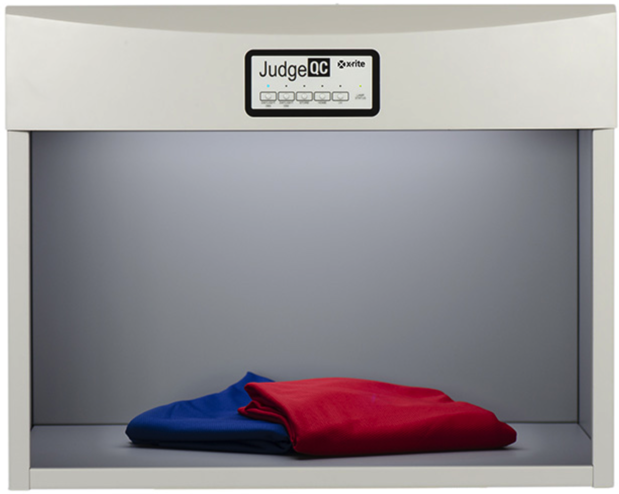
This is an important step, because out-of-specification material can cause costly rejections, rework, and upset customers… and may even land your products on discount store shelves. Ouch.
