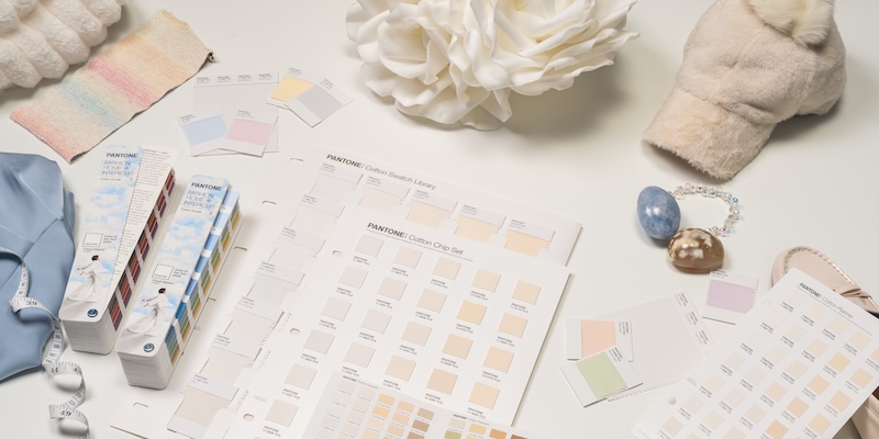
Il colore Pantone dell'anno 2026, PANTONE 11-4201 Cloud Dancer, è descritto come un bianco vaporoso ed etereo che dà spazio alla creatività, alla riflessione e alla calma. Un bianco caldo e freddo al tempo stesso, la cui presenza serena simboleggia il bisogno di chiarezza in un mondo rumoroso. E non appena la scelta è stata annunciata la scorsa settimana, si è riacceso un vecchio dibattito: il bianco è proprio un colore?
Spesso si pensa che il bianco sia "assenza" di colore. Ma la scienza del colore dice il contrario. Per capire questo colore critico, esaminiamo la scienza che sta dietro a come vediamo il bianco e a come viene prodotto.
La luce è la vera fonte del colore
La percezione umana del colore inizia con la luce. Gli oggetti non possiedono intrinsecamente il colore, ma assorbono alcune lunghezze d'onda e ne riflettono altre. La miscela riflessa entra nei nostri occhi e il nostro cervello interpreta quel segnale come un colore.

Lo spettro visibile dei colori, che conosciamo come arcobaleno, ingloba lunghezze d’onda da circa 380 a 720 nanometri e si scompone nei tre colori primari rosso, verde e blu. Mescolando questi colori in diverse intensità, possiamo creare milioni di colori. Quando mescoliamo il rosso, il verde e il blu in uguale intensità, percepiamo il risultato come luce bianca.
Poiché il bianco riflette tutte le lunghezze d'onda, è profondamente influenzato dalla temperatura del colore della sorgente luminosa. Un oggetto bianco può apparire brillante alla luce del giorno, con tonalità crema sotto il sole pomeridiano o leggermente blu sotto le lampade fluorescenti. La sorgente di luce non si limita a illuminare il bianco, ma ne plasma l'intero aspetto. Ciò diventa fondamentale quando si confrontano i bianchi tra prodotti, materiali o ambienti.

Leggi il nostro blog: Percezione del colore Parte 1: L'effetto della luce
Confronto tra teoria del colore additiva e teoria del colore sottrattiva
Per capire come viene prodotto il bianco nei diversi sistemi è necessario esaminare i due principali modelli di colore: additivo e sottrattivo.
Colore additivo (RGB)
Il colore additivo è quello che si ottiene aggiungendo luce. Schermi, telefoni e display digitali utilizzano le lunghezze d'onda del rosso, del verde e del blu (RGB) per creare tutti gli altri colori.
- Assenza di luce = nero
- RGB a massima intensità = bianco
I dispositivi digitali si basano su questa combinazione per simulare un'ampia gamma di colori, manipolando la quantità di luce emessa da ciascun pixel. Ecco perché il bianco del telefono o del monitor è letteralmente fatto di luce.
Colore sottrattivo (CMY/CMYK)
Il colore sottrattivo è quello che si ottiene sottraendo lunghezze d'onda dalla luce bianca usando inchiostri, coloranti o pigmenti. Funziona controllando la quantità di luce che un materiale riflette verso l'osservatore. Nella stampa e nel packaging, ad esempio, il ciano, il magenta e il giallo assorbono, o sottraggono, le loro lunghezze d'onda opposte per produrre la tonalità desiderata.

In questo sistema, il bianco è l'assenza di colore, perché non è possibile miscelare alcuna combinazione di inchiostri o pigmenti per produrlo. Il bianco deriva interamente dal substrato o dal materiale di base, motivo per cui spesso si discute se il bianco possa essere considerato un colore.
Tuttavia, se si guarda alla chimica dei pigmenti, la storia si fa più interessante. I produttori creano materiali bianchi utilizzando sostanze specifiche come il gesso o minerali come il biossido di titanio e l'ossido di zinco. Anche per la carta bianca, il cotone, la lana e altri materiali naturali si usano processi di sbiancamento per rimuovere la loro tonalità gialla intrinseca.

Il modo in cui la materia prima viene preparata introduce leggere variazioni di sfumature calde o fredde, ed è per questo che vediamo così tante sfumature diverse di bianco nelle vernici, nelle materie plastiche, nei tessuti e nei prodotti di uso quotidiano. In questo contesto, il bianco è un colore, con proprietà misurabili e sfumature visive proprie.
Leggi il nostro blog: Confronto tra modelli di colore additivo e sottrattivo
Perché molti bianchi non sono veramente bianchi
Una quantità sorprendente di materiali "bianchi" che ci circondano - carta, tessuti, packaging, materie plastiche - non sono affatto bianchi per natura. I produttori spesso aggiungono agenti sbiancanti ottici alla formulazione del colore o al materiale di base per creare un bianco visivamente più brillante.
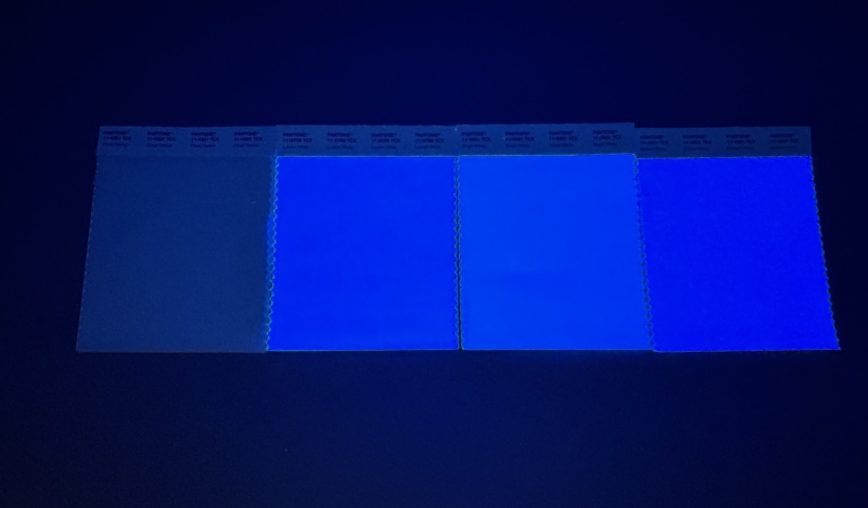
Gli agenti sbiancanti funzionano assorbendo la luce ultravioletta (UV) che non possiamo vedere e la riemettono nella regione blu dove possiamo vederla. I nostri occhi percepiranno questo bianco come più luminoso di quello che non contiene sbiancanti ottici.
Questo effetto "più bianco del bianco" può essere attraente, ma complica la comunicazione del colore. Gli agenti sbiancanti ottici diventano fluorescenti solo con sorgenti di luce contenenti UV. In presenza di luce a LED o altre luci a bassa emissione di raggi UV, un bianco ottenuto con agenti sbiancanti può apparire improvvisamente opaco, ingiallito o non corrispondente. Ciò significa che due materiali bianchi possono corrispondere in un ambiente e stonare in un altro.

Leggi il nostro blog: Sbiancanti ottici: un primer
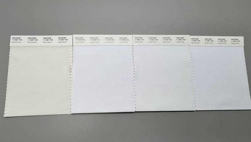
Sono stati usati agenti sbiancanti ottici per Cloud Dancer?
No, ed è proprio questo che lo rende speciale.
PANTONE 11-4201 Cloud Dancer è un bianco naturale, ottenuto senza sbiancanti ottici. La sua curva di riflettanza rimane bilanciata in tutto lo spettro visibile, senza picchi di blu artificiali, senza fluorescenza e senza miglioramenti ottici.
Questo è Cloud Dancer:
- Riflette la luce in modo uniforme
- Mantiene un aspetto coerente in condizioni d'illuminazione diverse
- È più prevedibile nei workflow del colore digitali e fisici del colore
- Si comporta come un vero bianco neutro di riferimento
Nella formulazione di questo neutro morbido, i produttori devono comunque considerare se il materiale di base contiene agenti sbiancanti ottici, poiché qualsiasi standard cromatico si comporterà in modo diverso su substrati con agenti sbiancanti. Per confrontare e valutare con precisione queste variazioni si utilizza spesso una cabina d'illuminazione.
Al contrario, molti bianchi popolari (come PANTONE 11-4001 o 11-0700) contengono agenti sbiancanti ottici e spesso misurano oltre il 100% di riflettanza nella regione del blu, prova evidente di fluorescenza. Per i settori che si basano sulla precisione del colore, la differenza tra un bianco naturale e uno con agenti sbiancanti ottici può influenzare in modo significativo la percezione, la misurazione e i risultati di produzione.

Allora? Il bianco è un colore?
Sì, il bianco è assolutamente un colore. Ha un profilo spettrale misurabile, partecipa pienamente ai sistemi additivi e sottrattivi e influenza il modo in cui viene visto ogni altro colore. È anche uno dei colori più difficili da gestire perché il suo aspetto dipende dalla luce, dalla composizione del materiale e dalla percezione umana.
Il bianco può apparire semplice, ma la sua scienza non lo è affatto. E forse è proprio questo il punto: i colori più tranquilli spesso invitano a una conversazione più profonda. Cloud Dancer ci incoraggia a guardare più da vicino e ad apprezzare l'interazione tra luce, percezione e materiale che dà forma a ogni colore che vediamo.
Se vuoi saperne di più sulla riproduzione di PANTONE 11-4201 Cloud Dancer, compila il modulo e un esperto del colore ti contatterà.
