When visually evaluating color, everyone accepts or rejects color matches based on their color perception skills. In manufacturing, this subjectivity can lead to confusion and frustration between customers, suppliers, vendors, production, and management.
Are these acceptable color differences?
This is why color measurement devices are important in so many industries. By measuring colors using a spectrophotometer, you can communicate and compare spectral data for exact results.
To aid in color decisions, color acceptability limits called tolerances can be set as guidelines for how much perceived color difference is acceptable. Tolerances are used to control color, ensure consistency within a production run, and to minimize lot-to-lot variability. But even when using spectral data and tolerances to quantify color, customers and suppliers still find themselves disagreeing.
Why does this happen?
Through the years, different numerical ordering systems have been developed. If customer and supplier are using different ones, the tolerance – and acceptable color – will be different. Today we’ll look at the most common tolerancing methods so you can be prepared, no matter which method you are expected to use.
Why you can’t always count on your eyes.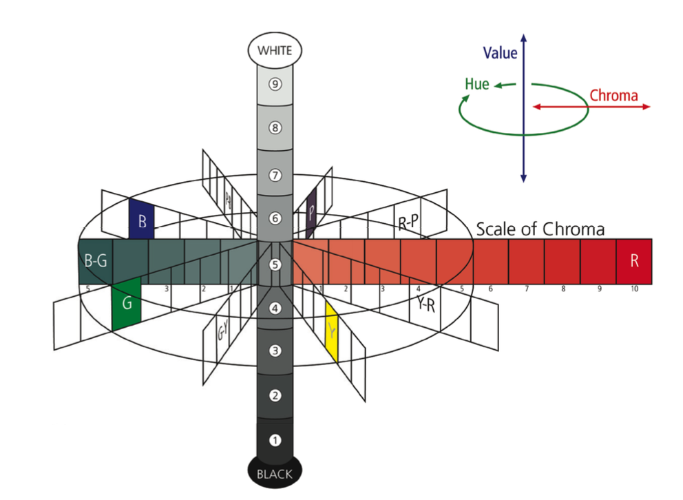
The human eye has limitations when distinguishing color differences. In addition to color memory loss, eye fatigue, color blindness, and viewing conditions, the eye can’t equally detect differences in hue (red, green, blue), chroma (saturation), or lightness and darkness. In fact, the average observer will see hue differences first, chroma or saturation differences second, and lightness/darkness differences last.
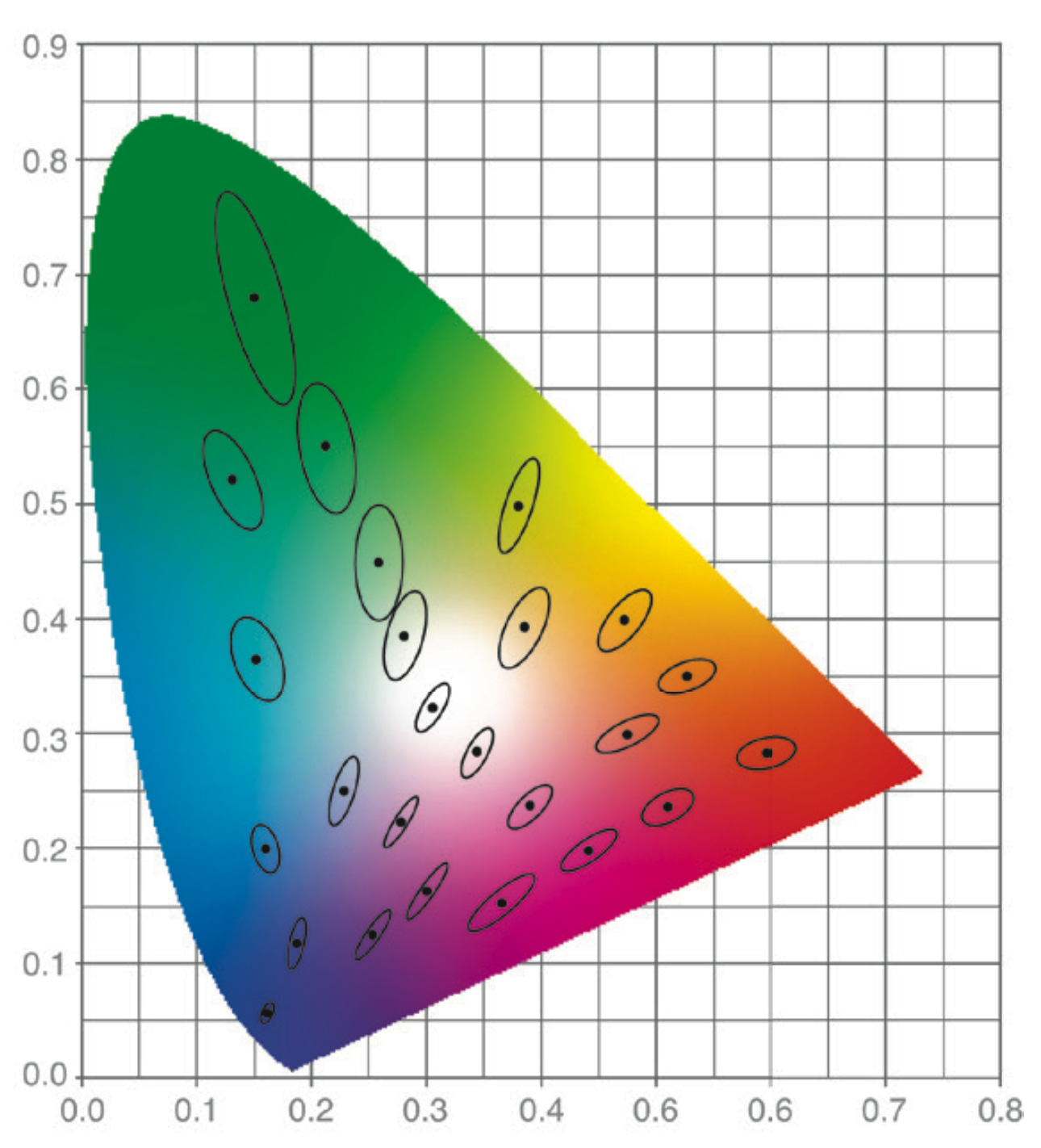
McAdam’s Chromaticity Diagram
As a result, a tolerance established for an acceptable color match has a three-dimensional boundary with varying limits for lightness/darkness, hue and chroma. Over the years, tolerancing methods have evolved in an attempt to create a method that best correlates to the eye’s sensitivity.
David MacAdam was one of the first to determine the human perceptibility limits for an entire population of colors. To do this, he produced a large assortment of master standards, then changed each color’s hue, chroma, and lightness until his observers noticed a difference from the color target. The resulting diagram, plotted on the chromaticity diagram, shows elliptical zones of visual acceptability.
Methods that improve color interpretation
1 – CIELAB
The 3D aspect of the CIELAB color space
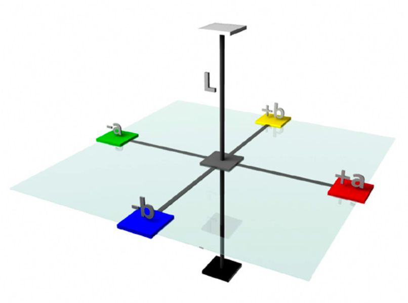
CIELAB, or L*a*b*, was the first internationally accepted color space. L*a*b* values are calculated from the tristimulus values (X,Y,Z), which are the backbone of all color mathematical models. The location of a color in the CIELAB color space is defined by a three-dimensional, rectangular coordinate system:
- L* indicates the color’s lightness or darkness
- a* is the color’s position on the red-green axis
- b* is the color’s position on the yellow-blue axis
Once the L*a*b* position of a color is determined, a rectangular tolerance box can be drawn around it to indicate the acceptable color difference.
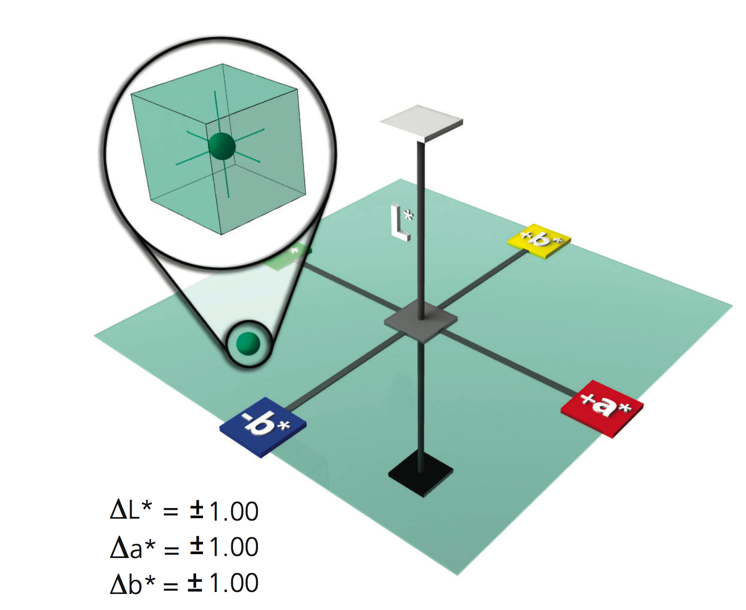
This color – a relatively dark (L* = 42.65, a* = -23.01, b* = 10.50) shade of greenish/blue – is defined by three numbers in the L*a*b* color model. Note that both a* and b* are negative, placing the measured dot in the green/blue quadrant.
But, since visual acceptability is the shape of an ellipse not a rectangle, there are some places in L*a*b* color space where using a tolerance box may cause problems. Some colors may pass that shouldn’t, and some acceptable colors may fail.
2 – L*C*h°
L*C*h° color difference calculations are derived from L*a*b* values, but mathematics convert the rectangular coordinate system to a cylindrical polar coordinate system.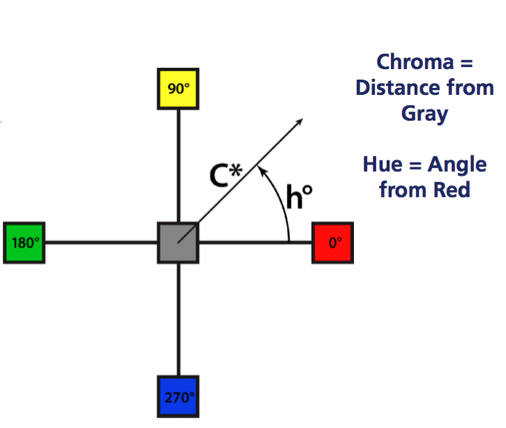
- L* is the same as in L*a*b* and represents the lightness plane
- C* is calculated vector distance from the center of color space to the measured color. Larger C* values indicate higher chroma or saturation.
- ∆h° is the calculated hue difference between two colors.
Using the L*C* h° polar coordinate system to set up tolerancing allows a tolerance box to be rotated in orientation to the hue angle. This more closely matches human perception of color, which reduces the chance of disagreement between human observer and instrumental readings or values.
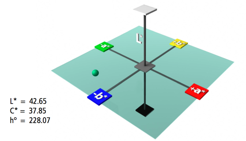
This image shows the same bluish-green point on the same color plane that was illustrated as L*a*b*, but using the L*C*h° system.
The image below compares tolerancing in L*a*b* and L*C*h°. The black oval shows the range of colors that visually appear within tolerance, while the red rectangle around the perception ellipse will be recorded as “in tolerance” by color measurement software.

As you can see, the L*C*h° system more closely relates to human perception, but still is not as accurate as they could be.
3 – CMC, CI94, and CIE2000
The most current and accepted tolerancing methods are elliptical – DECMC, CIE94, and CIE2000. These are not new color spaces, but rather are color difference calculations that are based on the color’s location in color space. This provides better agreement between visual assessment and instrumentally measured color difference.
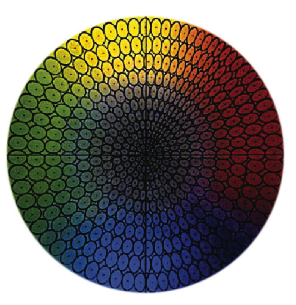
CMC Tolerancing Model
The image to the right shows a slice of these three-dimensional color models, bisected near the equator. At the center is gray, and chroma increases while moving out in any direction. Red, with a hue angle of zero, is at the right. Moving counter-clockwise, the hues shift into oranges, then yellows, then greens, etc.
These tolerancing systems create tolerance ellipsoids in color space around the target color. The ellipsoid represents the volume of acceptance, and automatically varies in size depending on position of the color in color space to more closely represent visual color perception. As you can see, the ellipses in the orange area of color space are longer and narrower than the broad and rounder ones in the green area. The size and shape of the ellipses also change as the color increases in chroma.
These equations allow the user to vary the overall size of the ellipse to better match what is considered acceptable. The eye generally has greater acceptance for shifts in the lightness (l) dimension than in the chromaticity (c) (hue and chroma) dimension.
Although we have not yet devised the perfect color tolerancing system, these elliptical tolerance methods best represents how we see color differences and are recognized standards in many industries.
What does this mean for manufacturers?
- The amount of acceptable tolerance varies by industry and application. For example, the tolerance for a plastic bubble container will be higher than the plastic dashboard for a $35,000 car.
- When you’re discussing color difference, be sure you’re talking about the same tolerancing system.
- When you’re setting the acceptable tolerance within your color measurement instruments and software, you must also select the tolerancing system to calculate accurate results.
To learn more about color models and tolerancing, consider our traveling Fundamentals of Color and Appearance seminar. Check to see when we’ll be near you.
Featured Color Management Solutions
Learn more about these featured products:
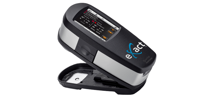
eXact
The new eXact combines industry-leading functionality with an easy-to-use interface to deliver the best solution yet for controlling, managing, and communicating color across the entire color workflow.
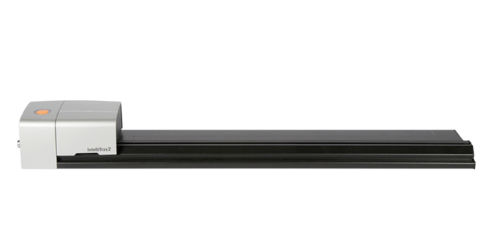
IntelliTrax2
Scan the color bar on a typical press sheet in less than 10 seconds. IntelliTrax2 is the ideal color management solution for high-end, high-speed printing/converting operations.