Warm weather is just around the corner and spring is in the air!
Fluffy yellow chicks…
Delicate pink tulips…
Soft green sprouts poking through the ground…
And, of course, spring M&M'S®!
Advertisers target our springtime emotions through pastel colors. Pastels have a calming effect, and everywhere you look companies are using them to feed our desire to feel a bit of spring.
Today we’ll take a look at the psychology of color, how marketers use this information to capture our attention, and Pantone’s influence on spring palettes.
Color in Marketing
Color is light and light is energy. Color can stimulate and excite us. It can make us feel happy, tranquil… or even depressed. We experience the psychological effects of color all day. It’s subconscious, yet effective.
In addition to identifying brands, colors can actually draw us to certain products. Marketers know this, and they use it to their benefit.
Studies show that red can actually increase our pulse, blood pressure and adrenaline, hence the red Nike swoosh. When combined with yellow, red can make us feel hungry. McDonald’s, anyone? Orange makes us feel happy and excited and is a great way to entice us to buy something. Yellow makes us think of sunshine and can be used to grab our attention in a comforting way.
Spring is the perfect time for marketers to target our emotions. You can’t help but feel happy. It’s a time of rebirth, renewal, and rejuvenation.
Pastels are less saturated than primary colors, making them feel light, soft, and calming. For spring, they work well with neutral colors to create a feeling of earthiness and sophistication.
Pantone’s Influence
Pantone plays a major role in the way marketers design and implement their spring campaigns. Each year during New York Fashion Week, the company releases the PANTONE® Fashion Color Report, which is a comprehensive overview of the way designers are using color in their upcoming collections.
According to Pantone, "The desire for colorful self-expression is a key take away for Spring 2018. The color story is wildly divergent and we see a kaleidoscope bounty of uplifting shades and feel-good tones. There is a feeling of optimism and confidence driving a new vitality into fashion trends."
Here are the 12 beautiful colors Pantone has selected for this year's palette.
 |
PANTONE 13-0646 - Meadowlark
A confident and outgoing bright yellow shade, glistening with joy and illuminating the world around us.
|
 |
PANTONE 17-1563 - Cherry Tomato
A tempestuous orangey red that exudes heat and energy and demands attention.
|
 |
PANTONE 16-4132 - Little Boy Blue
Suggestive of expansiveness and continuity, this azure blue shade reassures us with its promise of a new day.
|
 |
PANTONE 18-1440 - Chili Oil
An earthy brown based red that adds flavorful definition to the spring 2018 palette.
|
 |
PANTONE 14-3207 - Pink Lavender
A soft and romantic violet rose that charms with its soothing sense of quiescence.
|
 |
PANTONE 15-1520 - Blooming Dahlia
With its seemingly suggestive scent, this subtly alluring hue beckons us with its understated appeal.
|
 |
PANTONE 16-5533 - Arcadia
A cooler, cleaner take on green that with its tinge of blue undertone takes us into a new direction for the spring 2018 season.
|
 |
PANTONE 18-3838 - Ultra Violet
Conveying originality and ingenuity, a distinctive and complex purple shade that fascinates and intrigues.
|
 |
PANTONE 18-1028 - Emperador
A rich chocolate infused brown that adds strength and substance to the spring 2018 palette.
|
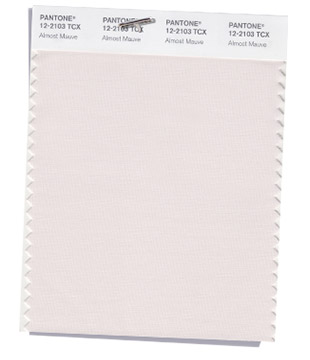 |
PANTONE 12-2103 - Almost Mauve
Delicate and ephemeral Almost Mauve adds a sense of nostalgia to the spring 2018 palette.
|
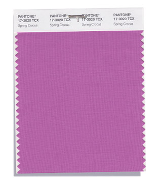 |
PANTONE 17-3020 - Spring Crocus
A flamboyant and tantalizing fuchsia shade that summons you in with its beguiling charm.
|
 |
PANTONE 13-0550 - Lime Punch
Lime Punch hits a chord with its strident and striking citrus like presence.
|
Keep your eyes open!
It will be exciting to watch how designers and marketers utilize these engaging, earthy pastels in their spring campaigns.
What will you buy without realizing you were influenced?
