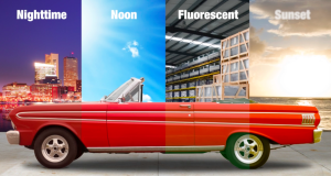
As the temperature of light changes, so does our perception of color.
As I mentioned in our last post, light plays a huge role in the way we perceive color.
Today we’ll look at the science of color in manufacturing and photography; specifically how an object’s reflective and absorptive properties and viewing technology can impact the colors we perceive.
To reflect or not to reflect… that is the question.
The colors an object absorbs and reflects is determined by its material – is it metal, plastic or fabric? – and the dyes or inks used to “color” it. Changing the material of the object or the formulation of the dyes and inks will change the reflective values, and therefore color we see.
 This poses a huge challenge in the manufacturing industry.
Think about assembling headphones with parts that were manufactured in different plants. Achieving the same color on different materials is not easy. Just because the leather ear pads, foam head cushion and printed metal sides appear to match under factory lighting doesn’t mean they will match under the store’s fluorescent lights, outside in the sun, or in the new owner’s new family room.
But it’s very important to the consumer that they DO match. Would you take a bottle of vitamins if half of them appear a shade lighter than the others? Would you cook and eat pasta if you open the box and half of it is a lighter shade of brown? Probably not.
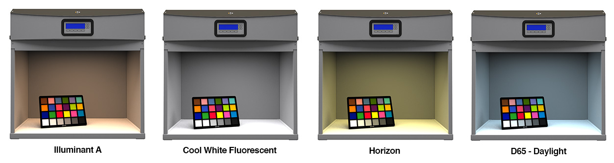
In manufacturing, color matching is crucial. Light booths allow us to place parts next to each other and change the illuminant so we can see how the colors look and whether they still match without the mind-tricking effects of surrounding colors.
Check out these images of the ColorChecker. Each was photographed inside X-Rite’s SpectraLight QC booth with a different light source.
Color perception in digital photography
Color perception is just as important in photography. Who wants a green face in their birthday picture? Capturing accurate colors with a camera starts with proper white balance.
As I mentioned earlier with my “white paper” example, whites look alike unless we have a point of reference to change our impression. Cameras work the same way. You now know that early morning sun will give a yellow cast, daylight will make everything look bluer, and fluorescent light more green. Setting the white balance will tell the camera what white really is, so it can capture the correct colors based on the light source.
While many digital cameras offer auto white balance for different scenes, such as outdoor, indoor, and moonlight, it’s not very accurate. The best way to ensure you’re capturing accurate color is to use a white balance card, such as X-Rite’s ColorChecker, to manually set white balance in your camera before each shot. The most common way to do that is to zoom in on the white balance card, and press the white balance button or select it from a menu. You should see the scene neutralize and know you’re in business.
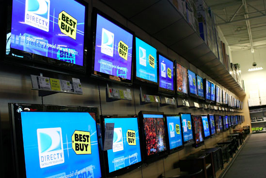
Photo courtesy of Best Buy
And then there’s technology to confuse things even more.
Technology can be a gateway, and a roadblock, for communicating color. Have you ever walked into an electronics superstore and wondered why the color on every single TV – even those by the same manufacturer – looks completely different?
Although modern technology is great for quick and easy communication, it can pose some serious problems for people in the color industry. Think of all of the ways we view color: TV, computer, phone, tablet, print… each displays it a little differently. Electronic devices use the additive color model. Print uses subtractive. Resolution varies, and devices use different color spaces and conversion equations for translation.
When it’s your job to ensure brand colors display correctly, it can get a bit hairy!
Color management helps by creating data files that describe the unique characteristics of individual digital devices. These “profiles” enable color matching between devices, including from monitor to print, between an original photograph and a digital file, and even between two prints created on different media with different inks.
Best Buy wall of TVs is a huge topic that deserves (and will get) it’s own post, but I wanted to mention it as something to keep in mind when using technology to share and interpret color.
What do YOU see every day?
Color science is very technical, and there is a lot more at play that the topics I briefly touched on here. Stay tuned for part three in our color perception series: The tricks the environment plays on our eyes.
Color Perception Blog Series |
|---|
| Part 1: The Effect of Light |
| Part 2: The Impact on Manufacturing |
| Part 3: The Tricks the Environment Plays on Our Eyes |
| Part 4: Human Traits |
