X-Rite Pantone® brings together the art and science of color to empower brands and packaging converters to deliver on design and color intent for their packaging. Last week we were in Atlanta at HOW Design LIVE 2016, introducing a few new tools that can help designers achieve color fidelity.
HOW is a more than just a conference for designers and brands – it’s an inspiration-packed, global creative gathering of the industry’s best. This made it the best place for us to showcase PantoneLIVE Cloud™, PantoneLIVE Designer, Digital Drawdowns and Digital Tolerances Guides.

The steps of a typical printing process introduce a common and gradual change or shift in a color as it passes from person to process. PantoneLIVE simply removes the opportunity for color drift by delivering digital color data directly from the source, giving you immediate color fidelity.
In case you missed us at HOW, here’s “how” our new solutions can help you achieve accurate color and get to market faster with fewer proofing and approval cycles.
1. PantoneLIVE Cloud
PantoneLIVE connects everyone in the supply chain with access to accurate, digital color. Brands and designers are working with the exact same digital color data as ink manufacturers, prepress, converters and printers.
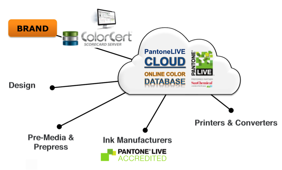
PantoneLIVE Libraries currently include over 10,000 Pantone Colors. Many of our customers also need access to their brand colors, which is why we also publish custom colors in the PantoneLIVE Cloud. We can create new Pantone Colors for your brand, just like we did for Tiffany and Veuve Clicquot. We offer “Private Cloud” for brands who want to use the tools and processes, but have a need to maintain their brand colors private or securely distributed to their suppliers.

Who doesn’t want their own Pantone Color? Veuve Cliquot Yellow is Pantone 137.
2. PantoneLIVE Designer License & Plug-In for Adobe® Illustrator®
 This is “how” we communicate the language of color. We deliver the most up-to-date Pantone Colors directly to Adobe Illustrator, where designers can manage their libraries using our plug-in tools. The PantoneLIVE plug in for Adobe Illustrator provides access to digital production standards for a more accurate representation of how the colors will appear on the end product.
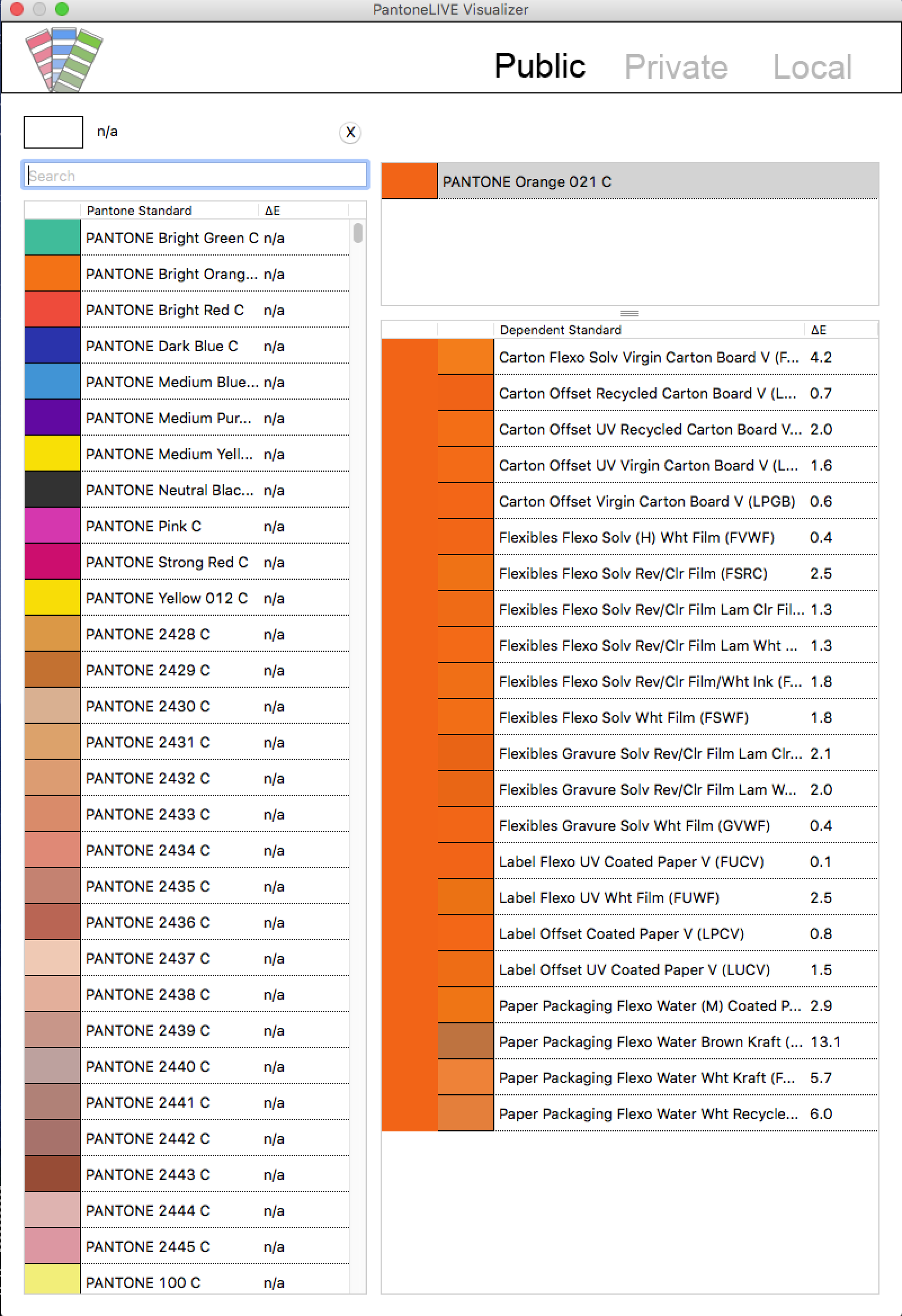
Using X-Rite’s PantoneLIVE Viewer in Adobe Illustrator, designers can anticipate color reproduction on multiple substrates. Inevitably, there is going to be a trade-off between aspirational and achievable color…. It is the hard fact of reproducing color in the physical world. In the end, it is usually economics that guides the final decisions about which materials and processes to use. Giving designers the language and tools they need can help them predict and achieve the best possible results.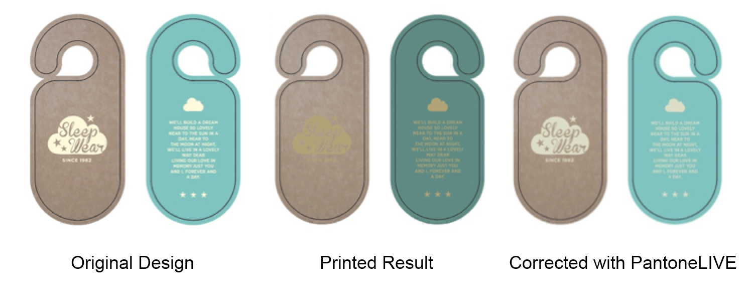 Here’s an example of how substrate, or material, plays a role in design. Had the designer used PantoneLIVE to see how their inspiration colors would look on the final material, they would have been able to use the Pantone Library for Kraft Paper and gotten a much better result. Although not identical to the design, at least the designer would have known what was achievable before this job went to print.
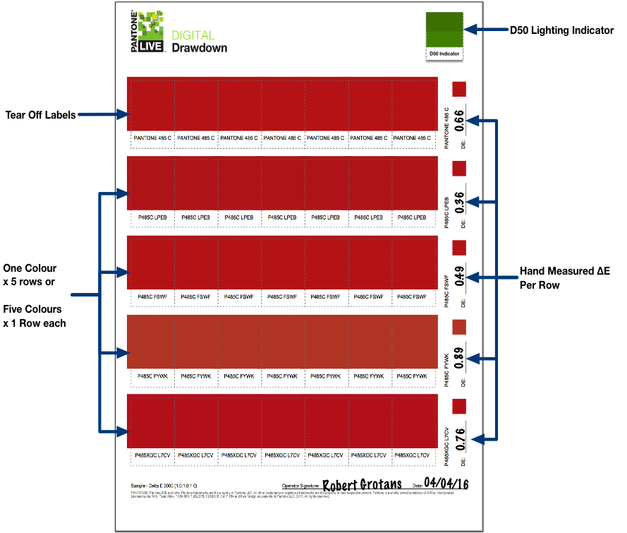
3. Pantone Digital Drawdowns
Of course, you still need to create physical proofs and samples, but digtal color removes the creep in color accuracy you experience in a visual-only workflow. Accuracy and time-to-market is greatly improved when everyone can pull digital color data from the source.
When it is time to show how a color will look on a specific material, you no longer have to go to the ink lab for a drawdown. We used our color science knowledge and technology to offer a better solution. A highly accurate, hand measured, digital drawdown is a friendly and familiar tear-off label that you can stick directly to a physical sample to verify accuracy in proofs, mock-ups, or press sheets.
4. Pantone Digital Tolerance Guides
Another ingenious tool is the new Digital Tolerance Guide, which allows you to visualize exactly how color difference will appear. Until now you had to guess whether a Delta E of 2.0 or 3.0 would be “good enough,” but with the Digital Tolerance Guide you can actually see the difference.

Have you ever wondered what a Delta E, color difference, looks like? With the Pantone Digital Tolerance Guide, you can see for yourself.
Easy-to-use tools that help you predict color, shorten color discussions, and eliminate arguments… PantoneLIVE Cloud and Designer, along with Digital Drawdowns and Digital Tolerances Guides, can help you get to market faster with fewer approval loops.
To learn more, or download the full HOW presentation, and be sure to watch our free, on-demand “Package Design and Color Consistency” webinar!
