As a sponsor of ArtPrize, X-Rite Pantone has been taking the opportunity to explore color – how it affects us emotionally, and how it impacts the decisions we make. So far we have profiled two artists – Anne Lemanski, who uses color to portray the imagery of science and nature, and Ruben Ubiera, whose creative use of metallic paint and light gives the impression of movement in his outdoor murals.
Today we’re showcasing the work of artist Michael Peoples, who has been experimenting with colorful wax, molds and mold making for the last several years. He works primarily with recycled candles that he collects from various places, especially thrift stores. The color he finds determines the base color of the object. Then he uses crayons to enhance the color direction and give the piece substance. This year, Peoples is submitting another molded creation to ArtPrize.
His installation for ArtPrize 2013, Will You Still Need Me, Will You Still Feed Me, included two sets of 64 Guan Yin figurines, which he molded from 160 boxes of Crayola crayons. Arranged on a 6×6 foot chessboard, the figurines represented that moment we all remember from childhood: opening a new box of crayons. The bright colors and waxy smell were meant to conjure the nostalgic memory of the endless creative possibilities that a new box of crayons represented.

Michael People’s 2013 ArtPrize entry Will You Still Need Me, Will You Still Feed Me.
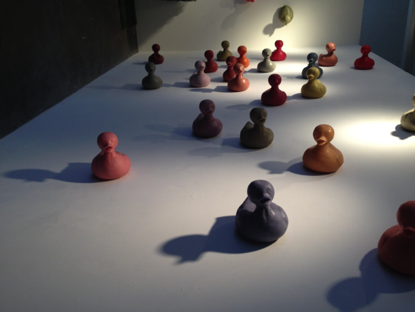
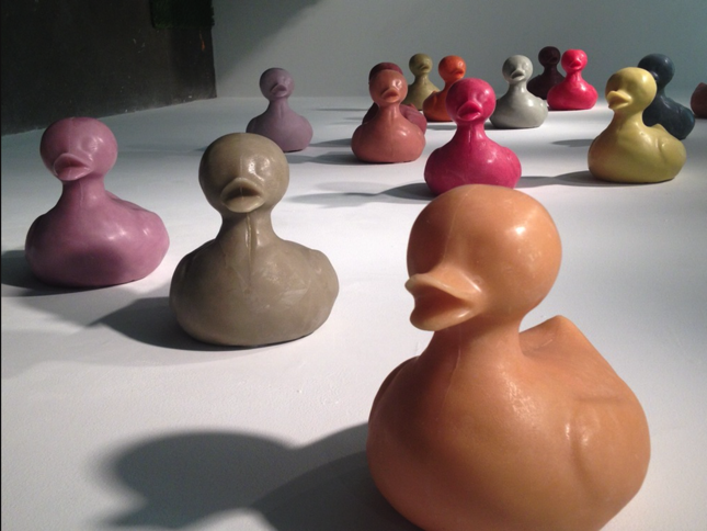
The scent of crayons is one of the most recognizable smells and has a direct correlation with childhood. This year, Peoples is once again using color and scent to evoke an emotional experience with The Great Race. It consists of castings of bright, colorful, rubber ducklings, the same type you’d see in a child’s bathtub or at a carnival. It’s no doubt this work is meant to prompt visitors to reflect on their childhood. Each duck is oversized, so that in an adult hand it represents the scale of the classic toy for a child.
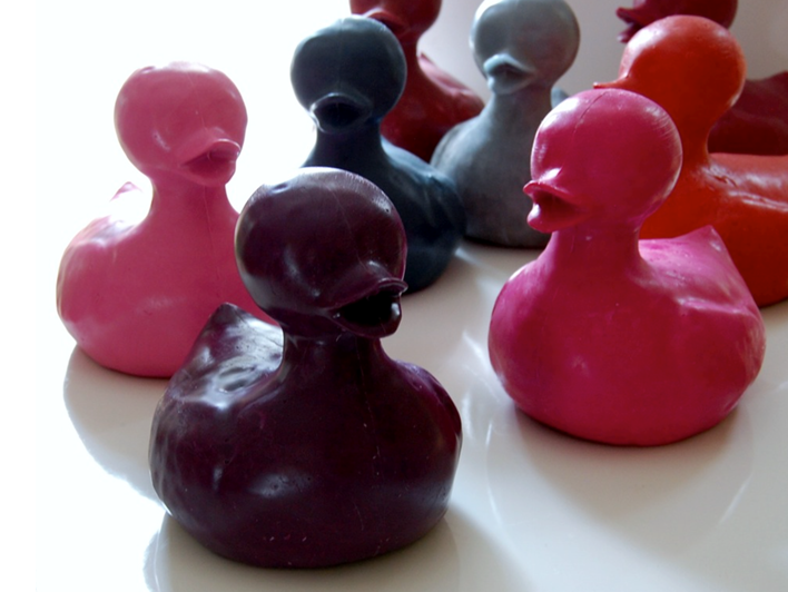
Heather Duffy is the Exhibitions Curator for Urban Institute for Contemporary Arts, where Peoples’ exhibition will be displayed. She was attracted to Michael’s work because of the unique connection he creates between materials and memory – a multisensory experience, complete with visuals and a focus on the sense of smell. “Each of the 200 ducks in The Great Race is created from melted down crayons, the scent of which is closely associated with a strong positive sense of nostalgia in adults. No two ducks are alike, and none were cast out because of imperfection. The freshest and most sturdy ducks which most cleanly mimic the original mold are placed at the very beginning of the race; the farther along the duck is in The Great Race, or up the wall in this case, the more unique, misshapen, ‘scarred,’ or otherwise imperfect it is.”
Peoples adds, “The idea of repetition in my work is important. I have always had an interest in mass production, but with these works I individualize each one. Over the time it takes to complete a series, I make mistakes as well as improvements to the process. These are all included and add another dimension to the final installation.”
In a world where companies spend so much time and money to keep color consistent, we were intrigued by Peoples’ random use of color and the message it portrays.
For example, the color of each Crayola crayon Peoples used for his ducks was carefully measured in the Crayola factory to ensure that each crayon matched the one in the box next to it. In fact, each Crayola crayon color is assigned an RGB value that must be matched within a small tolerance to even make it into the box in the first place. It’s a big job, and one that Crayola takes very seriously to ensure that its customers are happy with the perfect colors they receive in each box.
As suppliers and pigments change, crayon makers must adjust their formulas to keep the color consistent. And accurate measurement and matching requires reliable color measurement instruments, related software and appropriate lighting conditions. Check out our recent blog post on how lighting affects color perception and keep that in mind when you view Peoples’ fabulous display.
In creating his work, Peoples melted the crayons and combined them with other types of wax to create new shades. “I use color because of the resonance it adds to an installation. Each work acts as an invocation. Underlying layers help breathe a personal spirit into the work. Aesthetically it can be appreciated without having to know any these hidden aspects, yet they add a new perspective when revealed.
“My artistic practice centers around process, work, and nostalgia. This installation is a work that could only be accomplished with the passage of time and a commitment to the work itself. There are so many things about a box of crayons that adds to its mystique. It is one of those memories from childhood that is multi sensory: Smell, color, the feel of the paper and crayon in your hand. It’s the entire sensation of the new box of crayons at the beginning of a school year that holds so many possibilities, that box of 64 with the crayon sharpener.”
We asked Peoples what’s next for the ducks… will there be other installations in the future? “I have found that people enjoy owning a small part of something larger, so each of the ducks is available for purchase individually and there will be several in the UICA’s gift shop.”
Stay tuned as we continue our ArtPrize Seven artist series. Up next – Jose Carlos Casado.
