Whether you’re printing on press or replicating a brand’s colors on the web, PANTONE’s Color Systems are the gold standard for communicating color specification and quality control. They provide a common language for color so specifiers and manufacturers can be sure they understand the customer’s expectations and reproduce those colors, even if they’re a world away.
The PANTONE PLUS SERIES COLOR BRIDGE Set provides process color simulations of all solid PANTONE Colors as a side-by-side comparison.
Digital Standards
Digital PANTONE Standards can be used to specify color, design packaging layouts and formulate ink and raw materials. Adobe® plug-ins like PantoneLIVE Color Book and Viewer provide creatives a way to visually understand how a color will look once it is produced on a particular packaging substrate. Other software tools like PANTONE COLOR MANAGER make it easy to import the latest PANTONE Color Libraries into your design software of choice. Colors are specified by their PANTONE Color Number, but with a Digital PANTONE Standard, spectral data can be shared by everyone. By going to the numbers, you can reduce or remove variances that occur from subjective reading under poor lighting or when using older physical references. Everyone in the supply chain from design to final product is accessing the same digital color data, creating a high level of consistency from start to finish.
Digital standards provide manufacturers with confidence that they’re delivering the right and relevant color, so they can work faster and more efficiently.
Maintaining Digital PANTONE Color standards is simple because they never fade. You just need to update your libraries regularly to keep them current and make sure everyone in your supply chain is accessing the same version. X-Rite makes this easy with its cloud-based ecosystem, PantoneLIVE, which stores Digital PANTONE Color packaging standards.

Accessing digital standards through PantoneLIVE to formulate exact ink colors.
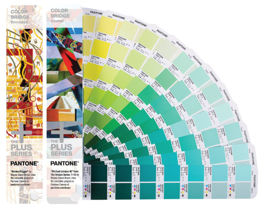
Physical Standards
Of course, it is essential to still have physical reference guides when working with color. In order to ensure the best color match possible, a visual evaluation using a current PANTONE Guide, such as a FORMULA GUIDE or COLOR BRIDGE, must also be performed under the proper lighting and viewing conditions. Only by performing a proper visual evaluation can you be certain that your color will meet the exacting standards of the most demanding clients.
It’s Pantone’s role to produce color publications that provide the visual reference for each color, but users have the responsibility to properly care for their PANTONE Guides to ensure that they remain accurate. Here are some best practices for maintaining your PANTONE Guides and Chip Books.
- Handle them carefully. Finger smudges, oil and dirt will damage the pages and can even change the color of the swatch.
- Store them properly. UV light will cause color to fade, so keep them in a temperature-controlled environment and away from direct sunlight.
- Keep them clean. Be aware of airborne contaminants as well.
- Pantone recommends replacing them annually. Even though you may feel they still “look right,” even slight deterioration will impact your color and can cause you to produce out-of-spec color. Plus, Pantone offers regular product updates, such as color range extensions. Frequently replacing your PANTONE Guides and Chip Books ensures that you can take full advantage of these updates.
The cost of incorrect color is much higher than the price of keeping your guides up-to-date. Find out whether yours lives up to today’s standards by visiting pantone.com.
