We’ve all done it. Snapped a picture on a digital camera or smart phone, sent it to the computer, made a few adjustments, then sent it off to print…. only to be disappointed.
The sky looks green. Grandma’s hair is purple. The contrast is so far off you can’t even see that cute little puppy. Stupid camera.
 The struggle is real for so many people, from hobbyist to professional photographers, graphic designers, and professional printers. Let’s look into this all-too-common mystery of the off-color print.
The Mystery
For photographers and designers, wrong color leads to frustration. For printers it means expensive rework and unhappy customers. So why is it so common that the final print is a disappointment? What is responsible for all of those bad images? The camera? The design software? The printer?
Truth is, it may be any of them, all of them, or something else entirely.
The Investigation
In a traditional print workflow, color has to travel through many different devices before it makes it to print. Let’s investigate the collaborators.
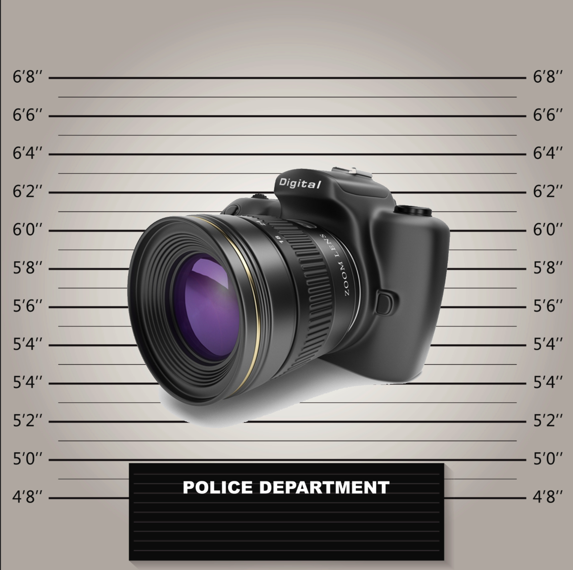 Accomplice #1 – The camera. It’s no surprise that there will be a difference in color and quality between a point-and-shoot smartphone and a $6,000 DSLRs camera. There are so many cameras available today, and with rapidly changing technology, enhancements are coming out all the time. That makes the camera the first place color can wrong.
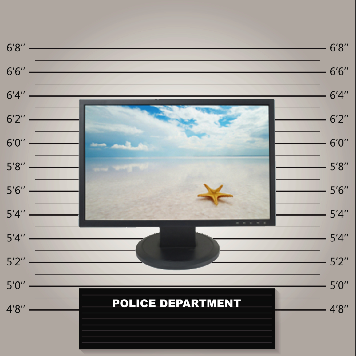 Accomplice #2 – The monitor. From giant old CRTs to various stages of LCD resolution, different monitors display color differently. In fact, if you go into an electronics store and look at the wall of displays, you’ll find even two devices by the same manufacturer will not look exactly the same. When you correcting color while viewing it on a bad display, you’re sure to be disappointed with the printed results.
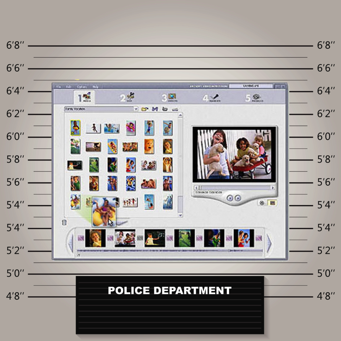 Accomplice #3 – The design program. Whether you’re an amateur photographer using your camera’s design program or a designer editing a professional layout in Adobe® Photoshop® or InDesign®, you are introducing yet another place for color to shift. Design applications use different color settings as default and convert colors differently during saving and exporting.
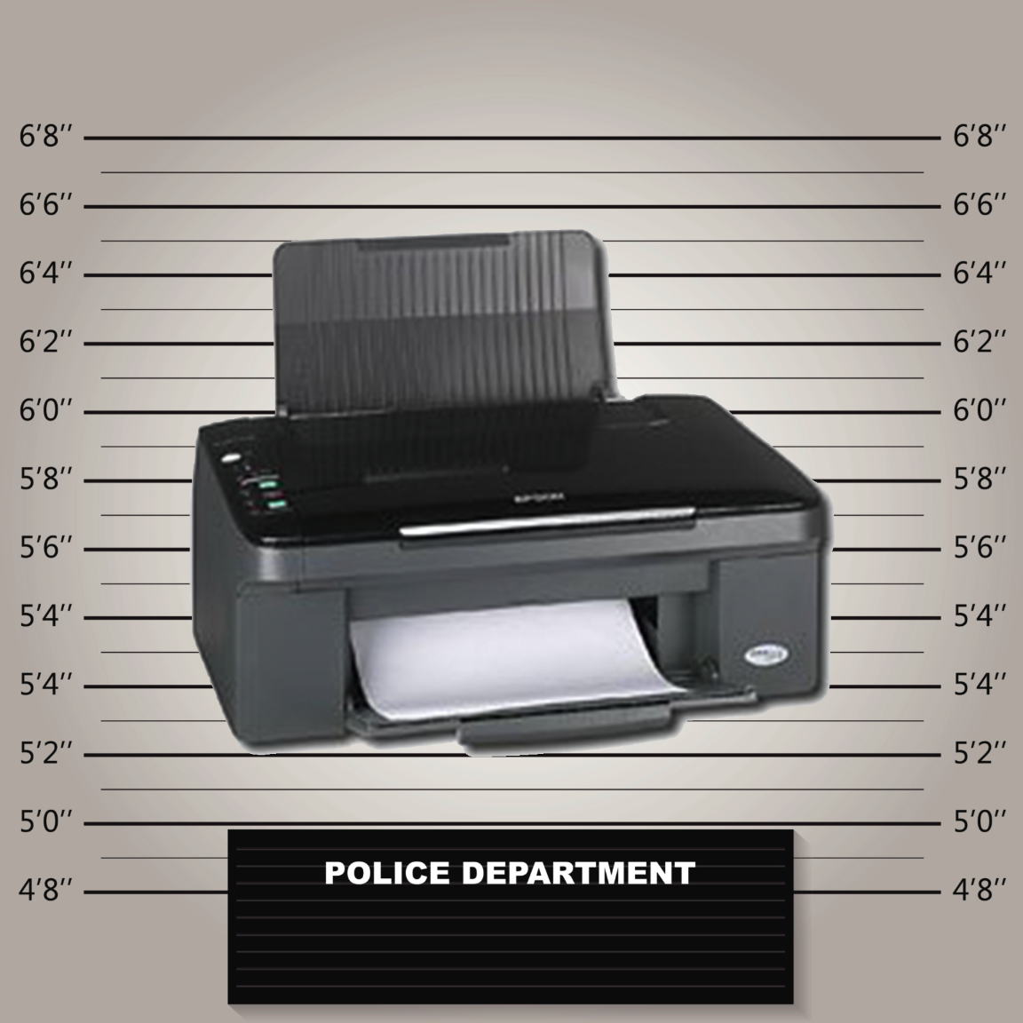 Accomplice #4 – The printer. Printers range from compact photo printers and self-serve grocery store kiosks up to commercial print shops producing magazines, books, and packaging on giant digital, offset, and flexo presses. Assuming your color made it intact through accomplices #1, #2, and #3, the type of printer you’re using to produce it will play a huge role in the final quality.
The Explanation
Any of these accomplices can be the culprit in a color workflow, but more times than not, it’s more than just one. Here’s why.
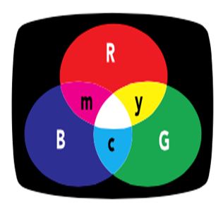 Each of your devices rely on different color models to display color. Input devices – your camera and monitor – use the additive color model to display color. They start with darkness and add red, green, and blue light to create a spectrum of colors. Printers, on the other hand, use the subtractive color model. They start with white and using opposing colors – cyan, magenta, and yellow – to subtract color.
Plus, each device in your workflow uses a different color gamut. Even two of the exact same cameras can capture different colors, and the same goes for monitors and printers. In the end, the color you get depends on the devices that are producing it. As you can imagine, this causes much confusion for those colorful pixels.
What does this mean for photographers, designers and printers?
Even if you have the best quality camera, monitor, design program and printer, if those devices don’t speak the same language, you’ve got a problem. To ensure accurate color, you need the help of color management.
A color-managed workflow uses hardware and software to optimize each of your devices and help them communicate. From novice users to color professionals, X-Rite’s color management solutions are easy to set up and can provide good results without a lot of work or color knowledge.
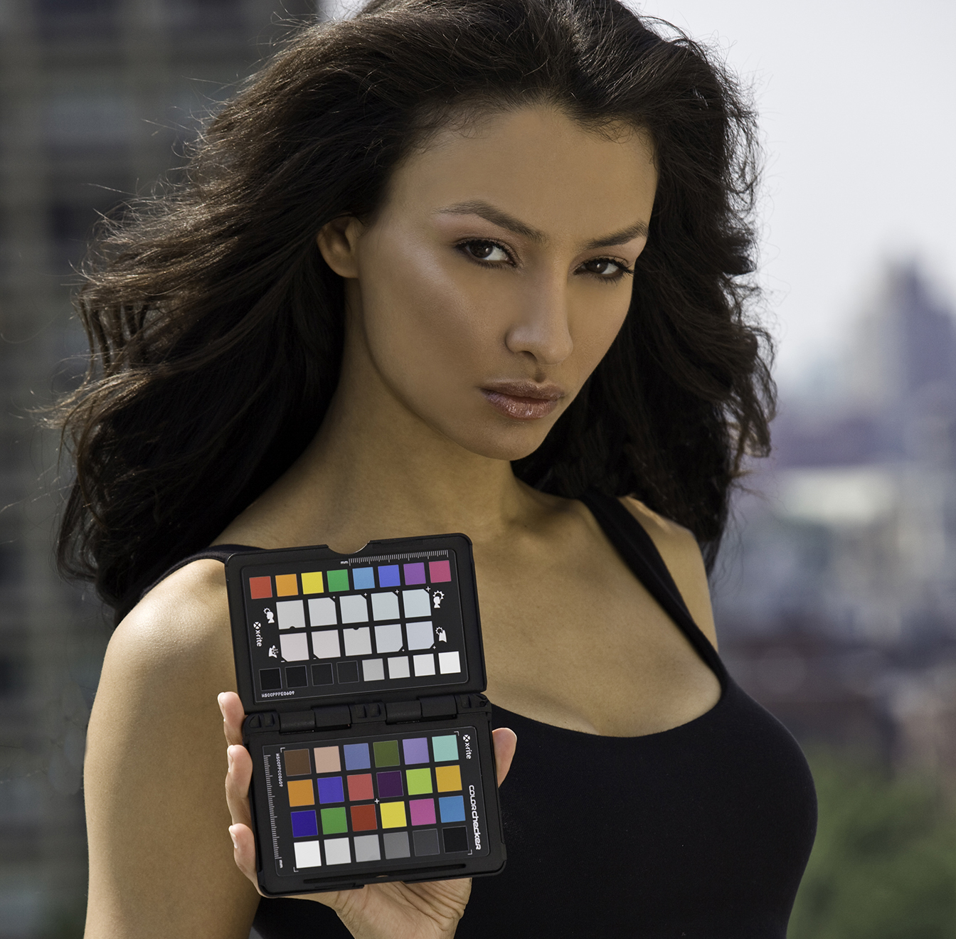
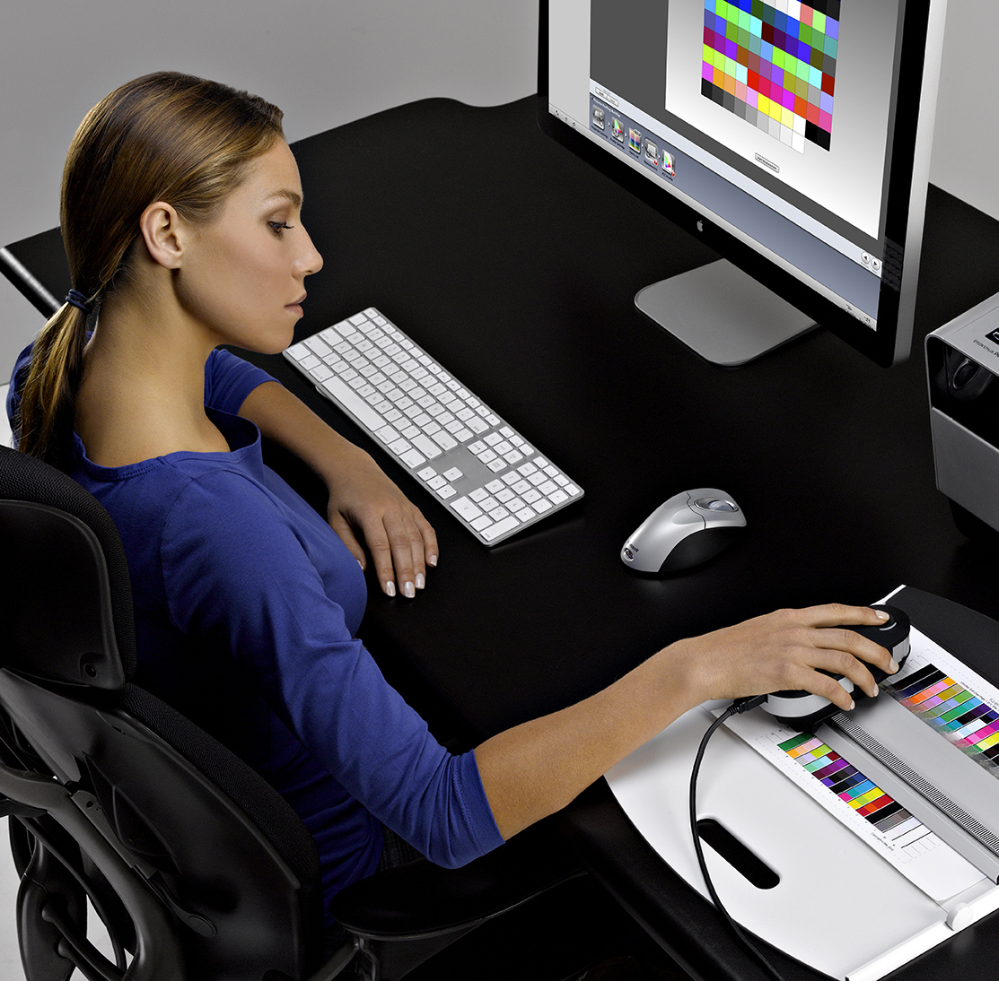
For the camera, using the ColorChecker Passport allows photographers to correct for any color issues caused by the camera or the lighting conditions when the image was shot.
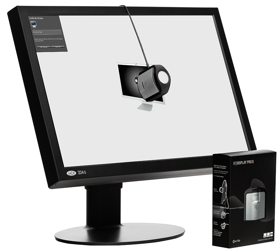
For the monitor, using the i1Display Pro to calibrate and profile will correct the very common problem of a monitor being too bright and too blue, so you can trust the colors you see on screen.
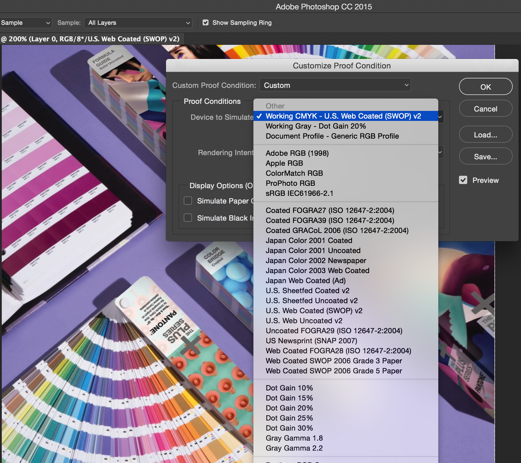
As for the design program, using the “softproofing” feature (free in both Adobe Photoshop and Lightroom®) BEFORE you print files will avoid many frustrating and expensive print mistakes.
The printer can also be a cause of a poor print, but the simple and inexpensive step of doing a nozzle check on cheap paper before printing your file can improve quality. For professional printing applications, it’s best to calibrate and profile your printer to achieve the most accurate results using a solution like i1 Professional.
Photographers and Designers – Color management will help you work edit confidently and send your files to print knowing the colors you get back are the colors you expect.
Printers – Understanding how color management works from beginning to end will help you understand your role in the process and save you a lot of time, rework, and hassle. It can also help you educate your clients so the files you receive in the future are already color managed. Why not send them to our blog to learn more?
X-Rite offers an excellent introduction to color management. Our Color Control Freak eLearning course uses video presentations, software demos, and interactive exercises to teach you the basics.
Another color mystery solved!
