
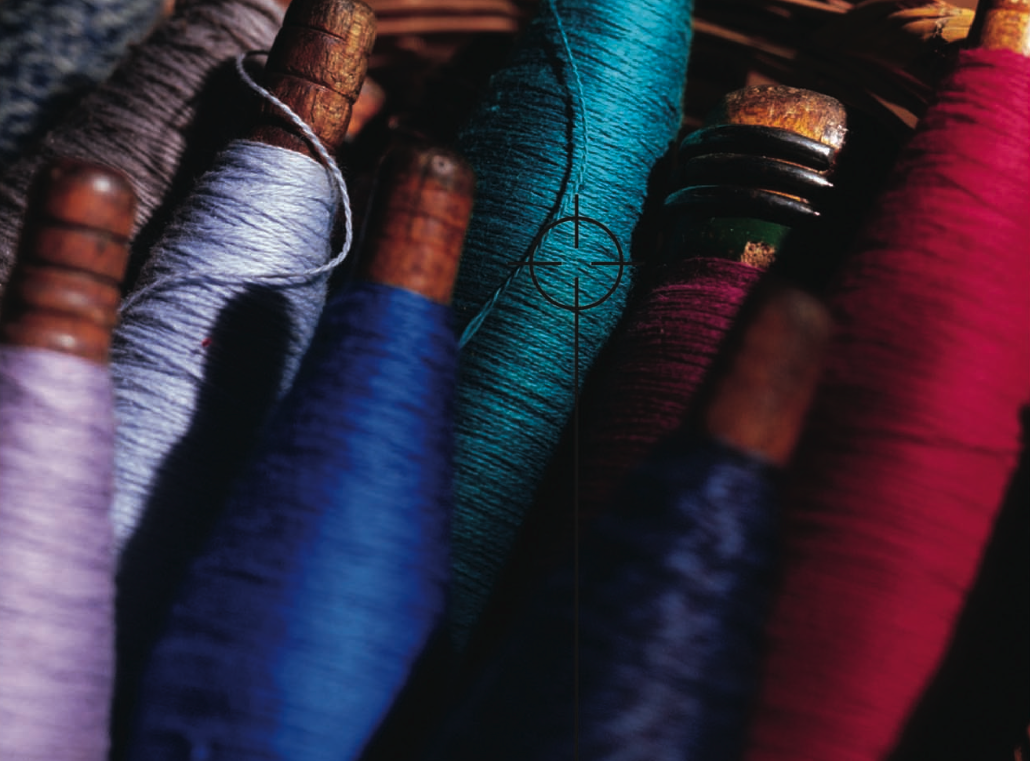
L’empreinte écologique de la mode est hors de contrôle. Selon le Conseil de défense des ressources naturelles (Natural Resources Defense Council - NRDC), “les usines textiles génèrent un cinquième de la pollution industrielle de l’eau dans le monde et utilisent 20 000 produits chimiques, dont beaucoup sont cancérigènes, pour fabriquer leurs vêtements". Teinture de tissu en usine. Image de NRDC.org. Un ...
Posted April 12, 2023 by X-Rite Color
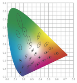
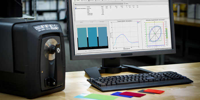
Pour mesurer la couleur, un dispositif de colorimétrie éclaire un échantillon, capture la quantité de lumière transmise ou reflétée dans la plage de longueurs d’onde de 380 à 780 nm et la quantifie en mesure spectrale. La colorimétrie est nécessaire pour spécifier, quantifier, communiquer, formuler et vérifier la qualité des couleurs pour des travaux dans lesquels celles-ci constituent un critè...
Posted August 24, 2021 by X-Rite Color

La pandémie de COVID-19 a obligé de nombreuses entreprises à repenser leur façon de communiquer, d’approuver et de produire la couleur. Pour certaines, cela implique d’essayer de poursuivre leurs activités habituelles à distance. Pour d’autres, il s’agit de trouver des moyens de gérer la couleur sans se déplacer. Quoi qu’il en soit, nous savons que nos clients font tout leur possible pour maintenir leur activi...
Posted December 15, 2020 by X-Rite Color
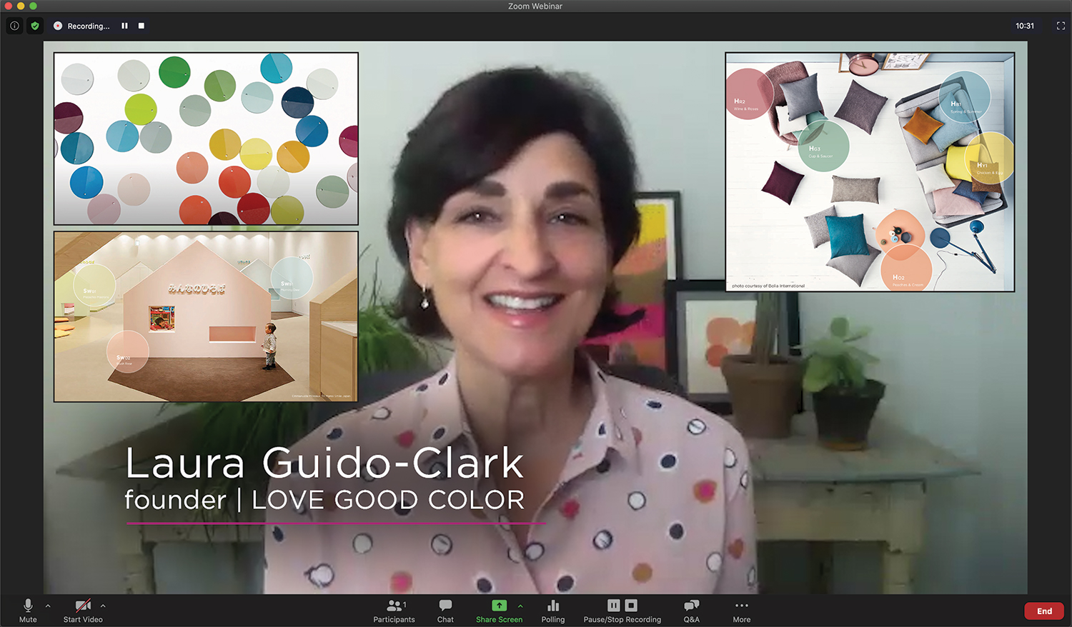
Recently we had the opportunity to sit down with Laura Guido-Clark, a consumer products designer of color, material, and texture. She has been dubbed an “Experience Consultant,” which reflects her interest and study of human reactions to the look and feel of new products. Photo by Laura Flippen. We asked Guido-Clark to speak with us because we also appreciate the importance of color in our lives. Q. What inspired you to pursue a career in color? A. When I wa...
Posted September 01, 2020 by X-Rite Color

G7® is a proof-to-print process control method that allows you to reliably and efficiently match the visual appearance of the output from multiple printing devices. It works by defining the gray balance and NPDC curves in conjunction with the traditional method of measuring tonal value increase (TVI/dot gain) for each color. G7 can be applied to any type of printing, regardless of the type of ink or printing method, including all types of digital, offset, flexo, gravure printing. It&r...
Posted February 27, 2020 by Mark Gundlach
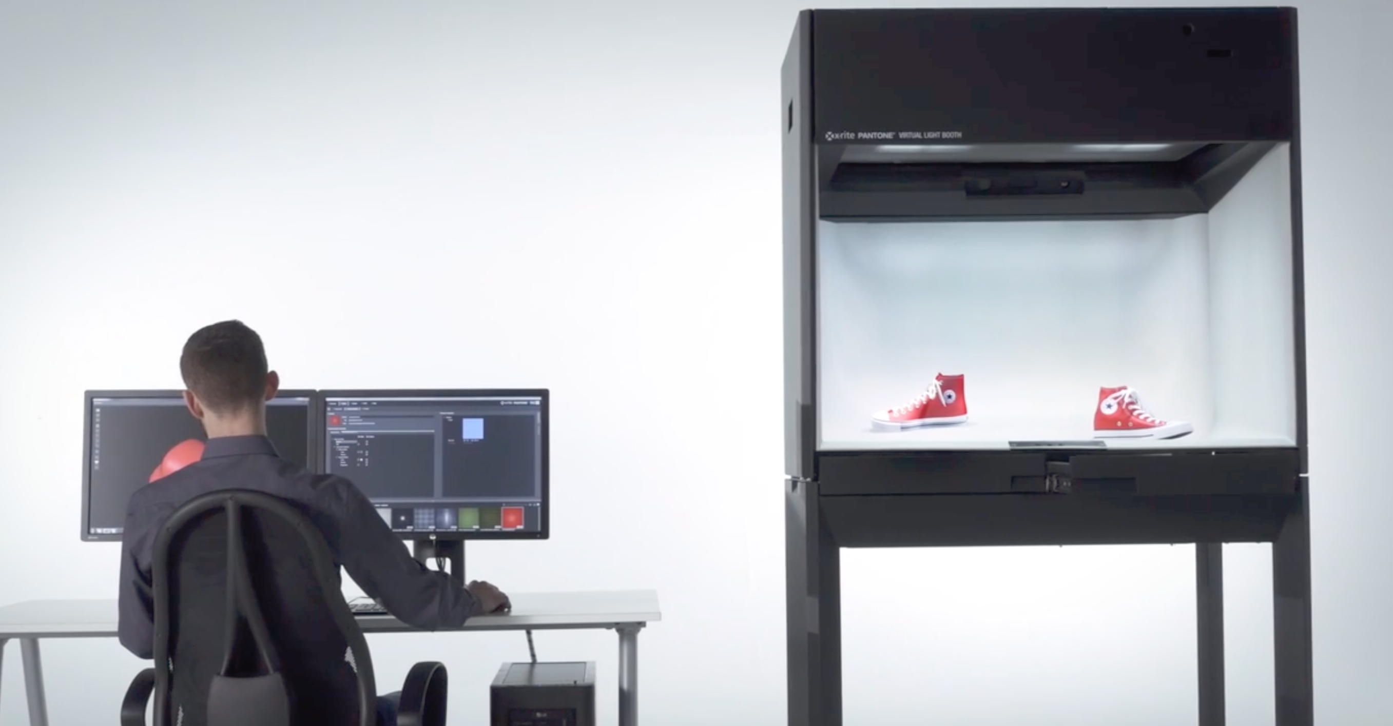
Virtual reality has re-imagined the art of apparel and footwear design. 3D design programs like MODO, KeyShot, CLO, Browzwear, Optitex, and Lectra augment the creativity of color and material designers to virtually construct patterns and render realistic 3D garments. This is exciting technology for brands that want to reduce waste for a greener footprint and accelerate design to keep up with fast fashion. However, designers are notoriously tactile. They need to touch, feel, and gain a...
Posted October 24, 2019 by Bruce Wright
With so many requests for innovative bases, transparency, and special effects, formulating color for paint, coating, and plastic applications can be a challenge. To keep up, formulation software needs to be innovative, too. We recently launched version 10 of our Color iMatch formulation software, and it is our smartest version yet. It allows you to select cost-reducing parameters, such as lowest cost or fewest colorants, and will determine the best formula for your application. It work...
Posted July 10, 2019 by Rich Knapp
Like geographic coordinates – longitude, latitude, and altitude – L*a*b* color values give us a way to locate and communicate colors. What’s the history of L*a*b*? In the 1940’s, Richard Hunter introduced a tri-stimulus model, Lab, which is scaled to achieve near uniform spacing of perceived color differences. While Hunter’s Lab was adopted as the de facto model for plotting absolute color coordinates and differences between colors, it was never formally accepted as...
Posted October 08, 2018 by Tim Mouw
Nous avons récemment écrit sur l’influence de l’apparence sur la couleur. Cet article porte sur certaines des caractéristiques qui influencent l’apparence d’un objet, telles que la texture, la brillance, la transparence et les effets spéciaux, et explique pourquoi il est essentiel de décrire l’apparence dès les premières étapes du flux de conception. Alors que les programmes 3D tentent depuis des années...
Posted November 29, 2017 by Thomas Meeker
You think you’re doing everything right, but your color isn’t consistent. Why? Through the years, designers have used many tools to help them specify color. Color swatches, style guides and product prototypes have been effective, but with the advent of the digital world, these physical tools are no longer enough. To be efficient, designers need to be SPECIFIC. X-Rite Pantone President Ron Voigt recently published an article in MediaPost that explains why. To be effective, designers n...
Posted November 17, 2017 by Cindy Cooperman
