
.jpeg?h=285&la=it-IT&w=400&hash=E9A3E267811AFF59A4193484FB7CBD292CC833E2)
Sostieni che il colore è importante, ma ne conosci a fondo importanza? In realtà, il colore è un elemento fondamentale nel processo di produzione. Oggi, molti produttori si rendono conto che ottenere il colore esatto è molto più complicato di quanto fosse in passato, e ricevono richieste di tolleranze più rigorose dai brand owner che supportano. Ecco perché. Se i progressi nella tecnologia del colore – p.e., packaging metallici, finiture pe...
Posted November 01, 2022 by Cindy Cooperman
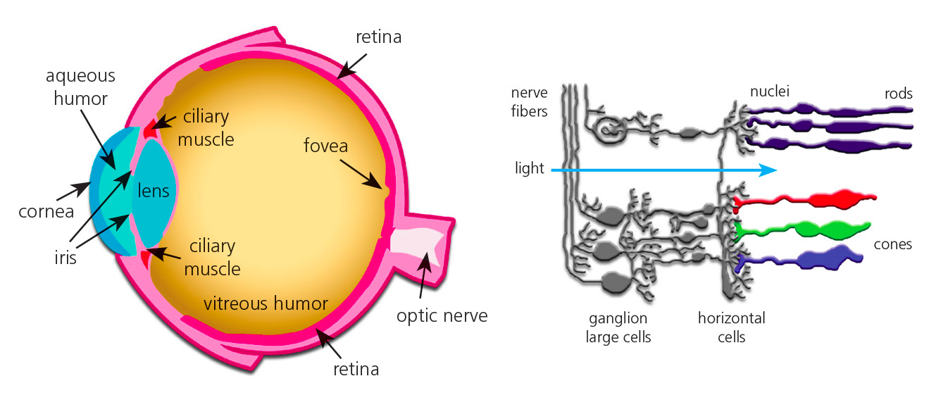
There are many things that affect our ability to see color. In some cases, it doesn’t matter if the red you see is the same shade I see. A barn is a barn, right? But for those who work in an industry where color evaluation is part of the job, it IS important… VERY important. In our color perception series, we’re discussing the many factors that affect how we see color and what colorists can do to ensure that the color they see is the color they are supposed to see. Today we’ll take a closer look...
Posted August 31, 2022 by X-Rite Color

You’ve probably heard of popular detectives like Sherlock Holmes and high school sleuth Nancy Drew, who have gained notoriety by solving the toughest crimes. With so many color mysteries out there, we thought it was time to do some investigating of our own in the mysterious realm of color. In our Color Detective blog series, we’ll be tackling some of the biggest mysteries in color, starting with this red ball… Which isn’t actually red. The ball on the left is not green...
Posted April 06, 2016 by X-Rite Color

Which of these swatches would you call bright red? PANTONE FASHION, HOME + INTERIORS Color Specifier pages Speaking the language of color isn’t like giving someone your phone number and expecting they’ll remember it. Our minds just don’t process color like that. While vague color descriptions are sufficient for many people – “Turn left at the blue house” or “choose the reddest strawberries” – if you work in an industry where color is important, you need to know how to speak a much more spe...
Posted March 24, 2016 by Mike Huda

ArtPrize hired Grand Rapid’s own Conduit Studio to design theme ideas for this year’s event. Together, they selected Celebration of Color to highlight the importance of color in our everyday lives, and to inspire visitors to explore and discuss the creativity of the event. Last week, X-Rite Pantone contributed a guest blog for ArtPrize that walked through the process to select the color palettes that would define each neighborhood and give the event a unified feel. Today we’ll link art and scie...
Posted September 24, 2015 by X-Rite Color

As we’ve talked about in previous posts, proper lighting conditions are crucial for evaluating color. The best way to know you’re seeing color accurately is to evaluate your samples in a quality light booth. But what if you don’t have a light booth available? Pantone has solved this problem with its LIGHTING INDICATOR Stickers. They’re economical, easy to use, and the second best way to find out if your viewing conditions are right for color evaluation. Here’...
Posted July 06, 2015 by Shoshana Burgett
