
L’impronta ecologica della moda è fuori controllo. Stando al National Resources Defense Council (NRDC), “Le aziende tessili generano un quinto dell’inquinamento mondiale delle acque industriali e per produrre gli abiti utilizzano più di 20.000 sostanze chimiche, molte delle quali cancerogene.” Tessuto tinto nello stabilimento. Immagine da NRDC.org. Un problema che riguarda tutti Sapevi che occorrono circa 200 tonnellate di acqua (sufficie...
Posted April 12, 2023 by X-Rite Color
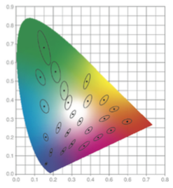
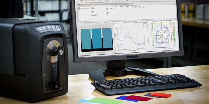
Per misurare il colore, lo strumento invia luce su un campione, cattura la quantità di luce che viene trasmessa o riflessa nell’intervallo di lunghezza d'onda da 380 a 780 nm e la quantifica come misurazione spettrale. La misurazione del colore è necessaria per specificare, quantificare, comunicare, formulare e verificare la qualità del colore nei lavori in cui il colore è importantissimo. Dato che ogni persona percepisce il colore in un modo diverso, la misuraz...
Posted August 24, 2021 by X-Rite Color

COVID-19 ha obbligato molte aziende a ripensare le modalità di comunicazione, approvazione e produzione del colore. Per alcune ha significato provare a continuare il “business come sempre”, ma da postazioni remote. Per altre, trovare il modo di gestire il colore senza effettuare spostamenti. Sappiamo però che i nostri clienti fanno sempre tutto quello che è in loro potere per sostenere l’attività e, allo stesso tempo, garantire la salute e la sicure...
Posted December 15, 2020 by X-Rite Color

Recently we had the opportunity to sit down with Laura Guido-Clark, a consumer products designer of color, material, and texture. She has been dubbed an “Experience Consultant,” which reflects her interest and study of human reactions to the look and feel of new products. Photo by Laura Flippen. We asked Guido-Clark to speak with us because we also appreciate the importance of color in our lives. Q. What inspired you to pursue a career in color? A. When I wa...
Posted September 01, 2020 by X-Rite Color

G7® is a proof-to-print process control method that allows you to reliably and efficiently match the visual appearance of the output from multiple printing devices. It works by defining the gray balance and NPDC curves in conjunction with the traditional method of measuring tonal value increase (TVI/dot gain) for each color. G7 can be applied to any type of printing, regardless of the type of ink or printing method, including all types of digital, offset, flexo, gravure printing. It&r...
Posted February 27, 2020 by Mark Gundlach

Virtual reality has re-imagined the art of apparel and footwear design. 3D design programs like MODO, KeyShot, CLO, Browzwear, Optitex, and Lectra augment the creativity of color and material designers to virtually construct patterns and render realistic 3D garments. This is exciting technology for brands that want to reduce waste for a greener footprint and accelerate design to keep up with fast fashion. However, designers are notoriously tactile. They need to touch, feel, and gain a...
Posted October 24, 2019 by Bruce Wright
With so many requests for innovative bases, transparency, and special effects, formulating color for paint, coating, and plastic applications can be a challenge. To keep up, formulation software needs to be innovative, too. We recently launched version 10 of our Color iMatch formulation software, and it is our smartest version yet. It allows you to select cost-reducing parameters, such as lowest cost or fewest colorants, and will determine the best formula for your application. It work...
Posted July 10, 2019 by Rich Knapp
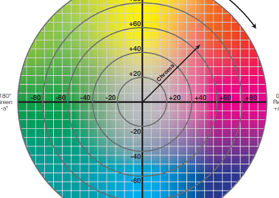
Like geographic coordinates – longitude, latitude, and altitude – L*a*b* color values give us a way to locate and communicate colors. What’s the history of L*a*b*? In the 1940’s, Richard Hunter introduced a tri-stimulus model, Lab, which is scaled to achieve near uniform spacing of perceived color differences. While Hunter’s Lab was adopted as the de facto model for plotting absolute color coordinates and differences between colors, it was never formally accepted as...
Posted October 08, 2018 by Tim Mouw

Di recente abbiamo discusso sul blog il modo in cui l’aspetto influisce sul colore. In questo articolo esaminiamo alcune delle caratteristiche che influiscono sull’aspetto di un oggetto, come texture, lucentezza, trasparenza ed effetti speciali, e spieghiamo quanto sia importante descrivere l’aspetto sin dalle prime fasi del workflow di design. E se i programmi 3D hanno cercato per anni di affrontare le caratteristiche di aspetto, qualcosa è però sempre mancato n...
Posted November 29, 2017 by Thomas Meeker
You think you’re doing everything right, but your color isn’t consistent. Why? Through the years, designers have used many tools to help them specify color. Color swatches, style guides and product prototypes have been effective, but with the advent of the digital world, these physical tools are no longer enough. To be efficient, designers need to be SPECIFIC. X-Rite Pantone President Ron Voigt recently published an article in MediaPost that explains why. To be effective, designers n...
Posted November 17, 2017 by Cindy Cooperman
