
Anyone responsible for printing goods or packaging knows that some colors, like orange, are just too difficult to reproduce using only CMY inks. A fourth color, black (K, which stands for key color) is often added to subtractive color printing applications. Since C+M+Y actually creates a muddy brownish color due to ink impurities in C, M and Y, adding a true black ink creates the deep color and tones that CMY alone can’t achieve, plus adds density to the shadows. This four-color printin...
Posted February 10, 2023 by Scott Harig

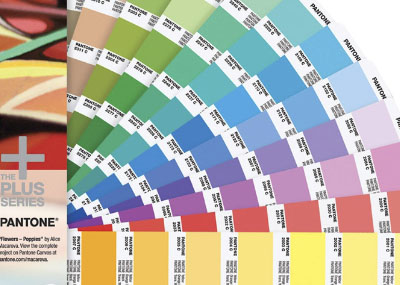
Extended Gamut Printing Increased product variation and lean manufacturing demands are forcing converters to work quicker and more cost-efficiently. Implementing extended gamut printing, also called fixed color palette printing, is a great way for brand owners and designers to specify achievable color, and for converters to reduce press setup time, produce smaller lot sizes, and increase press efficiency. In this video, X-Rite Pantone Color Expert Mark Gundlach explains extended color g...
Posted October 16, 2021 by Mark Gundlach

ICC color management means having a workflow that is predictable, consistent, and repeatable from capture through proofing to final output. To achieve a color managed workflow, you need to calibrate your devices and create an ICC profile for every component, including the camera, monitor, projector, scanner, and printer. Why Calibrate and Profile? For the best color results, you need to calibrate each device that is contributing to your workflow to ensure it is accurately reproducing colo...
Posted January 27, 2021 by Ray Cheydleur

Phone and computer screens are the window into the digital world of color, but if you are approving colors via email or text you need to be aware of the limitations. For starters, each of your devices relies on a different color model to display color. Input devices – your camera and monitor – use the additive color model to display color. They start with darkness and add red, green, and blue light to create a spectrum of colors. Printers, on the other hand, use the s...
Posted March 27, 2020 by X-Rite Color

To understand how color management works, you need a basic knowledge of the additive and subtractive systems of color reproduction. Both use a small number of primary colors that combine to produce a large number – or gamut – of colors… but the way they do that is quite different. In our Color Perception Part 1: The Effect of Light post, we explained how the visible color spectrum (we know it as the rainbow) encompasses light wavelengths from approximately 380 to 720 nm....
Posted August 10, 2018 by Tim Mouw

The Pantone Color Institute just announced PANTONE® 18-3838 Ultra Violet as the Pantone Color of the Year 2018! This news is always exciting because it sets the stage for upcoming trends for everything from housewares to fashion to packaging design. In fact, we have already seen shades of Color of the Year used in packaging and graphic design by forward-looking brands in the CPG, luxury, and beauty worlds as well as by personalities and artists seeking to stand out. Part of butt...
Posted December 11, 2017 by Mark Gundlach

It’s been said that everything you need to know you learned in kindergarten. Does this phrase ring true for print and packaging designers? In the spirit of spring, we attempted to use a simple childhood activity—dyeing eggs—to solve some of the most perplexing color issues facing the packaging designer/printer relationship. Here are three lessons to learn about color in print and packaging from our annual egg dyeing ...
Posted April 06, 2017 by Shoshana Burgett
