What happens when you have more than 2,000 brand colors to manage across a complex global packaging supply chain? Things get complicated!

Although it may seem easier to create a new color than to dig through databases or binders of color drawdowns to find the closest match, the problem comes later when you’re faced with a huge, unmanageable library.
One of our clients, a well-known fast-moving consumer packaged goods (FMCG) company, understands how easily things can get out of control. They were not only battling time and cost inefficiencies by using a proprietary color library, they lacked standardization for creating, communicating and managing brand colors.
Production was expensive and quality was suffering. They knew things had to change, but they didn’t know where to start. That’s where we came in.
Today we’re sharing their incredible success story.
What happens when a color library grows out of control?
A company representative explains the implications of growing a library of over 2000 colors: “We came to realize that with our proprietary color library, we were essentially reinventing the work that Pantone has been doing for more than 50 years to standardize the specification and communication of color.”
Quality was suffering, too. Before starting the project, we evaluated their ColorCert Scorecards for a recent toothpaste tube. The scores ranged from 14 to 25 out of 100… not even close to the passing score of 50.
PantoneLIVE to the rescue!
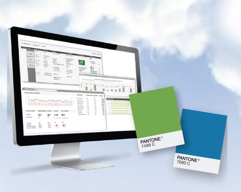
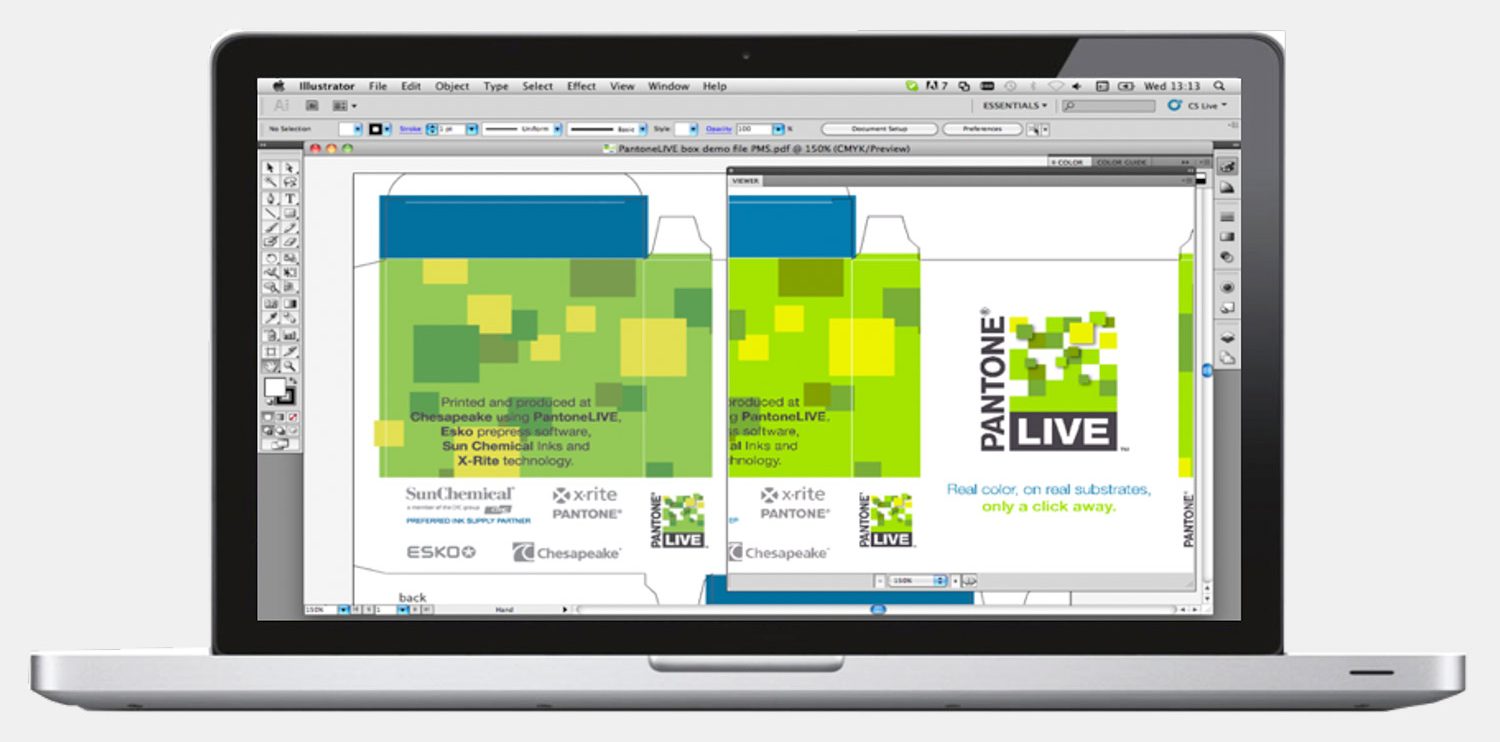
PantoneLIVE allows print and packaging companies to share accurate and achievable colors throughout the supply chain. Using common color standards, brand owners, designers, and printers can see exactly what is achievable on different substrates, printing presses, and ink systems.
By implementing PantoneLIVE and leveraging our services, this company consolidated their color library, mapped the resulting consolidated color set to Pantone Colors, and standardized the communication process. Here’s how we worked together to make it happen.
1 – We gathered digital values for the binders full of physical drawdowns.
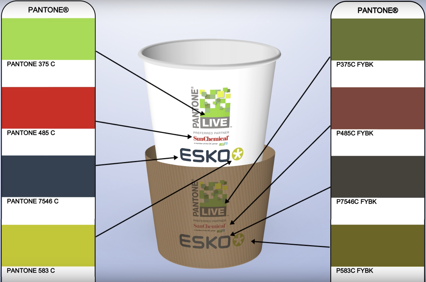
We then mapped each of the spectral values to Pantone Colors within the client’s specified tolerance. By moving from their own colors standards to Pantone, we reduced redundancy and ended up with a smaller, more manageable palette.
2 – We rationalized the color set to eliminate similar colors.
 Rationalization is a service that analyzes a color library and consolidates colors that have variations so small they are effectively the same. The smaller set of colors is then mapped to standard Pantone® Matching System (PMS) master colors and also to PantoneLIVE dependent references. In cases where there are brand colors that do not map to PMS colors, custom colors can be added to the PantoneLIVE private libraries for brands. In this video, X-Rite Pantone Senior Color Scientist Edward Hattenberger explains the many benefits of rationalization and mapping of color libraries.
If the custom color and the Pantone Color were close enough to be essentially the same, we substituted the Pantone Color. If the closest match was greater than what was visibly perceptible, the brand owner could choose to substitute the closest Pantone Color or create a new color.
We ended up creating about 100 new colors; about two-thirds were imported into the Pantone Library to become standard Pantone Colors, while the remaining colors became proprietary to the company. In the end, rationalization reduced the number of colors to about half the original size!
3 – We evaluated and compared printed samples.
In addition to the visual assessment, we compared each of the colors to the digital dependent standard in PantoneLIVE from the appropriate library.
4 – We gave access to stakeholders.
This is one of the wonderful features of PantoneLIVE – the ability to make the digital color library available across the entire supply chain.
The dramatic results
In the end, this company reduced its color library from about 2,090 colors to 1,035. This means a faster, more cost-effective means of choosing and communicating color across the company’s broad base of designers, agencies, brand managers and printers/packaging converters.
 Brand owners now have color data at their fingertips for new projects and to evaluate print quality. Designers have access to PantoneLIVE Visualizer, an app that allows them to virtually see how a chosen color will appear on different substrates and under different lighting conditions. And printers can manage consistency throughout production.
But perhaps the most dramatic metric was the improvement in quality – from a high of Delta E 12 to an average of Delta E 0.98! Remember our toothpaste? The first ColorCert Scorecard for this same tube after implementing PantoneLIVE was 89 out of 100!
After a successful pilot, the company began rolling out this process across its print supply chain. “We now have a set of standard operating procedures, are leveraging the color expertise resident at X-Rite Pantone, and have seen our quality dramatically improve. This has helped improve time to market and reduce overall costs. And as Pantone adds more colors to its libraries, we will have those at our disposal as well as still have the ability to create custom colors if we need them. This has made a significant difference in our overall quality and efficiency that we likely could not have accomplished without their assistance.”
Is PantoneLIVE right for you?
You don’t need a custom library of 2000 colors to reap the benefits of PantoneLIVE. To learn more about how X-Rite Pantone can help your brand stand out on the shelf with excellent color, get in touch. We’re always happy to help!
To learn more about achieving brand color with PantoneLIVE, check out these free resources:
- Achieve Timely & Consistent Color in Packaging, It’s Not Easy Being Purple, and PantoneLIVE on-demand webinars
- Understanding PantoneLIVE Master & Dependent Standards blog
- YouTube support videos

