
.jpeg?h=285&la=es&w=400&hash=8B21F38A521F20286B362733AEF530D873EBA896)
Usted dice que el color es importante, pero ¿sabe por qué lo es tanto? En efecto, el color es un elemento crítico en el proceso de fabricación. Por desgracia, muchas empresas fabricantes se están dando cuenta de que acertar con el color es mucho más difícil de lo que solía ser, y las marcas a las que apoyan les piden que cumplan tolerancias más estrictas. Le explicamos por qué. Los avances en la tecnología del color &m...
November 01, 2022
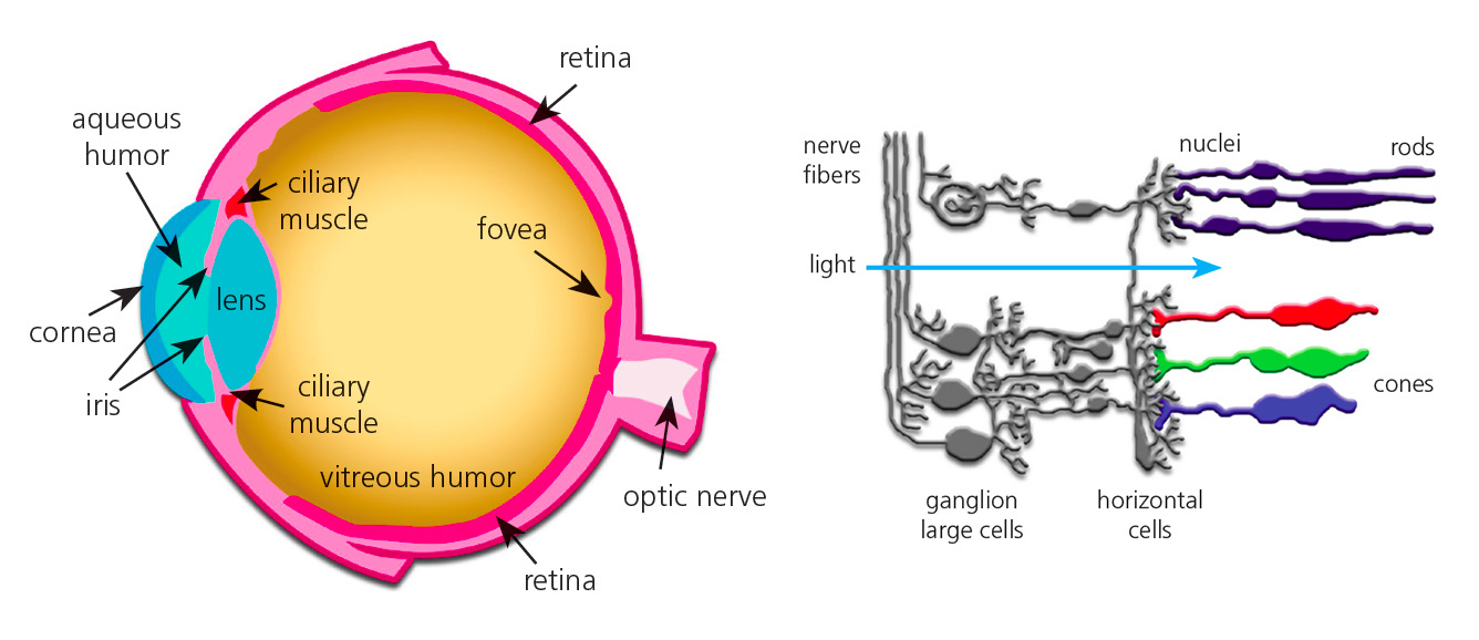
Hay muchas cosas que afectan nuestra capacidad de ver el color. En algunos casos, no importa si el rojo que ves es el mismo tono que yo veo. Un granero es un granero, ¿verdad? Pero para aquellos que trabajan en una industria donde la evaluación del color es parte del trabajo, ES importante... MUY importante. En nuestra serie de percepción del color,estamos discutiendo los muchos factores que afectan la forma en que vemos el color y lo que coloristas pueden hacer para asegu...
August 31, 2022

You’ve probably heard of popular detectives like Sherlock Holmes and high school sleuth Nancy Drew, who have gained notoriety by solving the toughest crimes. With so many color mysteries out there, we thought it was time to do some investigating of our own in the mysterious realm of color. In our Color Detective blog series, we’ll be tackling some of the biggest mysteries in color, starting with this red ball… Which isn’t actually red. The ball on the left is not green...
April 06, 2016

Which of these swatches would you call bright red? PANTONE FASHION, HOME + INTERIORS Color Specifier pages Speaking the language of color isn’t like giving someone your phone number and expecting they’ll remember it. Our minds just don’t process color like that. While vague color descriptions are sufficient for many people – “Turn left at the blue house” or “choose the reddest strawberries” – if you work in an industry where color is important, you need to know how to speak a much more spe...
March 24, 2016

ArtPrize hired Grand Rapid’s own Conduit Studio to design theme ideas for this year’s event. Together, they selected Celebration of Color to highlight the importance of color in our everyday lives, and to inspire visitors to explore and discuss the creativity of the event. Last week, X-Rite Pantone contributed a guest blog for ArtPrize that walked through the process to select the color palettes that would define each neighborhood and give the event a unified feel. Today we’ll link art and scie...
September 24, 2015
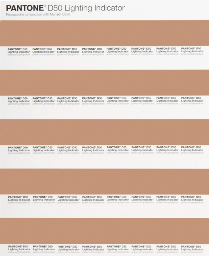
As we’ve talked about in previous posts, proper lighting conditions are crucial for evaluating color. The best way to know you’re seeing color accurately is to evaluate your samples in a quality light booth. But what if you don’t have a light booth available? Pantone has solved this problem with its LIGHTING INDICATOR Stickers. They’re economical, easy to use, and the second best way to find out if your viewing conditions are right for color evaluation. Here’...
July 06, 2015
