
Starbucks has once again kicked off the holiday season with four new festive cup designs. This year they surprised us with a magenta accent, which “lifts the traditional holiday colors and makes the red even look brighter,” said Kristy Cameron, Starbucks’ creative director. In the frenzy of holiday shopping, packaging plays a crucial role in catching the eye of potential buyers. However, staying ahead of the game and adapting packaging designs to align with ever-changing con...
Posted November 01, 2023 by Cindy Cooperman
.jpeg?h=285&la=en&w=400&hash=AC6EC8E66937FAB0B91715E08CE3FBCBE0296113)
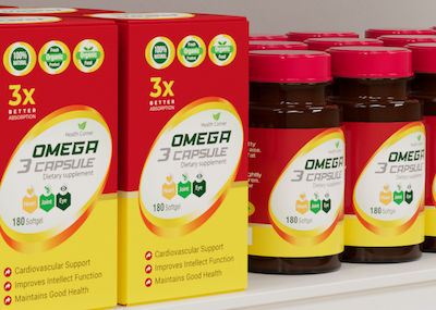
When all of final production packaging comes together on the store shelf, it’s a brand’s moment of truth. Do the stand-up pouches, overwraps, and corrugated POP displays match? How close is the color to its standard? We know you spend so much time and money designing, proofing, sampling, printing, and shipping… so where does the color go wrong? Is it an issue with accuracy, consistency, or both? Package designs come together on the shelf. Here you see pouches, labels, cartons, and corrugated wit...
Posted March 15, 2023 by Cindy Cooperman
All it takes is 2 to 7 seconds. That's right, a tiny snapshot in time is what a consumer invests in making many purchase decisions about a product. This is the much talked about and researched “First Moment of Truth”. X-Rite color management solutions for print and packaging deliver excellence in quality control, formulation and automation. Color is a significant factor in First Moment of Truth, when you considered the reach it has to engage us and communi...
Posted March 15, 2023 by Cindy Cooperman

When someone says “apple,” do you think red, green, or yellow? What do you do if a customer asks you to produce a color using descriptions that are not specific enough? Check out how something as seemingly simple as color communication can determine whether your color program succeeds or fails. A picture may paint a thousand words, but words alone do not paint a thousand colors. Circular conversations about color happen everyday. They generally start with someone asking for a sligh...
Posted March 15, 2023 by Cindy Cooperman

Does your quality control program include visual evaluation? If not, it should. Using the SpectraLight QC as part of a color evaluation workflow. No matter your industry, judging color is more than just measuring samples with a color measurement device. Just because a spectrophotometer says your color is within tolerance, doesn’t necessarily mean it will look right to the human eye. To minimize customer rejects, your color control process needs to include visual evaluation in a light boo...
Posted March 15, 2023 by X-Rite Color
Anyone responsible for printing goods or packaging knows that some colors, like orange, are just too difficult to reproduce using only CMY inks. A fourth color, black (K, which stands for key color) is often added to subtractive color printing applications. Since C+M+Y actually creates a muddy brownish color due to ink impurities in C, M and Y, adding a true black ink creates the deep color and tones that CMY alone can’t achieve, plus adds density to the shadows. This four-color printin...
Posted February 10, 2023 by Scott Harig
This time of year, the internet is full of Top 10 Countdowns. It’s a tradition we’ve embraced since 1940 when the Billboard published its first chart ranking the top selling recorded songs. Since then, others have jumped on the bandwagon to highlight the most popular trends of the previous year. We’ve been publishing our top-read blogs since 2016, and we’re happy to see some educational topics like color perception, tolerancing, and spectrophotometers continue to r...
Posted December 28, 2022 by X-Rite Color

It’s important to ensure design intent is realized each time and everywhere a product appears. But with so many variables to impact print quality, how can brands utilize suppliers around the world and still achieve consistent color? Our X-Rite Pantone Packaging Color Experts have designed a series of consulting services and workshops to help you get the most from your print, packaging, plastic or textile value chain. Offered both online and onsite, these interactive sessions i...
Posted December 06, 2022 by Cindy Cooperman
.jpg?h=285&la=en&w=400&hash=CF098B5757EE43CE3966F416E1D31AE6A67A8104)
Whether you’re choosing colors for a brand, creating palettes for a new product line, or designing seasonal packaging, inspiration is a key step in color selection. Inspiration can come from normal, everyday places, for example: A party. The grocery store. Sporting events. And of course, the great outdoors. Mother Nature has a knack for creating the most beautiful color palettes. “Colors for Autumn/Winter 2022/2023 contrast our competing desires for calm and comfort with energy boost...
Posted November 04, 2022 by X-Rite Color

Why Calibrate Your Spectrophotometer? For the most part, today’s color measurement instruments are 100% digital. In fact, there are very few analog components inside, except for the light bulbs. Although they’re more stable than their analog predecessors, their tolerances are much narrower, and they need regular spectrophotometer calibration to stay within these tight specs. Bulb Stability As you use your instrument and the bulb turns on and off, it starts to change its character. S...
Posted November 03, 2022 by Mike Huda
